Your logo’s shape can tell a lot about you and your business. Your logo can communicate to customers whether you are serious or friendly, artistic or scientific, traditional or cutting-edge. Like logo colors, logo shapes also have meanings and this article will help you understand them. Shape is an integral part of any design. You’ll be able to choose the right shape next time you need one.
The types of logo shapes used in creating a final product say a lot about the meaning of such a logo and go a long way towards creating a connection with the audience that tunes their shape psychology and emotions in a way that connects them with the brand.
Research has suggested that the brain interprets each shape differently, and each holds the ability to amplify an intended message to the viewer. So, while you might think that the popular logo shapes you’ve applied in your logo design are just for decoration, they actually determine how potential brand lovers see and interpret your logo design.
In this article, we will be analyzing the familiar shapes used in logo design and their respective meanings, alongside how their combinations influence the targeted audience and will try to figure out why logo shapes matter.
Table of Contents
The meaning of logo shapes
It’s common knowledge that different colors affect people in different ways. Not only will a bull be annoyed by aggressive flashings of red. However, very few people know that object shapes possess a similar effect. And in order to create a noticeable brand, it is highly recommended to resort to the psychology of basic shapes in logo design. Though it seems extremely difficult, we still are going to clarify the topic.
If you are an attentive person, you surely have noticed that most avatars are rounded nowadays. The trend has been spread not a long time ago. Initially, avatars on the internet were rectangular. And even Facebook has rounded them nowadays. The thing is that it’s not just a fad. In truth, it’s far from it!
Logo shape possess a fundamental psychological meaning. And the circle is not just a random choice here. It is the simplest and most pleasant figure in terms of perception. When a child is born, its mind is still weak and can only perceive obscure circles.
Even our parents’ faces are just smiling circles for the first months of our lives. It seems weird, but we remain influenced by the very first images in our life throughout a lifetime. That’s what makes it possible to address an inner child and increase sales with elaborate logo shapes.
Circular and Round Shapes in Logo Design
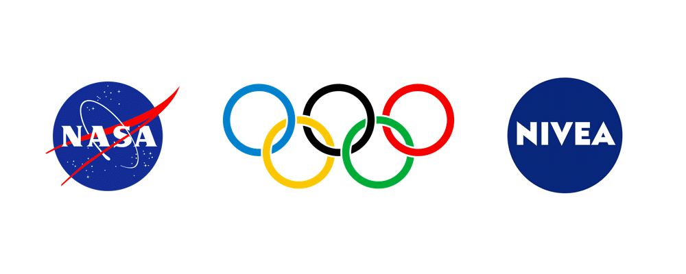
Round and oval shapes are known to have no edges or dots, and are usually round and soft, all of which makes them a unique logo shape among other natural shapes. Circles and ovals are associated with security, felinity, protection, and continuity. When more than one circle is combined, this may portray a community, support, love, continuity, or infinity – check out the Olympics logo.
Thus, a logo design which involves the use of a circle is not only welcoming, but also positive, and passes a message of unity. Such logos are also good for drawing attention since they are not things we see every day.
Examples of circle logos include the Glo logo and the Nivea logo released in 2013 — note their distinctiveness and beautiful nature. Circle logo shapes make those brands eye-catching.
Circle logo inspiration
Round logo inspiration
Rectangle and Square Logo Psychology
Combining rectangular and square shapes usually offer a blend of stability and boldness, which the human mind translates psychologically as balanced and reliable. Additionally, this combination is most often overlooked by the human eye compared to other geometric shapes as they make up what we see every day.
When present incorporate logo designs, rectangle, and square logos may represent strength, effectiveness, and top-notch professionalism. Rectangles are linked to everyday objects that hold things, including homes, boxes, and vaults.
The presence of the right angles and the straight lines portray professionalism as well as orderliness. Thus it is used in driving a deep sense of strength and balance. Square logo shapes are often used to convey a sense of innovation and modernity.
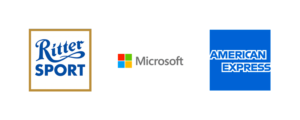
Top applications of the rectangular and square combinations can be found in the American Express logo design and the Microsoft logo design. Another classic example of a square logo is the Ritter Sports logo.
Square logo inspiration
Rectangle logo inspiration
Triangle Shape
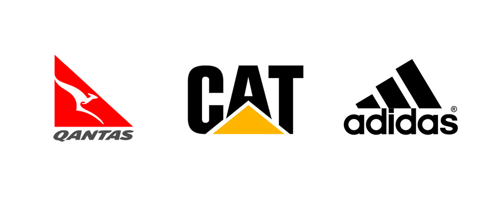
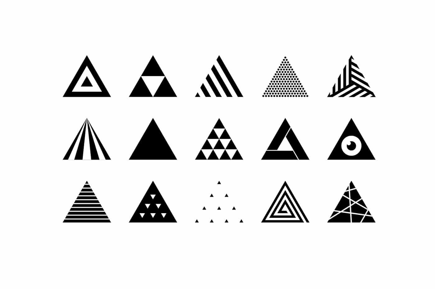
The triangular logo shape, like squares, consists of sharp angles and straight lines. How the mind interprets them depends on their orientation in the image. However, the triangular logo shapes generally portray such emotions and ideas bordering on stability and power. It may also represent energy, order, strength, and even more.
A triangle sitting on its base in a logo means stability and strength. When the triangular logo shape is facing downward, it means dynamism and uncertainty. These geometric logo shapes and orientations are primarily used in the fields of science and religion due to their strong association with power as well as masculine appearance.
Take a look at the Adidas Logo, and that of similarly adventurous brands, you will find out that triangles have been used to deliver unique meanings by its specific shapes. In the case of Adidas, the slanted lines from an abstract triangle translate to speed and motion, which interprets what the brand stands for. Triangles often used to emphasize abstract shapes of logo. These kind of logo shape can create a sense of intrigue and mystery.
Triangle logo inspiration
Horizontal and Vertical Line Psychology in Logo Design
The orientation of the logo shape in logo design has certain meanings. Vertical lines relate to strength, courage, dominance, masculinity, and aggression. On the other hand, horizontally placed lines and shapes are more feminine inclined, and thus means tranquility and calmness.
When many vertical lines are present in the shapes of a logo, it makes the logo design appear narrower, but in cases where horizontal lines are much, the image takes a broader appearance.
So, brands or companies that wish to attract the female audience will use horizontal lines more in their logo designs. These horizontal lines may also be used to portray movement and dynamism. An example is the Stumblebum horizontal logo. The simplicity of these logo shapes conveys a sense of professionalism and conciseness.
Conversely, companies seeking to appear bold and powerful will prefer straight lines in their designs alongside other stable components of logo design adding a bit abstract shapes. However, overusing vertical lines can present the brand as too aggressive, domineering and eventually spoils good shape.
Overall, when used rightly in logo designs often with curved shapes, these orientations can pass different messages to the intended audience.
Logos containing vertical lines
Logos containing horizontal lines
See more horisontal lines logos
Organic Logo Shapes
Organic logo shapes are known for their uniqueness and ability to capture attention when used correctly in logo designs. Just like the original real-world geometry, organic-shaped logos are usually in free forms and not in any way defined. When they are drawn on various figures, the combination gives a more distinct result. And due to these, such logo shapes used extensively by logo makers in the wellness industry.
The definitions of organic shapes are usually very flexible — in some cases, they may communicate familiarity and comfort, and in others, they may mean intimacy. An instance is the Gatorade logo, where the lightning shape portrays the energetic nature of the company.
Organic logo inspiration

Curves shapes
In cases of curves, they tend to add a feeling of rhythm and motion to logo designs, and they represent positive emotions, happiness, and sometimes movement. In brands that are more about forging a personal link with their audience, curved logo shapes are the ideal options.
Likewise, organizations that intend to convey reflections of joy and happiness to their customers will be better able to achieve this by using a curved logo shape. Unlike sharp edges and corners, curved shapes soften and balance logos.
Consider the Coca-Cola and Disney logos – both are brands that reflect joyfulness – and they both achieve this via curved logo shapes.
Curves logo inspiration

Spiral Shapes
Spirals are relatively uncommon, but when included in logo design, the logo maker is probably aiming at adding a distinct twist to the design. The appearance of spirals brings feelings of calm, even flow, and fascination. The combination may also represent a steady growth strategy, alongside a flow of love, time, and energy.
However, the more basic use of a logo’s spiral shape is to depict a brand’s creativity. Such brands would appear to the audience as innovative and distinct. Thus, the use of spiral logo shapes is widespread among companies looking to present their evolution, growth, and dynamism virtues to their audience.
Spiral logo inspiration
What logo shape is best to be used in the design?
There also are other meaningful shapes. And you don’t have to create a perfectly symmetrical logo. The whole depicture is just supposed to be shaped into the figure, like a pyramid inside of a triangle. Those shapes convey a sense of stability, reliability and firmness, provided they are pointed up. Should you point it down and the meaning goes down too. Shape is a basic building blocks of any design.
Does that mean that triangles and other pointy shapes aren’t appropriate for logo designing? Of course not! There are many products that don’t require boring stability. If you are selling transportation and delivery services, circular shapes will be a perfect choice for you, as those pointy shapes and clear, straight lines are stressing speed and maneuverability.
There are many even logo shapes, such as various rhombs, squares or rectangles. And we see those every day. It can be a window, TV, fridge or a door. We tend to trust square shapes, so a square logo is likely to become a trustworthy one. However, if you are afraid of getting a boring box of obscure symbols, we recommend choosing a spiral or a star. Moreover, the final choice is to be made according to the type of product being sold.
Having known that each logo shape has distinct psychology, it is essential to make sure that the choices are in line with the brand’s values and the most important characteristics. Furthermore, when combined, there must be an output that beats the individual qualities and potentials, without taking away the flow and fluidity. Thus, rather than just combining logo shapes for the sake of it, it is vital to ensure that they are harmonious.
Frequently Asked Questions
The most popular shapes for logo design are rectangles and squares. Squares are associated to equality, stability and reliability. Although some may think squares and rectangles are boring, there is a reason they are so popular.
Logos must be clear and easily remembered. They should clearly represent the brand and be easily identifiable. Bad logos can have many undesirable qualities, such as confusion, complexity, over-complexity, and poor recognition.
A logo often uses the circle to signify unity, commitment, love, or community. When curves are used in shapes, they tend to be feminine. Straight-lined shape, however, can be more masculine. Circles represent life and its cycle. They have no beginning or end.
A great logo should be distinctive, relevant, simple, graphic, and convey the owner’s message. Logos should be easily printed in any size. Most importantly, they should not require color. Great concept and great execution are the two main ingredients of a great logo which must reveal its unique shape psychology.
Final words
Logo shape definitions are quite important to the logo creation process. They have a way of creating a distinct feeling and perception about the final design, which usually originates from the brain.
So, in addition to logo fonts and colors, logo shapes can as well contribute to the interpretation and how logo design is defined with. Before proceeding with a logo design, determine the target audience and the proposed message. Remember, that shape psychology establish connection between your brand and consumers. With this information, you can then detect which shapes can pass this message across, and the best combinations to use that will not take away the virtues of the brand.
With all these in place, you are on the verge of making better logo design decisions with different shapes that will ultimately transform your branding.
I’m a product and graphic designer with 10-years background. Writing about branding, logo creation and business.

Wow, shape is so important in the logo design. I’d like to use circle in my logo design.
Yes, I read it with pleasure, now I use the information when creating my logo