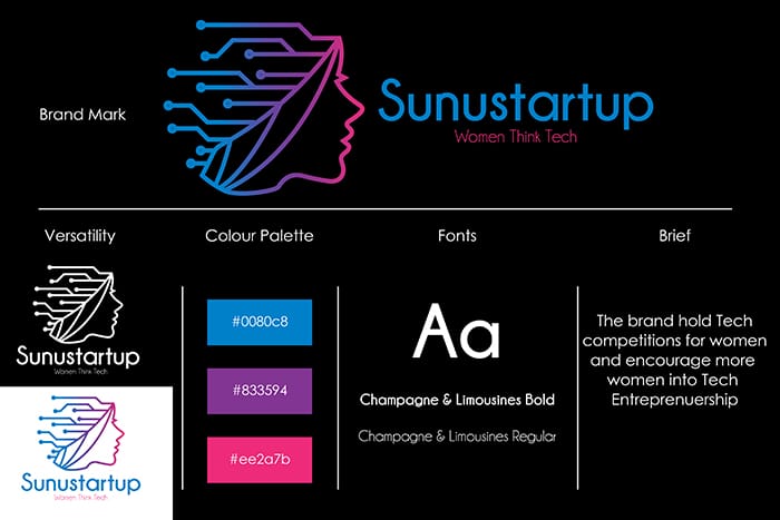
When you have finally got what you have been looking for you want to show it. If you are a business owner you show it to staff and investors first. If you are a staff member you are likely to show it to the boss and being a designer means that the first one to see your creation will be your customer. By presenting a logo, you can conclude a profitable bargain and increase the whole company’s income. Or you may lose everything you’ve been hoping for. The current article is dedicated to how to present a logo successfully to your clients.
Logo Impact Trumps Presentation
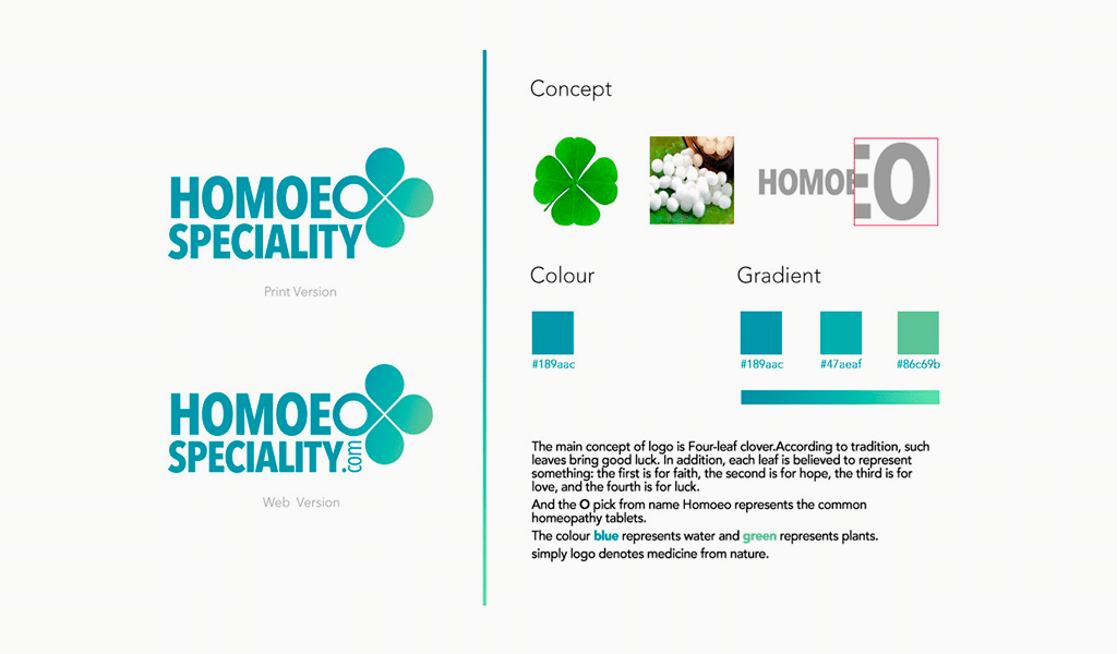
It would look weird if people would try to taste a drink by looking at a bottle. However, that’s just what you do by demonstrating your logo on a white background. Have a look at Coca-Cola. You can see a bottle, a vintage inscription, and a logo at the same time. And you don’t buy a bitten apple, but a gadget with the cool logo. Three Adidas stripes are nothing without stylish sneakers where they are depicted.
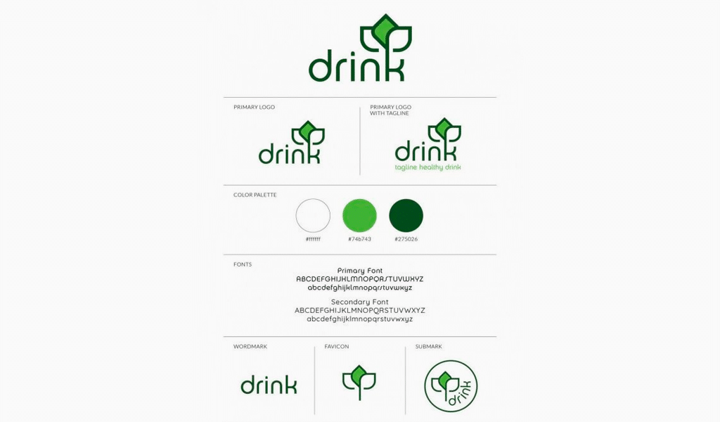
Never present the logo alone. Be sure to use some outline mockup. Show your customers how exactly a logo would look like being applied to some product. Make some card samples. Come up with a concept of a huge banner on a football field. It is the only mockup that enables you to run a smooth logo presentation to a client. Mockups make logos look real.
Final logo recognition often depends on ad funding. It is quite possible that some far less famous company produces just as delicious drinks as Coca-Cola. And their logo could be of high quality too. However, such companies are no match for the marketing power of megacorporations as it is rooted in abundant advertisement funding.
How to Craft an Ideal Logo Presentation
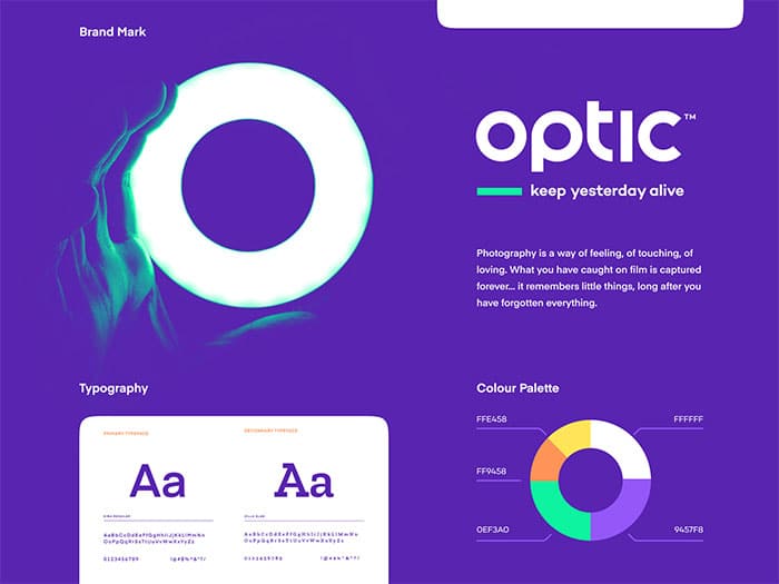
After you’ve selected some plausible images for logo mockup, you’d better pay attention to a presentation. You might start with a hexing as most programs feature this function. Its function is to mark a slide so that you could allocate all the elements in a pleasant manner. Thanks to that tool, all the info comes according to a sequence. Mark margins and workspace with arrows. Ultimately, the net caters for legibility and clearness.
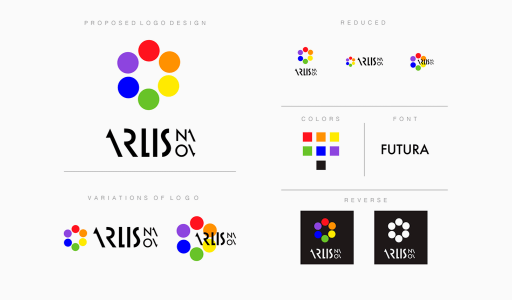
Don’t forget to allocate text in a proper manner. It must be apt and clear too. Paragraph division greatly improves the reader’s perception capabilities. Paragraphing is meant to structure a text thus implementing its meaning. Be sure to illustrate a given text with some relevant pictures.
Headings are also important for a structure. Always separate it from the text and some random illustrating phrases. It is a good idea to use a different font and size too. But don’t make every heading differ from any other headings in terms of style. Choose one bold font type for a heading and one ordinary type for a text, it is quite enough.
Effective Logo Presentation Techniques
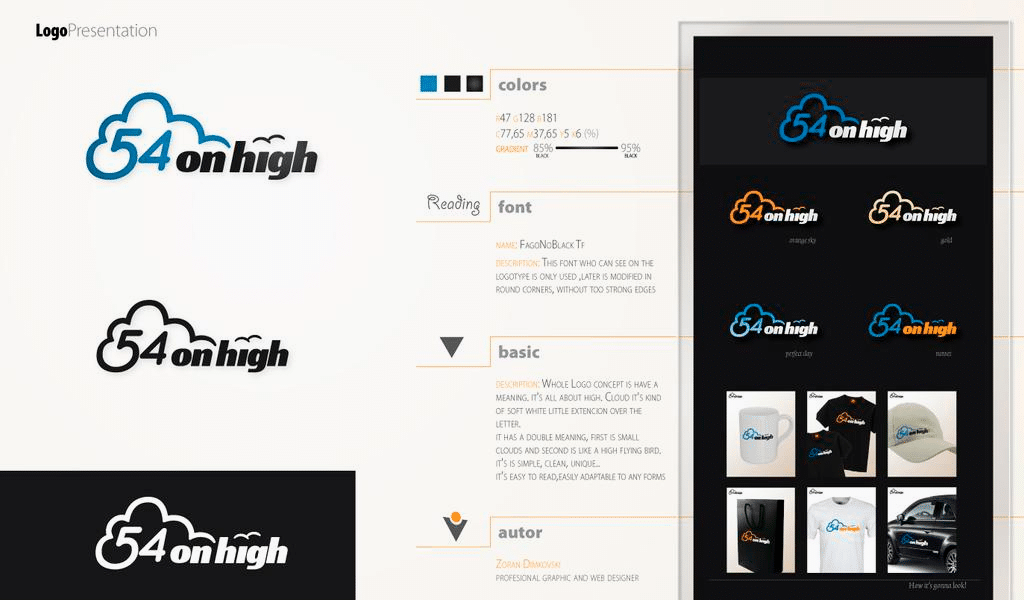
Adding animation to your presentation would be a fresh move indeed. It will make it interesting and even alluring for a customer. You might want to resort to professional animations templates to pep up the graphic aspect of your presentation. You can use some animated photo materials or video footages as a background for slides. However, watch your materials carefully. They must be free to use by their owner or creator. It is piracy otherwise. Also, be sure to choose something of neutral style, so that it doesn’t contradict with your logo style.
Pay attention to screen resolution as well. It must match the resolution of the slide. Square displays are obsolete. The only acceptable option today is the 16:9 ratio. It is required to depict images via smartphones, monitors, and even projectors.
I’m a product and graphic designer with 10-years background. Writing about branding, logo creation and business.

