Creating a logo for a customer is not an easy task. If you think that 100-150 drafts is a huge number, then consider this fact: professional designers and specialized companies create thousands of drafts for each client.
Unfortunately, results are not that likely to meet expectations. Everybody sees a logo differently and it’s really hard to find two people whose ideas on the same topic would be at least similar in this field. Some customers are only interested in the technical aspects of logo creation. It’s important that a designer sticks to the task description and creates something that is close to what the customer described. But, of course, it’s important to know and use good logo design principles when you work for the result. Some customers are into ideas, for them, it’s important that a logo has something within it. They can flip through tens, hundreds, thousands of drafts before they find something that can resemble what they expected to see as a perfect sketch. But the expectation and the result are never the same.
Another 5-6 years ago, no one delved into the process of creation and, in fact, the very meaning of a logo for a company. They made it mainly because of the fact that everyone had it, so they needed it as well. And talking to designers customers could refer to a logo as a “label”, a “picture”, and even “an inscription to print it around.” Such a confusing version of the requirements could be transformed into the same result and, naturally, such a logo would hardly have really represented the company and reached clients.
Let’s see how to make a good logo and what are the important cool logo design principles.
Table of Contents
The logo is an analog of a quality mark
The most important thing to remember is that the logo is a sign of quality. This is the only way it should be positioned, if not by the customer, then at least by the creator.
For example, the sale of any product should be associated with something from the buyer, and so, the visual image at this moment always contains the logo. The same is true when providing services. A logo always reflects the high quality of goods and services of the company providing them. A cause-and-effect relationship should appear at the mere sight of a logo: “I need something – I see the logo – The quality is high – I want to buy it”.
Thus, a logo is the carrier of the properties of a product or service. Therefore, branded products belong to an expensive segment of the market among similar goods and services.
And if the logo of a company is unknown, then a buyer will first be wary of the product, no matter what excellent qualities it possesses. We should also mention the logo which serves as powerful advertising but represents a product of dubious quality. Yes, of course, such a product will attract the buyer, but it will happen only as a one-time sale.
Now it is clear why there happen all numerous lawsuits regarding the misuse of one or another logo. Only once should a logo appear in a doubtful campaign (offering a bad product or poor quality service) a cool logo can completely lose its former appeal to the consumer. And these will be multimillion-dollar losses for owners, and all PR-actions and branding will become a waste of money and time.
Sometimes a text is enough
Paul Rand created the world famous blue inscription on a yellow oval background as far back as the XX century, and this logo has been a famous IKEA logo since then.
Now the customers demand more and such simple but memorable inscriptions, unfortunately, or fortunately, are not in honor. Thus, the unique property of a logo such as memorability is almost lost.
A modern client requires an extremely clear display of a product or service on a logo. A grocery store is an image of products or baskets for products, a construction company is a construction tool, overalls are a helmet or a robe, a HUNDRED is a car or keys and so on.
The most striking is the fact that the logos of the titans of the international market for goods and services are absolutely not visually connected with the goods of the brands that they represent.
Moving to the most simple option
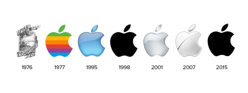
Even strong players once had other logos: Nokia had a fish head, and Samsung was selling rice and a corresponding associative logo. But now they have received not only many years of experience in the global market but also immense wisdom, so their logo is now a conservative text.
But this happened over time, gradually the companies became universal and did not specialize in one thing, and a corporation should have a trademark. So logos gradually dropped the extra load of visual garbage and turned into graphically conservative logos.
The visual perception of the logo and the formation of associative links
When consumers receive a great product or a quality service, they intuitively remembers the company logo. Even if the logo looks disgusting, the person will remember it and, if necessary, will search. This will become its graphic marker for good quality.
The main point is that sometimes you should retreat at least a little from the recognized canons of a high-quality logo. For example, take Apple, does it sell apples? Do they grow them? No, but the logo works according to the “emblem equals quality” scheme.
Sometimes you can just launch the product and wait a bit maybe the perfect design will occur to you later.
The most difficult is a situation where the customer comes and sincerely asks for a good logo like Apple Mac / Nokia / Nike and other companies, there often is a dissatisfaction with the result. Considering that this logos are on the peak of simplicity and minimalism, customers ask for this and disappoint at getting the very same thing.
And the snag here is that a client clings to one or another logo with the quality properties of the product, and not with the logo itself, but does not receive such an effect from its trademark. This effect is earned by hard work and quality, earned from its consumer.
Logo is a waste of time
Some companies sincerely believe in the above statement and here is one example: a certain distribution company engaged in the rent and sale of cinematography stubbornly avoided its logo creation for a long time firmly believing that “no one needs it, they will come and take the film.” And partly the company’s managers were right, even if the logo is there, it will not reflect the quality of the films it represents. Most often in such situations, the key decision is made after looking at the price tag. But there certainly are some above-mentioned perks in having a logo which could be used to benefit a company.
Business first, logo second
This situation is often observed with start-up entrepreneurs: they are planning to do something for a long time, they also choose the name for a long time, and when it comes to the logo… As a result, the business simply does not start, due to excessive attention to the accompanying, graphics. And this is not the only common mistake, let’s consider a few more:
- young businessmen themselves create a company logo and use the services of profile companies for enhancing their creations;
- bother with the name too much, throwing all the forces and thoughts on it;
- let things take their course or do it with skepticism.
And there are those who invest all their energy in business. It is worth mentioning the hackneyed, but important phrase: “Business is primary, the logo is decimal.”
Results
The logo must be catchy and conservatively simple. It is the sign of quality. Yes, it’s just a trademark form, and it doesn’t do its work for the business holder, but a logo can be a vivid and memorable stamp of the product.
Therefore, if the Samsung smartphone had not met expectations, the next, most likely, will be bought from Apple. Even huge cash infusions will not be able to change anymething. No multi-element logo will be effective. Brevity is what will be remembered. And the main purpose of a logo is to be remembered.
I’m a product and graphic designer with 10-years background. Writing about branding, logo creation and business.