

The Internet Explorer logo has undergone several transformations since its inception in 1995. This article explores the Internet Explorer logo meaning and history behind each version of the logo. We’ll dive into its design changes, the symbolism of different elements, and how these shifts reflected the browser’s journey through the years.
Internet Explorer, launched in 1995, quickly rose to prominence, achieving a peak market share of over 90% by 2003 due to its integration with Windows and competitive positioning against rival browsers.
The logo of Internet Explorer evolved significantly over the years, shifting from a globe symbol to a lowercase ‘e’ and finally to a modernized design, reflecting the changing trends in branding and the browser’s commitment to innovation.
The history of Internet Explorer’s logo illustrates key design principles such as the importance of simplicity, recognizability, and modernization, which are essential for creating impactful brand identities in a competitive market.
Table of Contents
The Birth of Internet Explorer
The birth of Internet Explorer in 1995 marked a significant milestone in the history of web browsers. Initially launched as part of the Windows 95 Plus! Pack, Internet Explorer was developed by a dedicated team led by Thomas Reardon. This new browser aimed to provide users with a seamless and integrated internet experience, leveraging the growing popularity of the Windows operating system.
Competing against established browsers like Netscape, the early days of Internet Explorer were characterized by rapid development and fierce competition. The major browser wars intensified as new players like Google Chrome and Mozilla Firefox entered the scene, each vying for dominance in the market. Despite these challenges, by 2003, Internet Explorer had reached a peak usage share of over 90%, solidifying its place as the leading web browser of its time.
The integration with the Windows operating system was a key factor in Internet Explorer’s success, offering users a familiar and convenient browsing experience. Understanding the context in which this iconic browser was created and the competitive landscape it navigated is crucial to appreciating the history and evolution of the Internet Explorer logo.
The First Logo (1995)
The first Internet Explorer logo, introduced in 1995, was a reflection of the browser’s ambition to conquer the digital world. This initial design featured an image of Earth, symbolizing the global reach and connectivity that the internet promised. The globe was depicted in calm gray and white colors, creating a sense of stability and reliability.
Accompanying the globe was the Microsoft Internet Explorer wordmark, rendered in a two-level format. The word “Microsoft” was positioned to the right of the globe in a thin black font, while “Internet Explorer” was written in an extra bold sans-serif, dark blue font with a green shadow. This combination of elements created a visually striking and memorable logo that conveyed the brand’s identity and mission.
The first Internet Explorer logo established a recognizable and trustworthy brand, setting the stage for the browser’s visual identity. As we move forward in time, we will see how the Internet Explorer logo evolved to reflect changes in design trends and the browser’s growing prominence in the digital world.
Evolution of the Iconic ‘E’ (1996 – 2001)
In 1996, a significant shift occurred in the branding of Internet Explorer with the introduction of the lowercase ‘e’ logo. This new design marked a departure from the original globe imagery, focusing instead on a simpler and more modern representation of the browser. The blue ‘e’ was accompanied by a diagonal orbiting ring, symbolizing connectivity and the dynamic nature of the internet.
The design of the ‘e’ underwent further refinements in 1997 to enhance its clarity and aesthetic appeal. The color of the lowercase ‘e’ transitioned to a lighter blue, making it more visually appealing and easier to recognize. These changes reflected the browser’s commitment to improving user experience and staying relevant in the fast-evolving digital landscape.
During this period, the evolution of the iconic ‘e’ logo underscored the importance of simplicity and recognizability in brand design. Focusing on a clear and memorable symbol allowed Internet Explorer to establish a strong visual identity that resonated with users, setting the stage for future developments, including the introduction of the ie icon.
Three-Dimensional Era (2001 – 2006)
The turn of the millennium brought with it a new era for the Internet Explorer logo, characterized by a shift to a three-dimensional design. Introduced in 2001, this updated logo featured deeper blue gradients, adding a sense of depth and realism to the ‘e’ emblem. The vibrant gradient blue color made the logo more visually inviting and modern.
Shadows were added to the logo, further enhancing its three-dimensional appearance and making it stand out in the crowded digital space. The design intended to evoke a friendly and approachable image for Internet Explorer, aligning with the broader trend of making technology more accessible and user-friendly.
The three-dimensional era of the Internet Explorer logo reflects the browser’s efforts to stay relevant and appealing in a rapidly changing technological landscape. Embracing cutting-edge design trends allowed Internet Explorer to maintain its position as a leading web browser, resonating with users who valued both functionality and aesthetics.
Rebranding to Windows Internet Explorer (2006 – 2010)
In 2006, Internet Explorer underwent a significant rebranding, transitioning to Windows Internet Explorer. This change was more than just a name update; it marked a comprehensive redesign of the browser’s visual identity. The new logo featured a darker ‘E’ with a black outline, giving it a more robust and modern appearance.
One of the most notable changes in the redesigned logo was the orbit surrounding the ‘E’, which shifted to a yellow color. This vibrant yellow orbit added a new level of visual impact, making the logo more dynamic and eye-catching. The rebranding aimed to reinforce the browser’s connection to the Windows operating system, emphasizing its integration and enhanced functionality.
Rebranding to Windows Internet Explorer strategically aligned the browser with the broader Windows ecosystem, reflecting its evolution and commitment to innovation. This transformation period paved the way for further developments in the browser’s visual identity and functionality.
Simplification and Modernization (2010 – 2022)

The period from 2010 to 2022 saw a trend towards simplification and modernization in the design of the Internet Explorer logo. The 2010 redesign introduced a lighter color scheme for both the emblem and its orbiting ring, showcasing a more contemporary aesthetic. This shift aligned with the broader design trend of minimalism, which favored clean lines and simple forms.
In 2011, the official logo underwent further modifications, resulting in a flat light blue design that emphasized clarity and modernity. The typeface was also updated to appear fresher and crisper, enhancing the logo’s overall appeal and relevance in a rapidly evolving digital landscape.
These changes demonstrate Internet Explorer’s efforts to stay current with design trends and user expectations. Focusing on a simplified and modern visual identity helped the browser maintain its relevance and appeal in an increasingly competitive market, especially when compared to previous versions.
Introduction of Microsoft Edge (2015)
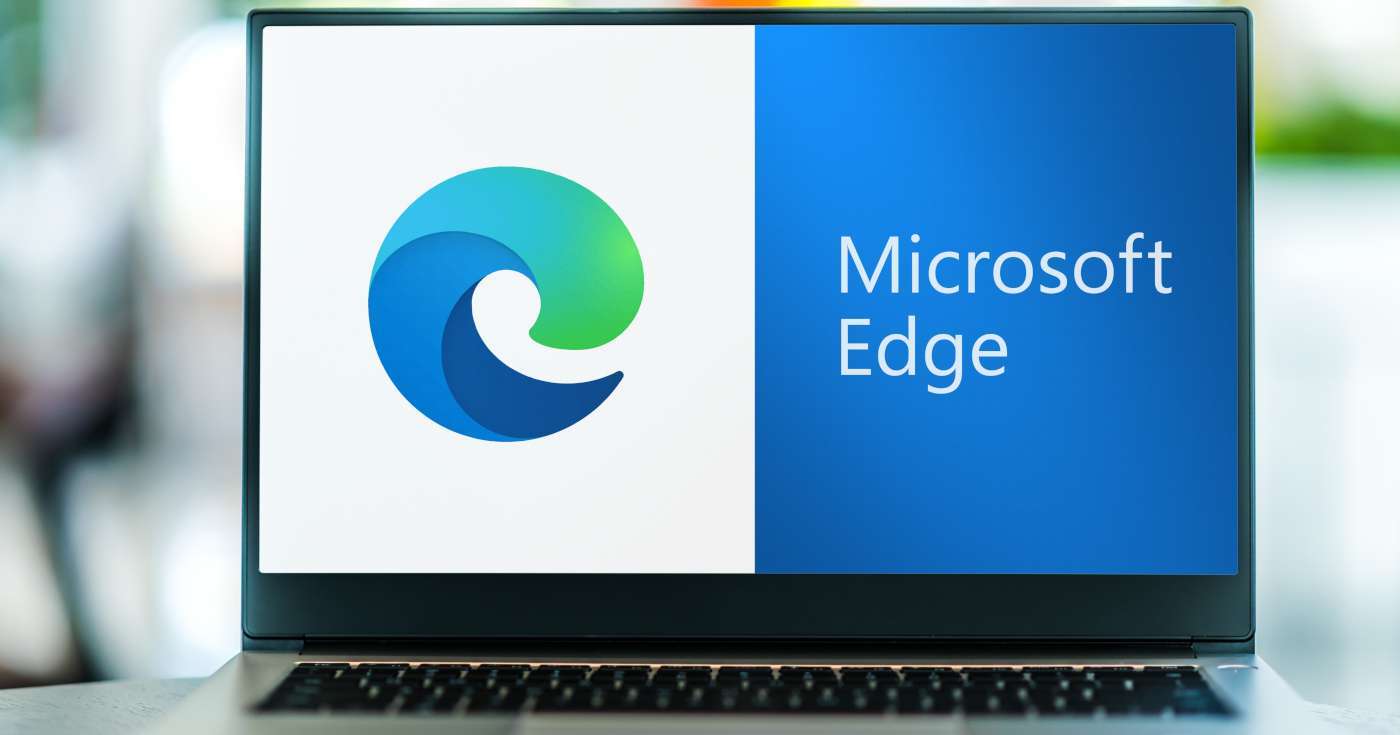
The introduction of Microsoft Edge in 2015 marked the beginning of a new era for Microsoft’s web browsers. Officially launched during the Build Conference on April 29, 2015, Microsoft Edge replaced the earlier project codename ‘Spartan’. The new browser was designed to be faster, more secure, and more compatible with modern web standards.
The initial logo of Microsoft Edge drew inspiration from the Internet Explorer logo, maintaining a connection to its predecessor while introducing a fresh design focus. The recognizable blue ‘E’ was retained, but with a sleeker and more modern appearance that signaled a new chapter for Microsoft’s web browsing solutions.
The transition to Microsoft Edge marked a significant shift in Microsoft’s approach to web browsing, highlighting the company’s commitment to innovation and user-centric design. Building on the legacy of Internet Explorer while embracing new technologies, Microsoft Edge aimed to deliver a superior browsing experience for users.
Lessons from Internet Explorer’s Logo Design
The evolution of the Internet Explorer logo offers valuable lessons for modern graphic designers. One of the key principles illustrated by this journey is the importance of simplicity in logo design. Initially, the Internet Explorer logo featured complex imagery of Earth, but over time, it transitioned to a more streamlined and memorable symbol.
The introduction of the bold blue lowercase ‘e’ simplified the logo, making it instantly recognizable as a symbol of the internet. This shift to a simpler design helped establish a strong visual identity and brand recognition among users. As the logo evolved to incorporate three-dimensional elements and deeper blue gradients, it maintained its relevance by balancing simplicity with modernity.
Rebranding to Windows Internet Explorer reinforced the logo’s relevance, using a darker ‘E’ and yellow orbit to symbolize innovation and connectivity. Understanding these principles allows modern graphic designers to create logos that resonate with users and stand the test of time.
Parting words
In summary, the evolution of the Internet Explorer logo is a testament to the dynamic nature of technology and design. From its early days with Earth imagery to the sleek and modern designs of later years, each iteration reflects changes in user expectations and design trends. The lessons learned from this journey can inspire and guide modern graphic designers in creating impactful and memorable logos.
I’m a product and graphic designer with 10-years background. Writing about branding, logo creation and business.


