The fact is that logo affects brand perception. It is more evident in beauty and art brands and is less important in medicine or heavy industry. At any rate, the logo is designed to attract customers. That’s why many companies strive to get a logo that would express some pleasant emotions and differ them from their rivals. One of the plausible solutions here is a signature logo design. Today, we are going to tell you how to create such a thing.
Create your own logo with Turbologo logo maker. It takes less than 5 minutes and no design skills needed.
Go to Logo MakerWhy such a move?

One of the most popular and effective business strategies nowadays is brand personification. And what is more personified than a signature? However, an ordinary handwritten signature looks trivial. That’s why we’ll have to pay some special attention to designing truly artful flourish. And it’s also a good idea to get a few ideas from calligraphy. And if all of the above doesn’t correspond to your logo style, it’s okay. First things first, however.
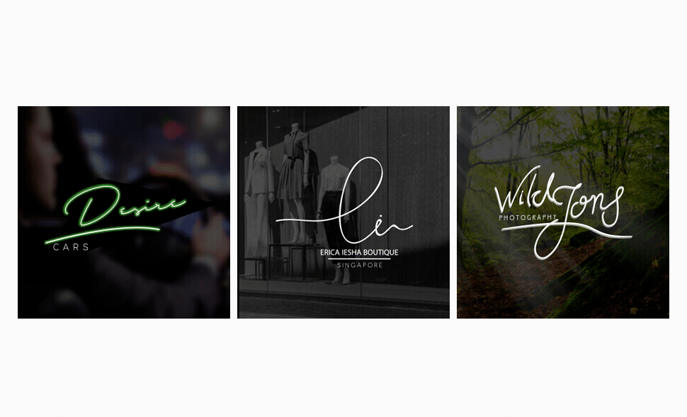
A signature logo design looks best a company’s name is represented by abbreviation. Some short and apt naming also does the trick. A combination of memorable naming and noticeable lettering cater for an unforgettable brand identity. And since logos consisting of words depend heavily on a company naming, a key role is assigned to the typographic. And your ultimate goal is to get a font that stands for the gist of your business.
How to create a proper signature logo
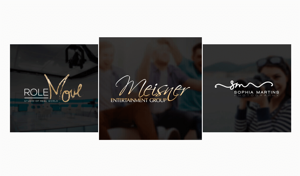
Fonts contain lots of meanings. They aren’t as eloquent as images though. And you don’t have to use handwriting as there are countless logo makers which generate some inscription in a matter of seconds.
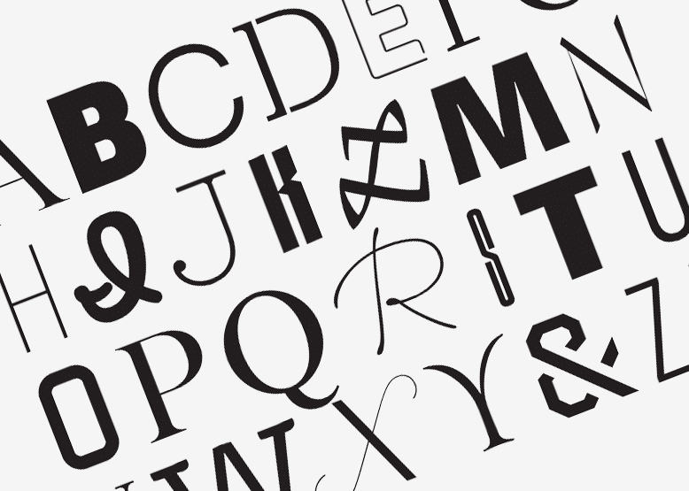
Yet how to choose a font to make a signature logo? Well, there are a few points here of course. For instance, straight, clear, and elongated fonts convey a sense of certainty which so important for business executives. It is used far more often than any other style. However, it would be a disaster for some arts companies. The problem is that the official style is boring. In contrast, roundish fonts are fervent and teasing, creating thus a warm and welcoming atmosphere. They suite need-work and food best.
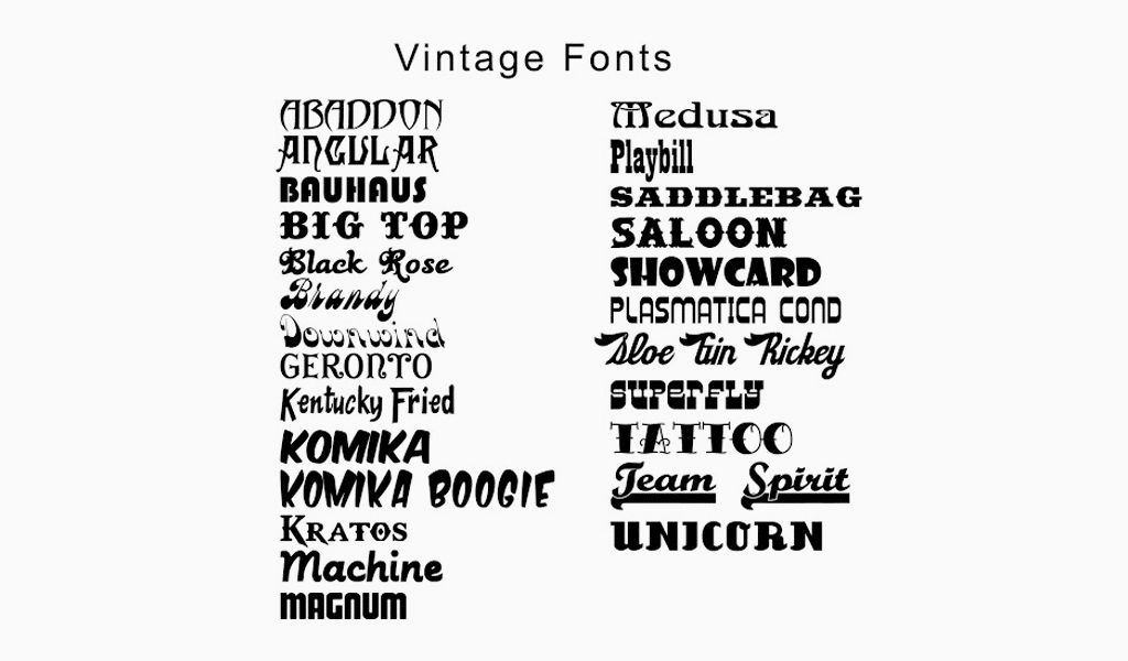
Another cool option is to use some vintage, ornamental fonts. However, you know well if it is suitable under certain conditions or not. It is totally profitable to use Gothic font for an antique weapons shop or a fencing club. Nevertheless, a bank or a food store would just frighten all the customers away. Don’t use it for industry or high tech spheres. Simplicity and ease are seriously misplaced here. You should create some grave signature logo in order to attract investors.
Crucial elements to add
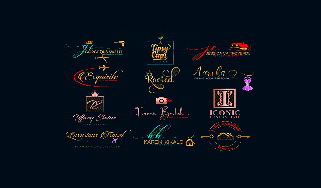
A small image to illustrate your naming never hurts. As far as statistic goes, people memorize a combination of text and images best. A logo with only an icon in it seems not trustworthy enough. They trust more to emblems with filling and dominating lettering. That’s why a perfect set of elements for a signature logo includes an inscription itself, an image, and overall design.
Symmetry is imperative for a professional and quality logo. In most cases, all the movement in the logo is directed rightwards. It represents striving for the future, so it could be a nice idea to implement in a logo. Avoid unstable figures at all costs, as it conveys a sense of unreliability. Another master move here is to place a depiction between two words of similar size. It would endow your logo with harmony and balance, causing your customers to trust your signature logo.
I’m a product and graphic designer with 10-years background. Writing about branding, logo creation and business.


