Scouts have appeared a long time ago and it is not just a bunch of kids. It is actually a worldwide youth organization aimed at guiding young people and ensuring that they have chosen a proper vector of development. The organization contributes to spiritual, intellectual and physical education. Scouts are beyond politics yet they help youngsters to form their own independent perception. The major guideline of scouts is nature education. Today we’ll tell you how that beautiful scout emblem was created, especially that of the girl’s chapter.
Table of Contents
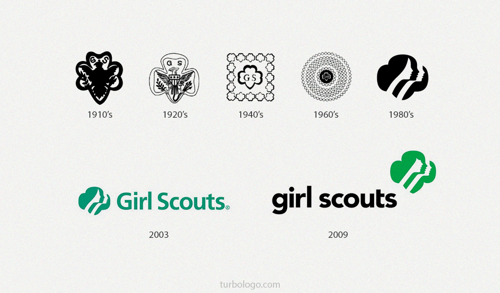
Girl scouts logo evolution
Origins of the emblem are rooted in before the last century. And scouts cherish their symbol. There is another youth organization in the world member of which would be that proud of being its part. An original logo is a gold heraldic lily framed by a green shamrock. So, how did the emblem appear and what is its meaning? A founder of the organization, Robert Baden-Powell said that it was suggested by a Pole Star.
The thing is that long ago a shamrock symbolized a compass needle pointing towards the North Pole and the Pole Star. Also, it was a guiding symbol in China 2000 b.c. One may even say that shamrock shows the way towards wealth and friendship. It is reliable as compass and guides others.
Looks like it was just the reason for the emblem to be chosen for Girl Scout chapter. Girl scouts weren’t singled out until 1912. And the unique symbol was also developed a bit later.
Girl scouts logo history
It wasn’t until 1978 when the chapter was given its own logo variation. Saul Bass was the one who created the initial Girl Scout emblem. He was a professional ahead of his own time indeed. That’s why all the changes have been applied to the inscription.
Want to make your own sports logo? Explore sports logo design ideas in our gallery.
Logo Meaning
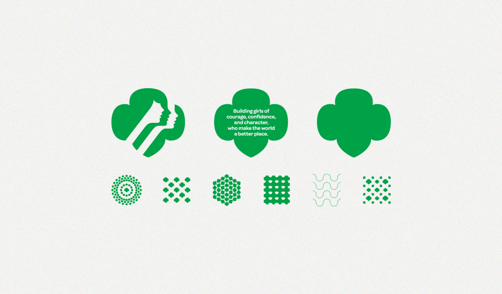
Like all the other works by Saul Bass, his symbol of Girl Scouts was exquisite, conveying a sense of unity. A lucky four-leaf clover is an original heraldic symbol with three girl side views in a background. It is very attractive and full of sense! You have three beautiful girls pointing towards the future. Despite their differences, they still have something in common and they are ready to help one another. Moreover, there are smiles on their faces which make the Girl Scouts logo inspiring and reassuring!
Girl scouts logo font
Initially, Saul Bass placed a green inscription on the left of the logo.
The main font was “Avenir Black”. It is not Scouts property, so it can be bought. Girl Scouts symbol was slightly altered in 2010. The lower leaf was redesigned to resemble a shield. The inscription also switched position and turned black. The letter “T” is now an elegant element of the composition and doesn’t divide it anymore. The font of the Girl Scouts logo hasn’t been altered. To tell the truth, the logo is too cool to be changed at all!

SEO specialist, link builder, and blog editor at Turbologo. Writing insightful content about marketing, design, and branding. Sharing practical tips on building and promoting brands online.


