It seems that no other brand design sphere is as free and spacious as gaming logo creating. It has inexplicably more than everything for your boundless imagination to design. You can resort to just about any idea like fairy adventures, bloody battles, ultra-high-tech cyborgs. You still feel tight? Think up your own universe and design for it! The only bound here is your own limit.
Computer games are 21-century fairy tales, and all humanity’s striving for something unusual and surprising is comprehended there. It truly is meant to expand the horizons. When designing a hospital logo you are limited by strict colors. Food industry colors must not alienate hungry customers. And gaming logo design has no such restrictions. Pretentious, unreal, funny and designed to a fault video game label can take any shape and convey any sense of literally anything.
Oh, yes, such a logo absolutely must not be dull. It seems to be the only limitation!
Table of Contents
How to make gaming logos
Well, what are we supposed to begin with? A gaming logo creation is aimed at the same basic questions. What kind of gamers do you want to attract? What game genre will your logo represent? Is it a detective story or an arcade? Or maybe you are aimed at some couch warriors ready to risk their lives entering a bloody bath? The general meaning is to be based upon these questions. There is nothing better than the star striped flag design for patriotic games. And lost items retrieval quest game would require some magic and sorcery!
So, you should imagine your game first, and then create your logo, keeping the image in mind. Pattern breaking here is actually a rule. Design can be any ranging from mystic to incomprehensible. And it is quite alright in this case.
How to pick the right colors for gaming logos
You have the whole palette at your disposal here. There are no limits and any color combination, along with their shades, is welcome. However, color compatibility is still a must (or maybe a should?). Good branding is based upon a group of colors. The colors can roughly be divided into basic colors and auxiliary colors. All the colors are to match and add up one to another.
A tiny piece of advice, try to choose a palette with not too many colors. The rainbow looks good, but it takes a considerable amount of skill and experience to combine the colors properly. If you are uncertain regarding your choice, you can try creating a game logo for free on our site. And having a look at your sketch you can ultimately call a professional to refine and finalize your logo.
Making up a gamer logo ideas
Just about any symbol can become a basis for a logo. The Elder Scrolls once introduced a very good idea. One of the major in-game pantheon symbols, the moon and the sun, was used as a logo. The Elder Scrolls IV, Oblivion used a depiction of a dragon and gates as a symbol, referring to plot events.
There other examples of the principle. Gaming logos are to be successive. This designing rule works well for big projects. And games often come in parts, introducing new events, new epochs, new characters, and as the plot changes, so must the logo do. Most often they change symbols but use the same design. The succession of logos makes the project something well developed and thought over, something that is of high level.
A good example here is Final Fantasy game series. A refined inscription with notched and curled font slightly alters from game to game. But the symbol of each part is always different. It is a crystal warrior for the very first part of the game, a dragon for the fifth or a meteor for the seventh. All the symbols in the game are meant to inspire a thirst for adventures and epos.
Gaming logo shape
In many games, it is necessary to be not only attentive but also fast to respond. It won’t hurt if you stress speed by thin, angled lines in your logo. Another way to stress quickness is to place several overlapping simple geometric shapes in a line. It is as if you can see the figure move. And try to tell a bit about the game itself. For example, if your logo is blue and it has some circles in it – the game is sure to be related to some water adventures, or at least some plot locations will be full of water.
Consider placing the game logo in a stylized game button as another interesting solution. And don’t forget about the latest negative spacing trend. You can find many figures hidden between or inside of stylized letters. Use your imagination and you’ll create a brilliant gaming logo!
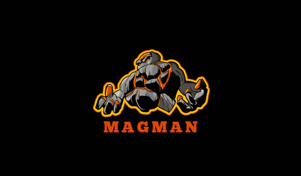
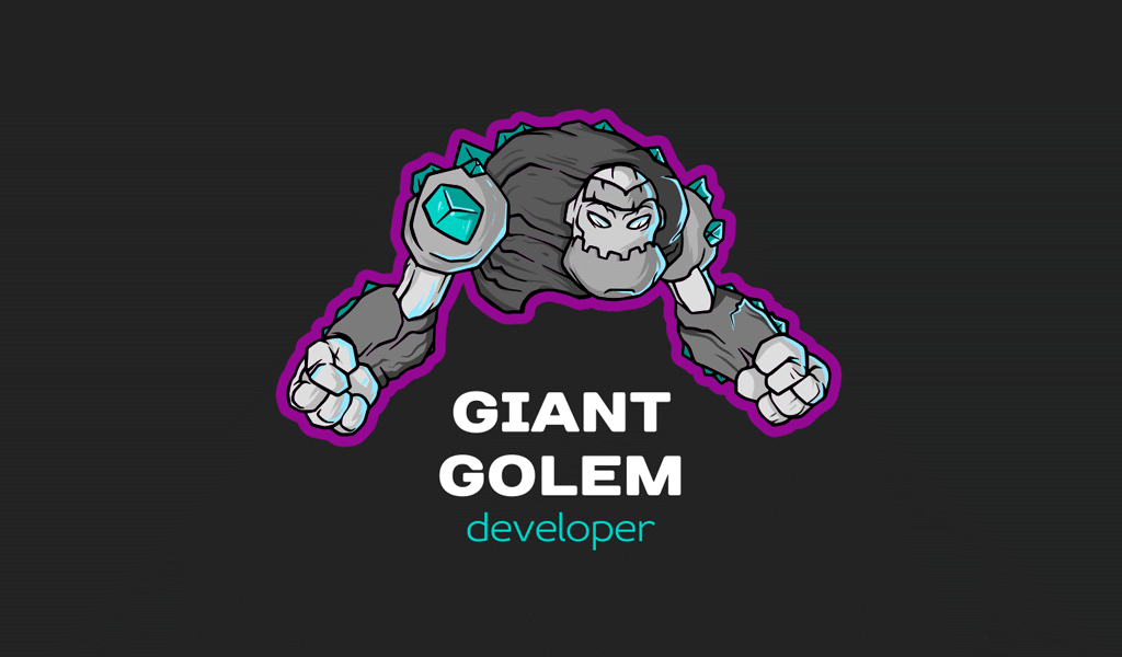
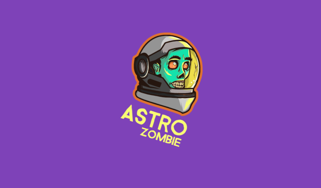
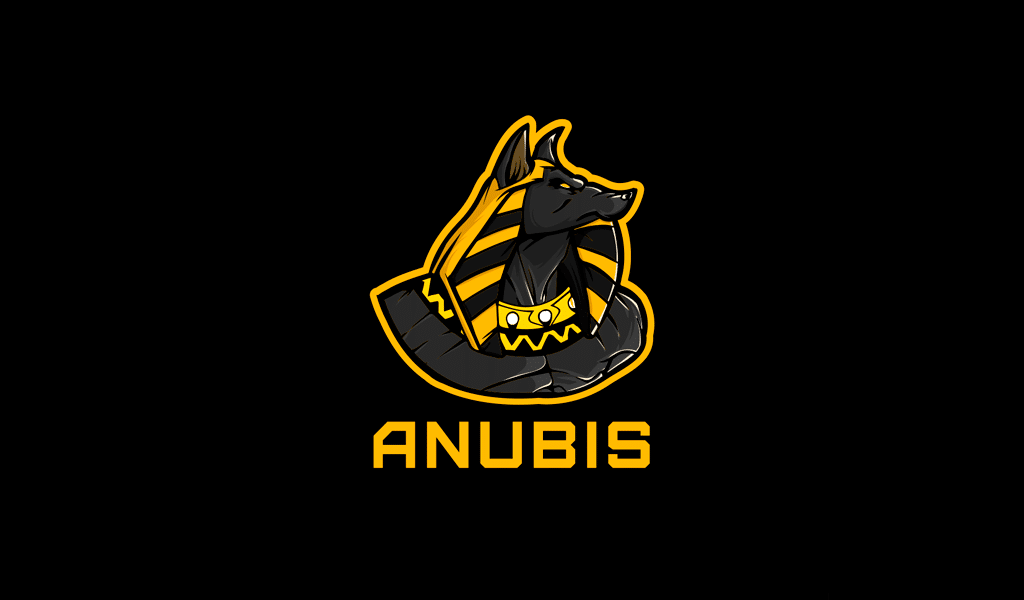
Examples of gaming logos

I’m a product and graphic designer with 10-years background. Writing about branding, logo creation and business.

