
Game of Thrones isn’t for geeks and fantasy fans alone. The series is well known all around the world. It’s struck even those who considered fantasy to be but a fairy tale. And what’s so important about it? The thing is that the series has been created by a team of professionals. Game of thrones is diversified and boasts a wide range of hidden merits such as underlying history and psychology themes.
And even those who don’t read books at all are hooked by the series. Appealing actors, uncommon costumes and great identics are sure to be found in the series too. Game of thrones logo is a masterpiece indeed. And it is just the thing we are going to tell you about today.
Game of Thrones logo history
And what led to such a tremendous popularity? In order to understand the phenomenon, we need to delve deep into game of thrones HBO logo history. Initially, the project wasn’t even funded enough. In contrast to Marvel franchise with its abundant funding, designers had quite an arduous mission to accomplish. They were supposed to get up R. R. Martin’s “Song of Ice and Fire”. And like any other type of art it was meant to make others believe that things are serious here.
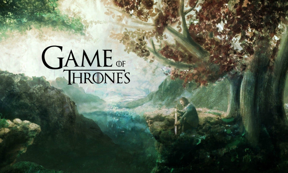
First of all, they decided to combine two well-turned solutions. Antique maps convey a sense of wandering and adventures. However, the move is used quite often and Lord of the rings or Hobbit are a good examples of it. And the second solution is a depiction of a flat Earth. In ancient times people had no idea of planets. Game of Thrones logo is encompassed in astrolabe and illuminated by a tiny sun. It immediately sends us back to the times of myths, legends, ancient warriors and the first kings.
Game of Thrones logo meaning
Upon disassembling the logo it becomes clear that the depiction actually contains a whole world. It’s a universe we are all welcome to enter. The idea is supported by shields of the great houses, which also are of highest quality and deep detailization. Countless mems based on those prove just that. If you want to have some fun with game of throne logo, all you have to do is download its vector image.
Game of Thrones logo font
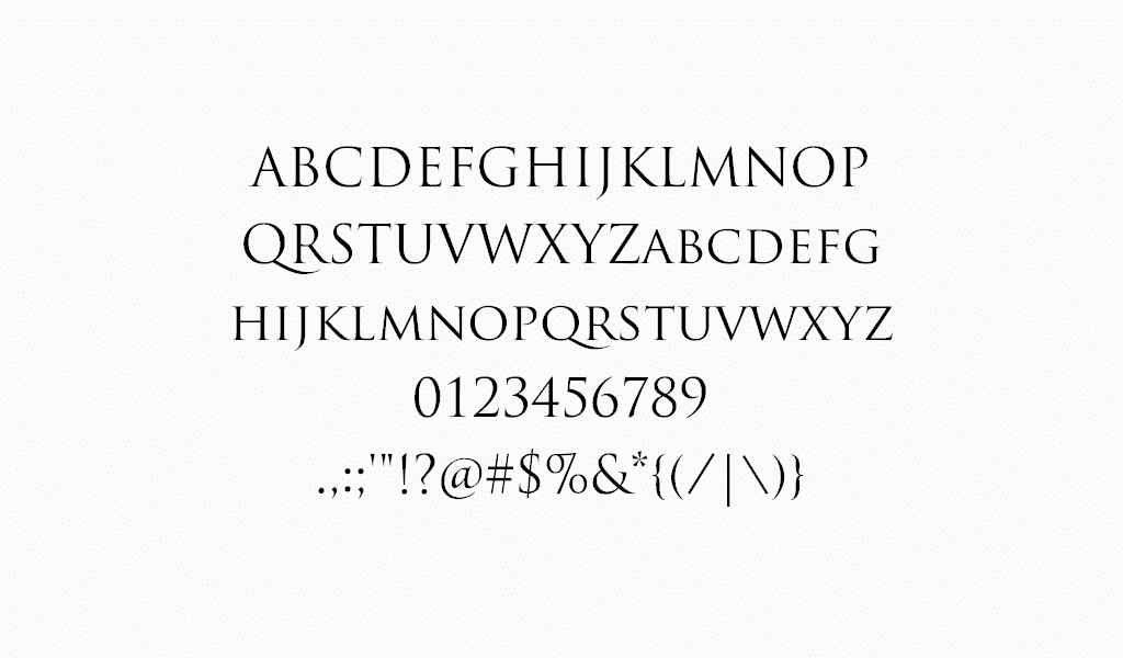
A gold astrolabe symbol is crowned by clear and thin font inscription. And it can often be seen separated from the logo. The inscription is actually a main game of thrones logo. The font is based on numerous gothic ones and you can’t confuse it with anything else. Oh, and you are free to use it for noncommercial purposes! It is both elegant and exquisite, just like “Trajan Pro”, which is often used in the series too. These fonts make many fans sigh for the cherished scenes of game of thrones.
Want to craft a legendary logo like Game of Thrones? Dive into our gallery of iconic film logo design inspirations.
Perhaps the most convincing thing here is that all 8 seasons were highly rated. Despite the fact that ending disillusioned most part of the audience, it still expects much from creators. They are shooting a prequel even as we speak here. The series is a success due characters’ emotions and feelings we all understand well. That is why we are longing for more episodes.

SEO specialist, link builder, and blog editor at Turbologo. Writing insightful content about marketing, design, and branding. Sharing practical tips on building and promoting brands online.


