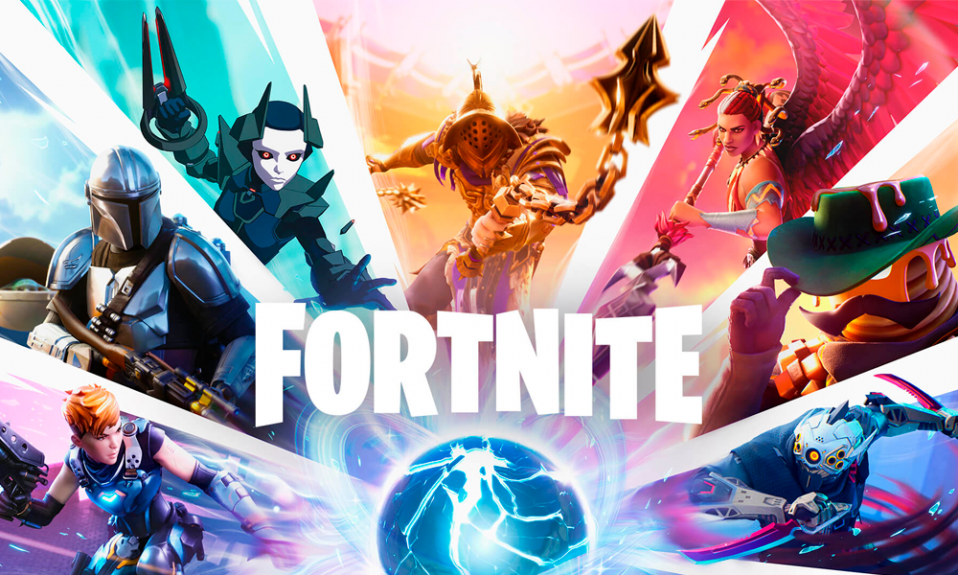
Fortnite is a video game in the virtual world of which, the individual gets an opportunity to fight zombies. It fascinates gamers all over the world from its first days of existence. Its modes are capable of capturing one’s attention and amusing him/her for an enduring time.
Anyway, the high-quality graphics, amazing effects, and pleasantness of activity are not the only factors that form its popularity. Regardless of the product or service provided by the brand, it still requires a noticeable mark – the logo. Digital applications do not make an exception to it.
Create your own logo with Turbologo logo maker. It takes less than 5 minutes and no design skills needed.
Go to Logo MakerFortnite logo design is an identity invented for the program, launched by Epic Games. When scrolling through a collection of apps, you will instantly recognize it for sure. But do you know the history behind it?
This article shares with the reader main insights into its meaning, evolution, font, and colors. Take a chance to familiarize yourself with the story of successful branding!
Table of Contents
Fortnite logo meaning
The Fortnite logo does not happen to be a bearer of any specific meaning. It simply depicts the name of the game. There are versions of the mark word with or without additional visual elements, plus, the one represented by solely ‘F’ letter on a range of backgrounds.
Be it as might be, the name itself has an evident resemblance with ‘fortnight’, which stands for fourteen days period. In terms of surviving challenges, the explanation of it may be a limited resource.
Fortnite logo history
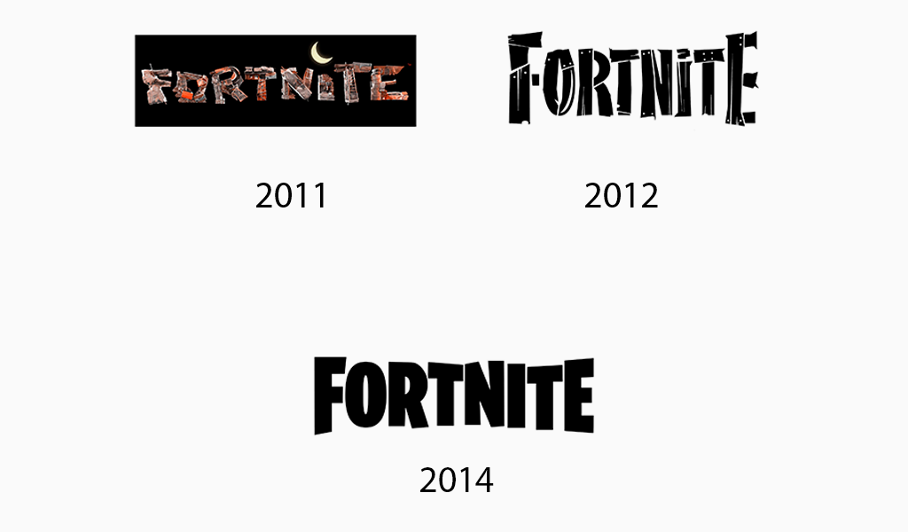
Created by Darren Sugg in 2011, the logo has undergone a few changes. Nevertheless, the modern style of it remains in all variants. From garbage symbols to wooden slab elements to present laconic bold letters. There exist three current designs. Among them:
- the mark word pictured in massive symbols, where ‘F’ and ‘E’ are capital letters;
- the same as first one, but supplemented with hillside, trees, and buildings;
- the Fortnite logo F.
Today the Fortnite fan club, its releases and capital flow keep on developing. And its logo serves as a concomitant force in the mentioned progress.
Fortnite logo evolution
2011-2012
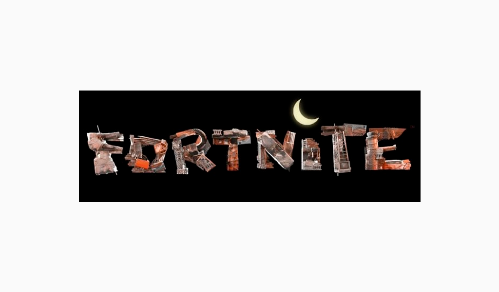
The original logo was showcasing a negligent style. The letters here are built from garbage. Old refrigerators, step-ladders, cabinets, boxes, and boards – those are the elements of its construction. One more remarkable thing about the old logo is the ‘i’ symbol. Instead of the dot above, the waning crescent moon is situated.
2012-2014
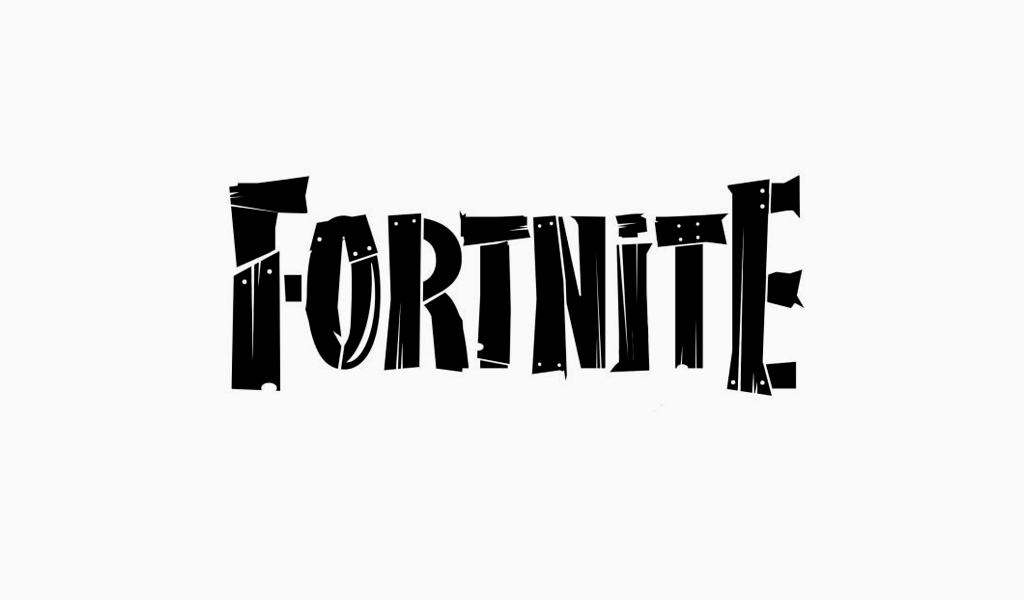
The next version of the logo was presented in 2012 and lasted two years. The letters now acquired this day outline. The main feature is that they were knocked together out of old shabby planks. The color of boards – black, of nails– white.
2014-till now
The recent Fortnite logo is as well monochrome, repeating contours of the previous one. It might be seen separately or with the hill, edifices, and vegetation above.
Fortnite logo font
What font is the Fortnite logo? This inquiry is quite an often one. The answer is Burbank Big Condensed Bold, invented by Tal Leming. The typeface is performed in thick, slightly asymmetrical, sans-serif characters.
According to some opinions, this logo font has a resemblance or even is based on a few others. Among the so-called ‘ancestors’, you might discover Floki Extra Bold, Niko Extra Condensed Bold, and Golary Red Exbo Caps.
Fortnite logo colors
The Fortnite logo is neat and no-nonsense. The same thing applies to the color palette utilized for it. Simple, laconic, black and white tones establish professional and confident impact, which, in its turn, increases the trustworthiness of the company.
I’m a product and graphic designer with 10-years background. Writing about branding, logo creation and business.

