Create your own logo with Turbologo logo maker. It takes less than 5 minutes and no design skills needed.
Go to Logo MakerTable of Contents
1. Batman Logo
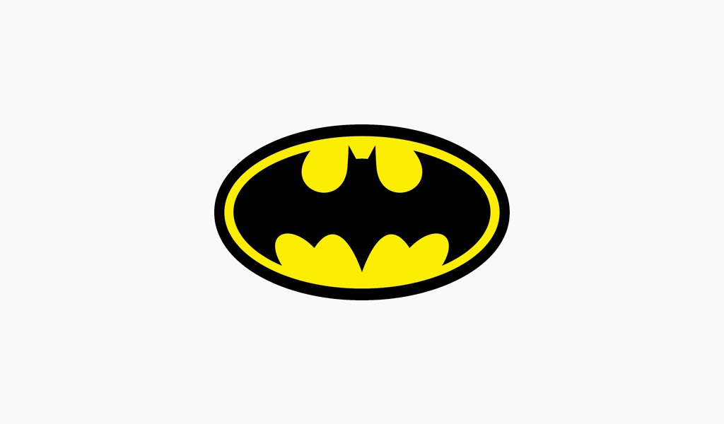
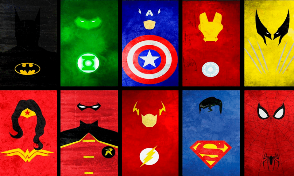
The first place in our collection of superhero logos rightfully belongs to the batman logo. And what are the defining traits of the character? He is grim, brooding, handsome and aristocratic. And authors did their best to reflect all of that in the identity. A stylish black only fits Byronic hero. And some yellow endows the batman logo with a touch of luxury. And of course, there is a bat fitted in the oval that symbolizes the dark hero’s nickname.
2. Superman Logo
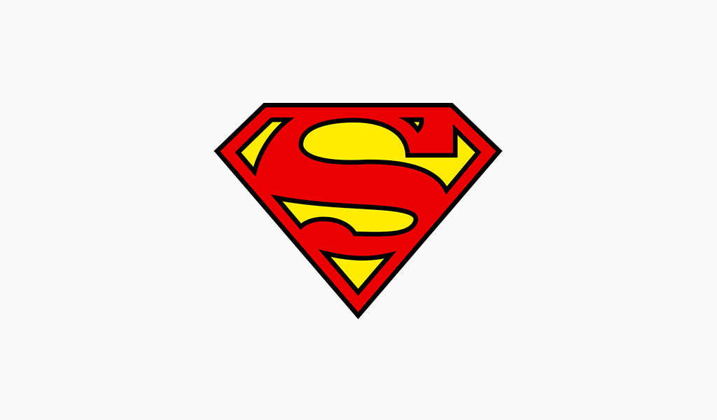
Superman logo is a pioneer of all fiction defenders of the world. It is one of the most iconic superhero symbols ever. A combination of red and gold is hard to miss too. And it is not a random choice. The name of the hero stands for the ideals of a perfect world. And the initial letter, being the major element of the identity, sets the style of the whole image.
3. Captain America Logo
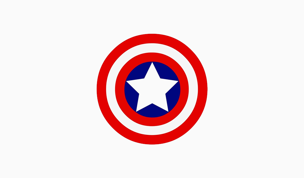
He is just as interesting and virtuous as the previous one. And he also boasts red in his symbolics. In that case, however, blue and white are added and the logo becomes a direct reference to the colors of the USA flag. Needless to say, an overall Captain America design is actually restyling of a state symbolics. Designers have done well-fitting the star symbol right in the center of Cap’s round shield.
4. Wonder Woman Logo
Here is a pretty at a bachelor party. And her nickname contains double W that results in endless stylistic variations. For instance, it enables you to refer to impressive wings in the Wonder Woman logo. Such a symbolics fits a feministic heroine indeed. And again, that patriotic air here is strong as never before. Natural ensign elements can be seen both in the Wonder Woman logo and her costume.
5. Spiderman Logo
Spider-man was coined by Marvel to oppose all the adult men mentioned above. Teens needed a role model. So, the Spiderman logo reflects the gist of the character which is a tiny, teeny spider. There were countless versions of the symbolics. The Spiderman logo used to change depending on the comic strip’s plot. The changes ranged from obscure, long, and spooky lines to soft and pleasing ones.
6. Deadpool Logo
Deadpool image and identity have much in common with the previous character. There even are some similar images. The logo itself is comprised of schematic, exaggerated and thickly outlined Deadpool’s eyes. And the expression is rather predatory and malicious. It stands for the hero’s personality as he is often deemed an antihero. That’s why there are all these abundant and deep colors there.
7. Green Lantern Logo
It’s funny that this and the previous character were played by Ryan Reynolds. However, Green Lantern himself is a good character as you can deduce from his logo. And the color screams that as well. Green is a color of virtue unless it’s not some toxic shade. Green Lantern logo design is minimalistic, vertically symmetrical, and fits a circle which is another “righteous” trait here.
8. Black Panther
The identity of this racy hero features traits of an animal and a man. This is quite an old move in comic strips as it looks really cool. Visual solutions are pretty simplistic, but it makes teenagers go crazy nevertheless. An apt black looks regal. These are the coolest superhero symbols one might imply. It requires no letters to stay impressive and spectacular.
9. Avengers Logo
It is a whole superhero insignia designed for a set of characters. There is a big capital letter implying a team of brave ones. A circle here symbolizes unity and common, mutual goals. An arrow pointed rightwards is a very interesting solution. It means achievements, motion, and success. Avengers logo also looks dynamic and calls to action thanks to the arrow.
10. Fantastic Four Logo
And here is another good example of a superhero emblem. The authors decided not to put all the qualities in the logo, limiting it to but one. It is actually a number. A fantastic four logo boasts a proper geometry with no abundant decorations. It has no gradients or color combinations as they are simply not relevant here. Only clear, straight lines are.
11. Flash Logo
Flash brand identity is a perfect example of a quality superhero logo idea. An attractive combination of red and gold, as well as a bright lightning flash in the middle, make the logo hard to miss. And the latter holds true for the hero’s image. His unnatural speed enables him to transform into a bolt of lightning and even time travel. The logo dynamics also implies that the character is an embodiment of courage and hope.
12. Black Widow Logo
Another spider character in our superhero logo rating. That spider is extremely toxic and dangerous. Even its color is aggressive and menacing. And the given kind is well known for the hourglass-shaped red spot. You can just walk away from such a striking natural concept, so the designers borrowed the idea. The Black Widow logo looks exactly as dangerous and juicy as the character itself.
13. Iron Man Logo
There are a lot of Iron Man logo versions. The character has become extremely popular thanks to a succession of movies starring him. The identity gravitates towards geometrical shapes. The major colors of the costume are red and yellow that is getting common for a superhero design. However, it can also be steel blue, symbolizing Tony’s artificial heart. Iron Man suit is nothing without the wearer and its energy.
14. Loki Logo
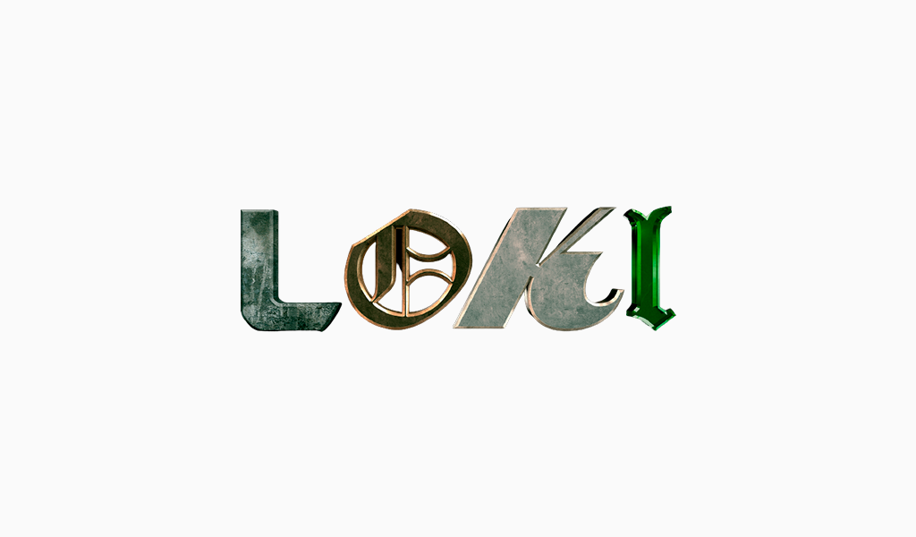
Loki is evil. He often acts as a bad guy but they usually forgive him in the end and let him go. Probably, it is all because of his Scandinavian heritage. He is a god of deception after all. But his luck ran out and his logo is proof of that. Seeking to stress his trickiness and guile, designers applied different fonts to two letters in the logo. However, it proved to be messy and ridiculous repelling many fans.
15. Aquaman Logo
This superhero insignia looks alluring and simple. A general shape is that of a spear tip or a harpoon. The latter one is closer to a water realm of course. The logo also reminds a first letter of the hero’s name. Another fact worth mentioning is that the same element can be seen on his golden buckle.
16. Arrow Logo
The given brand identity is similar to the previous one. Arrow’s logo also features capital “A” but it’s shaped like an arrowhead. Seemingly because of the hero’s weapon of choice. This superhero logo is green and that is supposed to remind of his costume. What’s more, sometimes, designers add a full nickname to the logo, but it is still recognizable without that.
17. Captain Marvel Logo
Captain Marvel is one of those characters that has been designed to wait patiently for a triumphant comeback. The given superhero logo is rather simple. It features an eight-pointed gold star. The background is that of the USA flag colors. They have also designed an inscribed identity. Initially, the lettering was highlighted in red. However, it has been made blue recently as looks dramatic.
18. Punisher Logo
It is one of the spooky superhero logos. A black skull featuring rather long teeth is placed on a white background. Simple, clear, notable, and meaningful. And the punisher is an embodiment of those traits. The logo fits just fine.
19. Daredevil Logo
Just like many other similar characters, a Daredevil logo is red. However, it is not only a widespread and catchy move. It also stands for the character’s nature. An overall shape and design clearly imply a motion from left to right, stressing the hero’s impetuosity.
20. Homelander Logo
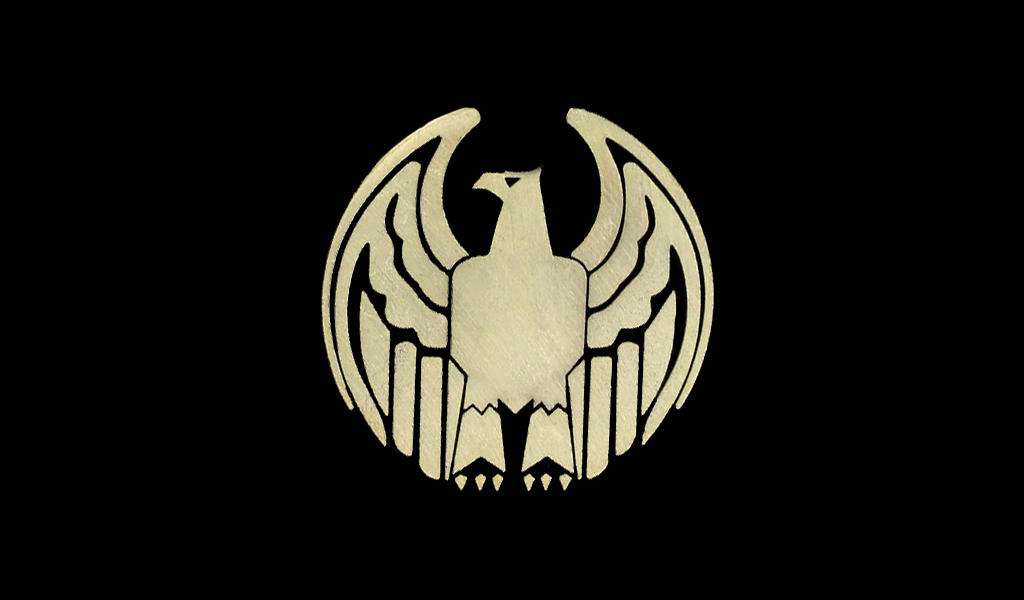
And last but not least is Homelander; it’s both showy and racy. As you might have already guessed, the logo should feature some patriotic traits. Well, it depicts an eagle. Nevertheless, the funniest twist here is that the character is a negative one. Quite an ironic move that is.
I’m a product and graphic designer with 10-years background. Writing about branding, logo creation and business.

