Facebook is most famous and boosted social network in the world. A Facebook brand has carried out a revolution, which has totally altered communication standards as we knew them. How do you think was Facebook able achieve such unbelievable results? And what has its logo to do with it? This article is just about that.
Table of Contents
Facebook logo history
So, why is it this very network so popular, that even a sudden passerby knows its logo? A major reason is that Facebook is well developed and adjusted service, earning more and more people’s trust even as we speak. And of those people could earn quite a sum using the site. And so, Facebook isn’t a single businessman’s success, but it also is a great help to many other, stray businesses. And it is an important feature to say the least. One should not care about his income alone, but keep others in mind too.
Well, how has it all started? The one who has founded, developed and sophisticated Facebook is Mark Zuckerberg, the youngest multi-millionaire in history. And he has accomplished that thanks only to Facebook. An idea of first social network in the world came to being when Mark Zuckerberg was studying in Harvard University.
Even then he had a peculiar view of life, as he was dreaming of creating opportune programs for study and communication. But the communication meant something brand new for him. And it is this very moment when Facebook logo design history begins. Mark had to create not only convenient site, but a whole brand which will be known to both users and investors alike.
Facebook logo meaning – A first variation and hidden sence
As we know, Mark was thinking too much upon his social network name, so a Facebook logo has no hidden meaning. The best logo is the one, which easy to read and comprehend, and Mark also thought this way, as Facebook logo immediately makes you understand what brand you are dealing with. A few interesting facts to consider: Initially Mark named his company “The Facebook”. But the article didn’t last long and the name became even simpler. Also, mark is one of those people, who don’t discern between red and green colors, so he chose blue for the logo, something that has become usual for us today.
But why was the first Facebook logo in history that simple? Well, one of the crucial objectives for web-business a creation of a worthy and competitive brand. And, as we remember, Facebook is a great help for a variety of other companies. Consequently, the more famous, more pleasing, more PR-active a brand is – the more people will trust it. It costs a pretty penny for your company to become recognizable and a good image cannot be cheap. That’s why the following Facebook logo evolution took that much funding, though it simply didn’t worth it from a commoner’s point of view.
Telling about Facebook logo meaning, we cannot avoid mentioning its most famous attribute. Something that has become better known than the label itself, and it is the most recognizable 21st century sign. This is “like”, a widely accepted core-symbol of internet communication. It is possible that thanks to this like-system Facebook has gone so far. We don’t know if the company would be as successful without it, but history has no place for the subjunctive mood.
The most popular opinion about the meaning of the logotype is that the small F symbol stand for the word Facebook, or it symbolizes the connection of friends. But according to the GIF spreaded in social media networks, this famous F symbol reflects the addiction of the numerous FB audience to using this network.
Lessons to learn from Facebook logo evolution
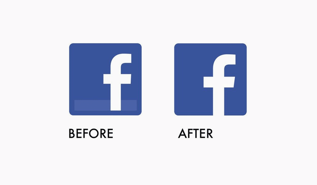
We have mentioned before, the article was dropped before Facebook logo quite fast and the label took its most recognizable form. The company’s icon was also changed. At first, the icon was presented by white letter “f” on a blue shield with a light-blue stripe at the bottom end. However, the logo was altered again in 2013. The stripe was removed and a final, more concise variation was adopted.
A new event took place in Facebook logo history in 2015. The logo itself was renewed for the first time in 10 years. At first glance, the changes were but minor.
A vast amount of users and commoners kept asking Facebook if it truly costed that much money. Many designers stated proudly that they would do the same thing, yet much cheaper and better. Is that so?
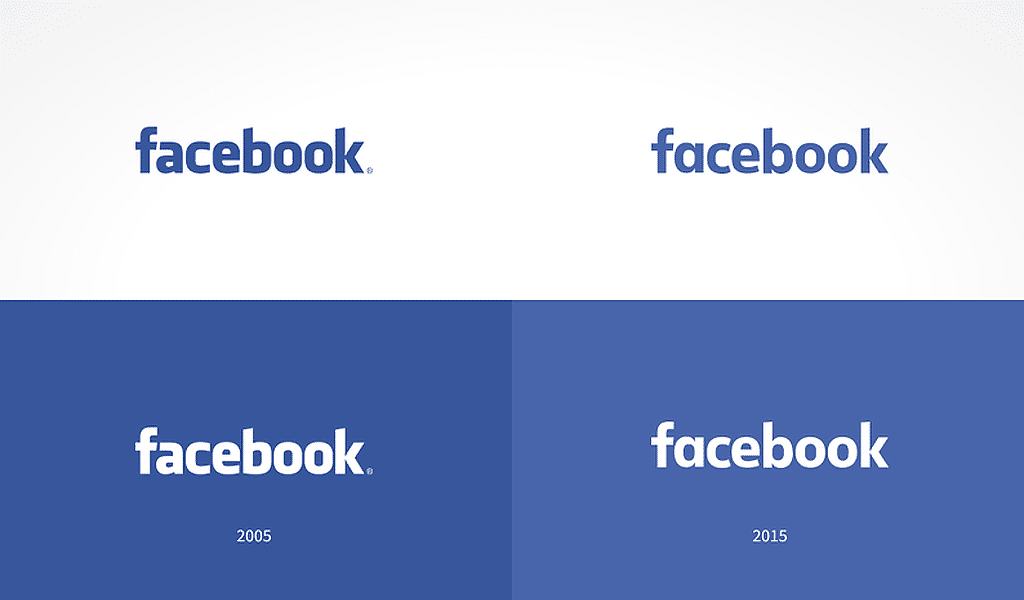
The truth is – no. They would not actually. First of all, the changes were calculated cautiously. An out-of-date type was removed and up-to-date, more legible, soft, pleasant one took its place. You can feel the changes by wearing unsuitable glasses. You can still see things, but they are somewhat unclear with no sheer borders, etc. And when you take the proper ones, your vision improves and the world around is far more clear and pleasant. Nearly the same thing occurred to the logo. With no sheer angles and too short spaces between letters, the logo became more pleasant and friendly. And it matters.
Logo Redesigns in Tech: How Facebook Compares
| Company | Year | Change Summary | Reason |
|---|---|---|---|
| 2015 | Font refinement, simpler “a” | Improved readability, modernity | |
| Meta | 2021 | New infinite symbol logo | Rebranding beyond social network |
| 2015 | Sans-serif font | Simplicity and digital clarity | |
| Airbnb | 2014 | Introduction of “Bélo” symbol | Emotional connection, uniqueness |
| Spotify | 2013 | Refined icon and flat style | Mobile optimization |
Facebook Logo Font
It is said that for FB logo was used a font similar to Klavika, but this font was modified a bit to made it a unique one. It seems that 95 percent of Klavika is used for the Facebook logo.
The Evolution of Facebook’s Typeface
When Facebook launched in 2004, its logo used a modified version of Klavika Bold, a geometric sans-serif typeface designed by Eric Olson. Later, the company moved toward a more custom look. In 2015, the logo was refined with slight letterform tweaks to improve legibility and visual balance. In 2019, Facebook introduced its proprietary font: Facebook Sans.
Facebook Sans — Key Characteristics
| Feature | Description |
|---|---|
| Style | Geometric sans-serif |
| Look | Clean, rounded, minimal |
| Readability | High legibility on all screen sizes |
| Use | Facebook branding, apps, UI |
Fonts Similar to Facebook’s Typeface
If you’re inspired by the clean and friendly look of Facebook’s font, here are some alternatives you can use:
- Montserrat — Open-source, modern, and geometric.
- Raleway — Elegant and lightweight, with a tech feel.
- Nunito Sans — Rounded and versatile.
- Open Sans — Balanced and legible, great for UI and branding.
While you shouldn’t copy Facebook directly, these fonts offer a similar modern feel and work great for branding and logo design.
Is good thing to alter the meaning as well?
Yet the most important part is that the changes didn’t alter the meaning of the logo, and it was of high value for the company, such as Facebook. You really can’t measure small business and a megacorporation with the same ruler. Given the circumstances, the logo is to be slightly changed rather than completely done over. And most designer’s creations are but beautiful pictures and not big business faces. That’s why you mustn’t blindly copy logos, they are to be created by your own.
Why Did Facebook Change Its Logo?
The 2015 logo update introduced a cleaner and more approachable font, aligning with mobile-first experiences. In 2021, the introduction of Meta redefined the corporate identity. While the Facebook logo remained mostly unchanged, the company introduced a new Meta symbol, emphasizing a broader vision beyond social networking.
These changes reflect a wider trend in tech branding — moving toward minimalism, flexibility, and abstraction.
Facebook Logo Change – Frequently Asked Questions
Why did Facebook change its logo?
To modernize the design, improve clarity, and reflect a shift in brand direction aligned with Meta.
When was the last Facebook logo update?
In 2015 (font redesign) and 2021 (Meta rebrand introduction).
What does the Meta logo mean?
It represents infinity and the metaverse, showing Meta’s future-oriented vision.
How is the Meta logo different from Facebook’s logo?
Meta uses a symbol, while Facebook keeps a wordmark. Meta reflects corporate identity.
What can businesses learn from Facebook’s logo redesign?
That branding updates can support strategic growth, platform shifts, and modern visuals.

SEO specialist, link builder, and blog editor at Turbologo. Writing insightful content about marketing, design, and branding. Sharing practical tips on building and promoting brands online.

