
Family secret recipe is always fun. And the ones that bring millions of income are even better! There are many rumors regarding such things. Today we are going to tell about a sweet soda bearing a legendary Dr.Pepper logo.
Table of Contents
Logo history
First of all, the drink is the oldest carbonated beverage in the world. Coca Cola, for example, was invented only a year later. Pepsi appeared eight years after Coca Cola and other famous ones were created even after that. So, Dr.Pepper truly was breakthrough in its own time. The question is, where does that modern and stylish name come from. Were they actually caring about naming those days? The legend has it that creator of the soda was working at a chemist’s and fell in love with doctor’s daughter. And he dedicated his creation to her father. He’d better name it after the girl, wouldn’t he? Well, the girl’s name isn’t as hot as a pepper. The epitome is probably describing his feelings more precisely.
Explore our gallery for inspiration on crafting a unique beverage logo, drawing from iconic designs like Dr. Pepper's.
However, there is another theory, which states that Dr.Pepper was just the right person help with brand promotion. And might be all what the name was about. Ads were stressing health benefits back then. It was said to be extremely useful is your body was demanding glucose. And the theory was a trustworthy one in XXI century. However, we know well today that sweet carbonated beverages aren’t the best choice if you want to stay fit.
The Dr Pepper logo was created by Nellie Eastland Kellner, a Waco artist, in 1890s.
Old Dr.Pepper logo
The very first logo included only Dr.Pepper inscription. Dr.Pepper original logo inscription was written with white and vintage font, featuring a well-designed dot. Later on however, the insignificant dot would be removed. The beverage taste resembles that of a cherry. That’s why the background is light vinous.
In the after years, the drink will be included in soldiers’ rations all over Europe. And after that vintage Dr.Pepper logo will be redesigned. Font, resembling Anvil, was crowning a cap. The inscription is placed in bright burgundy streak. The overall image solution will go down in history and we can enjoy it even today.
Dr.Pepper logo evolution
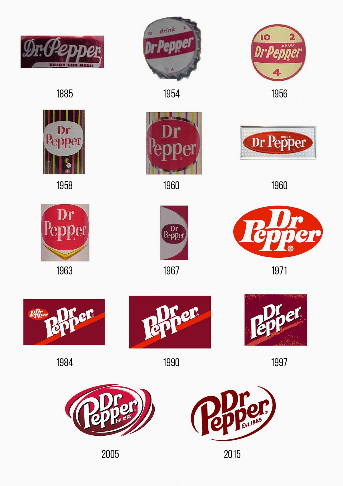
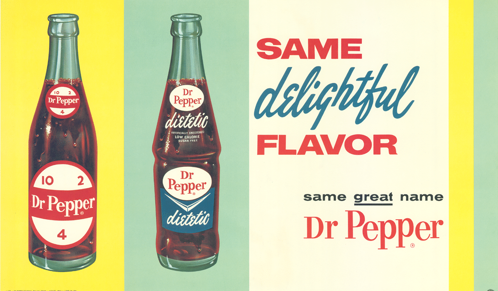
The white inscription in bold remained on bottles up until the end of 50s. The company adopted a rebranding in 1958 as it seemed impossible to run business with the current design. Cans were colored dark vinous and a few bright yellow and red stripes were added. A thin typed inscription with notches was placed into altered Dr.Pepper logo oval. There were some bubbles below that symbolized refreshing. But you could also see 10, 2 and 4 numbers inside of them. It was actually a recommended time for having another bottle of the soda.
This variation would be used for quite a short time, and then a simpler, more habitual logo would take its place, leaving only the font. Oval and inscription colors were going to switch places, as white looks better on a vinous background. Some curious novelties were used in old Dr.Pepper logo. Strangely enough, they placed a gold, pointy triangle below the oval. The point is that the symbol is more suitable for car service company. What’s more, overall style changes weren’t unique or revolutionary.
Current Dr.Pepper logo meaning
Logo is still slight red shaded burgundy. All the bubbles variations are removed, making the logo simpler. Current logotype consists of the name against the shaped background. The background has been modified – colors between lettering and the background were reversed. So, the “bubble” effect became less noticeable, but still symbolizes refreshing.
Dr.Pepper logo font
Dr.Pepper logo font is actually a unique lettering – it is a bold italic sans serif font. It has been designed especially for the brand. A colorful inscription on a white background is back. However, Dr.Pepper logo font colors have been swapped and altered many times, so we believe that the current logo variation will be altered again soon.

SEO specialist, link builder, and blog editor at Turbologo. Writing insightful content about marketing, design, and branding. Sharing practical tips on building and promoting brands online.


