A logo for apps serves not just as a decorative element but as a visual symbol that creates the first impression. Being a powerful marketing tool, a logo helps an app stand out among thousands of similar ones in the app store and fix it in the memory of users. A well-designed logo can tell about the essence of the application, its functionality and character without words. Let’s learn how to make an app logo that is functional and looks great both as a small icon on a phone screen and in large-scale advertising campaigns.
Create your own logo with Turbologo logo maker. It takes less than 5 minutes and no design skills needed.
Go to Logo MakerTable of Contents
Choosing a Logo Style
When designing an app logo, it is essential to consider a style that will reflect the specifics of its features. Here are the main types used by all famous app logos.
Iconic/Symbolic: Incorporating an app symbol
Icon logo for a mobile app is built around a simple, clean graphic symbol that is easy to recognize.
A great example here is the Spotify: a green circle with wavy lines that represent sound. It is both minimalist and informative, and easily adaptable for use across platforms. Another example is the TikTok logo. The abstract note with a “double exposure” effect hints at the music component of the app, while the design looks youthful and dynamic. Apps that wish to be identified with a particular symbol or concept could benefit from using icon logos.
Wordmarks: App logos with names
Wordmark logos emphasize the app name while playing with unique fonts and style. The Aliexpress logo is an example: the name is accompanied by a memorable company symbol, but the main focus is on readability and simplicity.
The H&M app logo features a distinctive lettering image in mobile app logo design. It contains a simple, clean spelling of the brand name, “H&M,” in a crisp, modern font on a cream background. Using the brand name directly in the logo effectively enhances its recognition and matches the company’s modern, affordable products. Blending symbols with names in app logos can be especially effective for newcomers aiming to establish themselves quickly.

Abstract app logo designs
Creating an app logo in abstract style results in unique visuals that are evocative but not tied to specific objects. For example, the Airbnb app logo is a combination of simple geometric shapes that form an app image resembling a heart, a house, and the letter “A.” It’s perfect for conveying ideas of hospitality and connection. The Calm meditation app logo is also an abstract style. Gradients and soft shapes imbue a sense of calm, relaxation, and harmony without depicting specific objects.

Mascot logos for apps
Popular mascot app logos incorporate characters to create an emotional connection with the user and give the brand a human face. While full-fledged mascots are rarely used in app icons due to the detail, simplified versions or recognizable elements of the mascot (such as a head or a distinctive detail) can be used for icons.
This approach adds playfulness and memorability, and is especially effective for educational and entertainment apps, but requires careful design to ensure the mascot is appropriate and does not overload the icon. Here are some examples of cool app mascot logos:
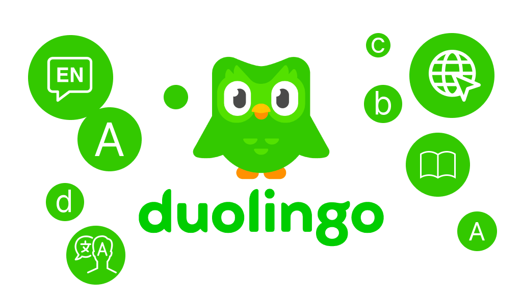
- Duolingo: Duo the Owl. A friendly and memorable character, associated with learning, makes the process more playful and motivating.
- Mailchimp: Freddie the Chimpanzee. Fun and a little eccentric, it personifies the email marketing service, making it less formal. logo mobile app icon
- Reddit: Snoo the Alien. Neutral and customizable, it represents the Reddit community, easily adapting to different topics.
The Psychology of Color in App Logo Design
Color isn’t just a design element, it’s a language that speaks to your user on a subconscious level.
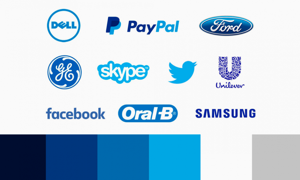
Shades can evoke emotions, associations, and even encourage action. For example, blue is traditionally associated with trust and stability, so it’s often used in financial apps like PayPal. Apps with green logos evokes a sense of calm and growth, making it a popular choice for health and ecology apps like Calm or Forest.

Here’s how primary colors affect perception:
- Blue — trust, reliability, calm. Blue app logo design is well-suited for banking, medical and technology companies.
- Green — naturalness, health, balance. Often used in ecology and fitness apps.
- Yellow — joy, energy, optimism. Suitable for entertainment and children’s apps.
- Red — passion, energy, urgency. Apps with red logos draw attention and stimulate action, so it is often found in discount or game applications.
- Purple — creativity, luxury, imagination. A great choice for art or premium service apps.
To decide on a fitting color palette, ask yourself the following questions: What emotions do you want to evoke? What is the character of your app — friendly, strict, innovative? Pick colors that resonate with your app’s purpose and target audience. Think about how different shades communicate different feelings. Consider the power of simplicity – imagine an app with a blue and white logo; it can be visually striking and memorable.
Designing a Visual Form of an App Logo
The shape of a logo is a hidden force that influences the perception of an app. Circles are associated with harmony, unity, and friendliness. It’s no wonder that application logos like Skype and WhatsApp use round elements in their logos. Squares and rectangles convey a sense of stability and reliability, making them popular for corporate apps.
Angles, lines, and geometric shapes can also be powerful tools. For example, triangles are associated with progress and forward movement. This is especially true for goal-oriented apps like fitness or self-improvement.
Achieving visual balance is crucial during a design stage. For example, if you use sharp angles, consider adding rounded elements to soften the overall look. Harmony of shapes allows you to create an app logo that is pleasing to the eye and intuitively appealing.
Best App Logos: Get Inspired

Looking for inspiration? Let’s look at successful examples of mobile app logos that stand out due to creative design solutions and skillful use of visual techniques.
Effective use of negative space
The design approach in the FedEx app can be inspiring. The space between the “E” and the “x” forms an arrow, symbolizing movement and speed. If adapted for an app like shipping or logistics, this technique would emphasize efficiency and convenience.

Another example is the logo for the Hootsuite app, a social media management platform. By combining an image of an owl with interface elements, designers used negative space of the app logo to emphasize the focus on analytics and monitoring.
Sophisticated integration of app functionality into the icon
Shazam’s logo, a stylized “S” sound wave, perfectly captures the essence of the music recognition app. The dynamic shape symbolizes sound and music, while the lightning bolt element conveys the idea of instant recognition.

The meditation application Headspace uses an orange circle to symbolize the sun and harmony. This minimalist app logo design immediately evokes warmth, calm, and mental clarity — perfect for a stress management app.
Impactful use of color to convey emotion or purpose
The logo of Canva, a popular design tool, stands out with its simple color palette. The turquoise shade is associated with creativity, freshness, and openness. It is a perfect example of using color to reflect the brand’s mission: to give people an easy and convenient tool for creativity.

The Venmo (a payment platform) logo for both apps uses blue, which inspires trust and reliability. The color palette reinforces the connection with the financial sphere, where stability and confidence are important.
Unique and memorable shapes
Logo design for the mobile app Twitch, a popular streaming platform, a popular streaming platform, uses a speech bubble logo. This not only underscores the idea of communication, but also makes the logo easily recognizable among younger audiences.

The logo of Asana, a team task management tool, is made in the form of three colored dots, which symbolize cooperation and joining forces. The simple shape conveys a complex concept, emphasizing teamwork.
Logos of apps that skillfully integrate letters
An example is the Waze app logo, which not only resembles a funny car, but also visually incorporates the letter “W” into the curves and lines of the icon. This makes the design both functional and memorable.

Another interesting case is the Figma app logo. It integrates several shapes and colors to form the letter “F”. This minimalist approach perfectly conveys the idea of design and multifunctionality.
How to Design an App Logo with Turbologo
Turbologo offers a user-friendly logo generator that makes the design process quick and easy. The platform makes it easy to make a high-quality app logo in a matter of minutes, regardless of your design abilities.
Apart from numerous ready-made templates that can be used as app logo design ideas, you will have access to a variety of unique symbols and icons that are ideal for various app niches. The platform automatically selects relevant design elements after the user’s preference is indicated, so that your logo reflects the essence of your app.
The main benefits of creating logos with Turbologo:
- Large collection of symbols and icons — easily select graphics that will highlight the uniqueness of your app.
- Huge variability — a great number of different app logos generated according to your preferences.
- Easy customization — change the color, font, shapes, and composition as you wish.
- Quick and effortless results — creating an app logo takes only a few minutes with no skills required.
- Logos in the right formats — get PNG, SVG, and JPG files ready to use in your app and promotional materials.
Turbologo’s AI tool will take care of everything from visual harmony to the right color balance. Just choose the design you like, customize it to your needs, and your logo is ready to go!
Blog editor and content marketing specialist at Turbologo. Writing about Marketing and design. Victoria’s articles contain useful tips on how to build a brand and promote it online.