What can be considered a symbol of epoch? What company is closely interrelated with 20th century? There can be many options, yet only 20th century fox truly sounds like it. We have continued to 21st century, but not Fox as it was purchased by Disney megacorporation. Fox owns only “Fox Sports” and “Fox News” channels nowadays. People just carry on working and making magnificent movies. However, 20th century fox logo is now but a sorrowful shadow of its former self, capable of remembering its brilliant past, yet daring not. No hard feelings here however! Let’s dare to remember it ourselves!
Create your own logo with Turbologo logo maker. It takes less than 5 minutes and no design skills needed.
Go to Logo MakerThe beginning of 20th century fox logo history
It all stems from Metro-Goldwyn-Mayer, a giant of those times. One of Mayer’s relatives lost a job in 1933, and he was given a small office to keep him busy. And none could’ve seriously thought that it would end with a history affecting corporation. None could imagine that it would grow a keep up with its master-company back then. Oscars followed one after the other and most experienced and famous actors were willing to star with the help of Fox. Those were hard times for the whole country, but not for 20th century pictures.
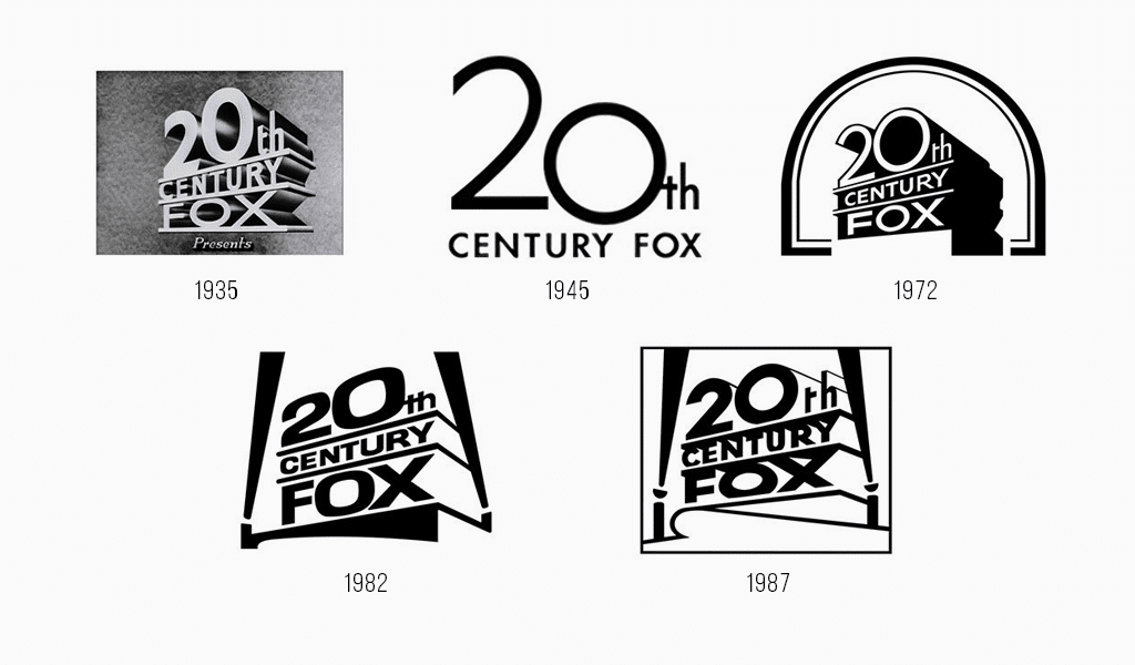
But where does one more word in the name come from? A few years after its foundation, the company decided to purchase “Fox Film Corporation”. Mister Fox was facing hard times and gladly accepted the deal. So, what was the companies’ branding looking like back then? Oddly enough, but it was just the same as ever. The first 20th century fox television logo was created by Emil Kosa Jr. He was a famous painter and designer and he ever was given an Oscar for his works. He used glass to draw a logo which could be animated if necessary. It was extremely popular those times. Just like it is now though.
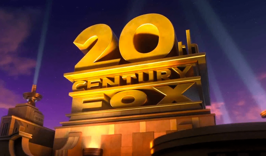
Emil was helped by Oscar-winning composer Alfred Newman when completing 20th century fox image. That is where those pretentious, gold numbers “2” and “0”, impossible-to-confuse fanfares and impressive light beams come from. And what path would logo evolution take under Disney’s supervision?
Evolution and meaning of 20th century fox television logo
The meaning of logo is rather clear as it is just a company’s name written in luxurious, golden letters. And all the associations are related to the red carpet and award ceremony. The logo suggests that each movie by 20th century fox is worthy of Oscar. What’s more, the logo wasn’t changed over decades to come. The only alteration was replacement of “pictures” with “Fox” after the companies were merged.
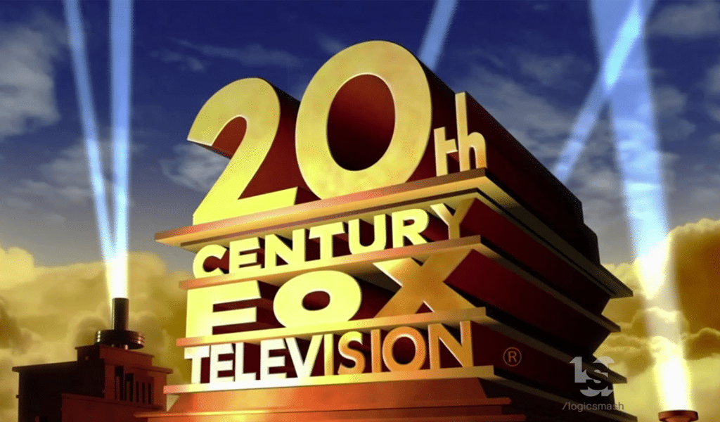
A font that was used during the genuine image creation was rather typical for art decoration. Emil Kosa is sure to invent his own type, yet there are some similar in terms of style ones. It appears that 20th century fox logo font was based on a good old Helvetica.
Perhaps, it is the lack of rebranding that made 20th century fox experiment with minor logo details. The logo is slightly altered in many movies. The funniest idea can be seen in Futurama. As the story takes place in the 3rd millennium, “2” was replaced with “3”. And not all the viewers have noticed that actually. The alteration examples are plenty here, so anyone interested in the topic is welcome to find them all!
Blog editor and content marketing specialist at Turbologo. Writing about Marketing and design. Victoria’s articles contain useful tips on how to build a brand and promote it online.

