Creating a stylish, memorable, reflective business logo is a whole science, in which a special place is given to fonts. Agree with the fact that of great importance is the chosen image, its style, combination of tones, proportions and other factors, nevertheless, we will not underestimate the role of the font.
Lettering not only informs the audience, but also largely sets the mood – the same logo with diametrically opposed to its design fonts are perceived very differently. By the way, many professional designers start working on a logo with the choice of font. Often it sets the “tone” not only the logo, but also the entire visual component of the project.
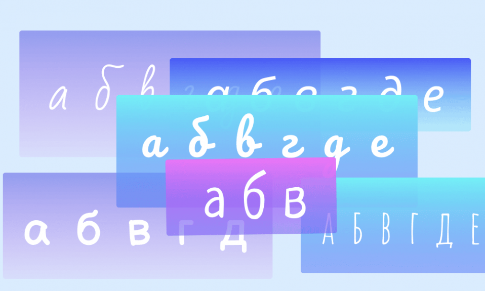
Can we call lettering a communication tool? – Yes, it is. Think about it: on the packages of children’s products manufacturers use soft, rounded, often handwritten fonts of different heights: they are friendly, “playful. It is unlikely that a serious law office or a manufacturer of life-saving drugs will stop at such a variant. We’re presenting a selection of the most interesting Cyrillic scripts:
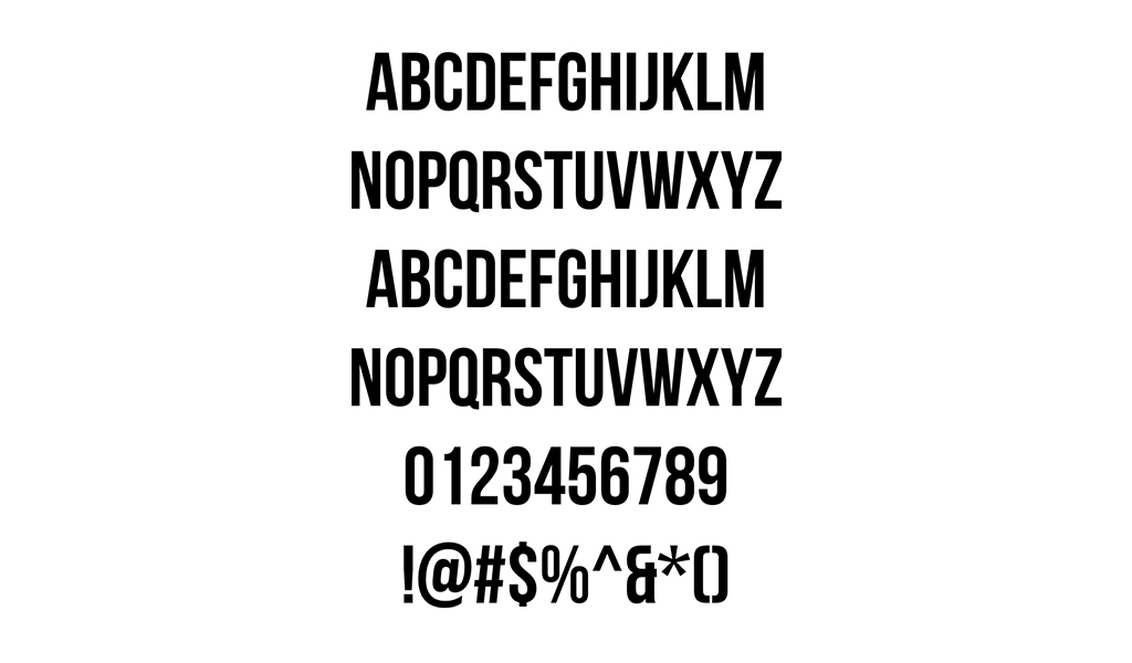
Bebas Neue is a simple uppercase font used by companies of all kinds. Created in 2010, loved by the audience due to the combination of clean lines, straightness and elegance. It is suitable for many fields, from commerce to art.
Spectral is a typeface that dates back to the origins of French type design. Spectral is the optimal solution for online projects: the text made in this font is easy to read from computer screens and gadgets. The font is modern and universal, it has the contrast peculiar to dynamic antiqua, and is distinguished by the openness of characters. The Cyrillic script is perfectly balanced and perfectly constructed.
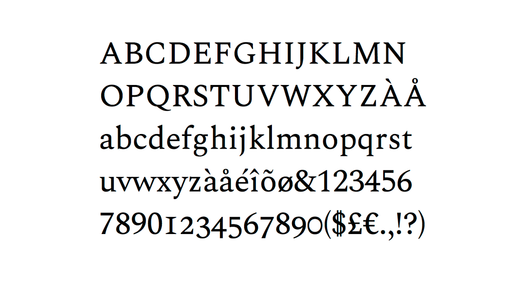
IBM Plex is literally designed to establish a contact between man and electronics: we recommend that companies connected with IT, development and digital processes pay attention to it. The advantages are that it is neutral enough to be readable from both the screen and the paper.
The font combines geometric and rounded components, which is a kind of display of rational and emotional elements. The inner refined details harmonize with the outer angular contours. By the way, italics enhance the contrast between the rigid and rounded fragments: take note if you are looking for a similar design solution.
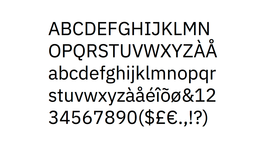
Mont has original details: built-up characters, rather high lowercase letters, etc. It creates a feeling of weightlessness, while looking quite solid. The ideal area of application is graphic design.
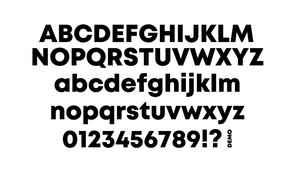
Ramona is a relatively new typeface created in 2020. The font is interesting with its uneven, yet neat graphic design, somewhat similar to handwriting. Ramona conveys a friendly mood and emphasizes individuality and openness.
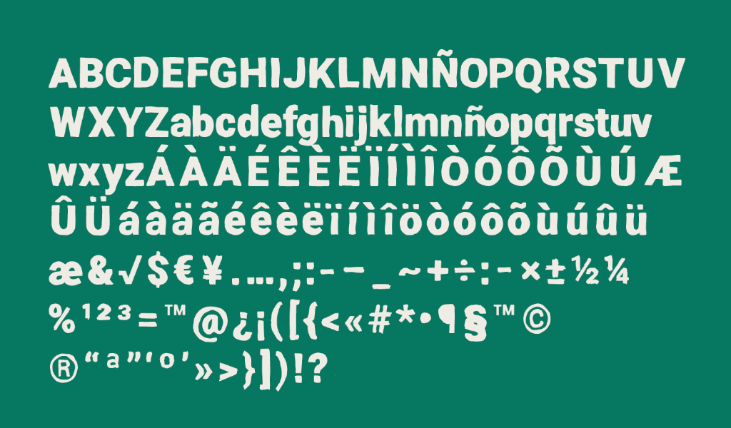
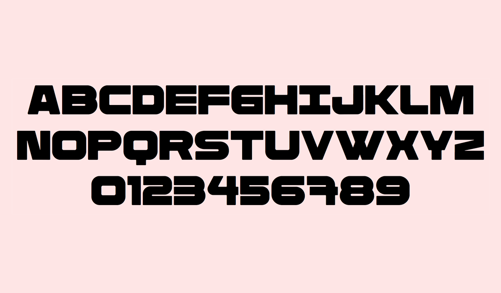
Rimma sans is inspired by monumental architecture and concrete products. The display font has a bold and soft design at the same time, it is rich and contrasting. The name was not chosen by chance: the typeface is named after the Russian architect Rimma Aldonina.
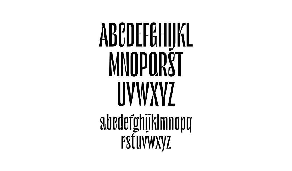
Le Murmure is the development of a design agency from France. The lettering is original and elegant, characterized by unusual stylistic variations of the characters. The play of proportions creates an interesting, atypical for less creative fonts, fantasy effect. The lettering is closer to the type of tall and geometric, but it cannot be completely attributed to such because of the unique decorative components.
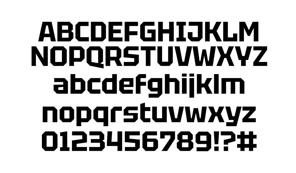
Tektur is an example of constructive lettering with faceted contours and angular intra-letter spaces. From a distance, the font resembles a compact sequence of pixels, a good solution for a technology company.
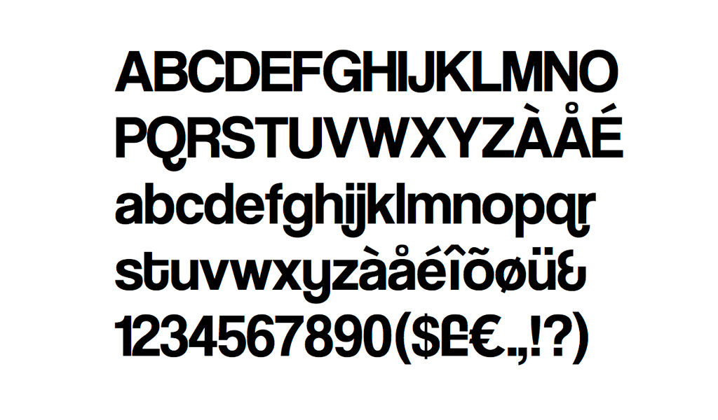
Coolvetica is a font that is not inspired by the style of Western chain stores of the 70s. The main differences are the tight spacing and the organic combination of graphic and rounded elements. The typeface belongs to the variety of display typefaces, created in 2010.
Playfair Display is inspired by the European Age of Enlightenment, when the pen was replaced by a metal pen with a sharp end: it quickly became fashionable and gained popularity. Thanks in large part to this writing instrument came the contrasting lettering with thin lines.
Playfair is a display typeface with serifs, combining rounded and geometric components. Interesting details – the inter-letter gap is often filled with small, thin connecting elements, which creates a hint of a handwritten version.
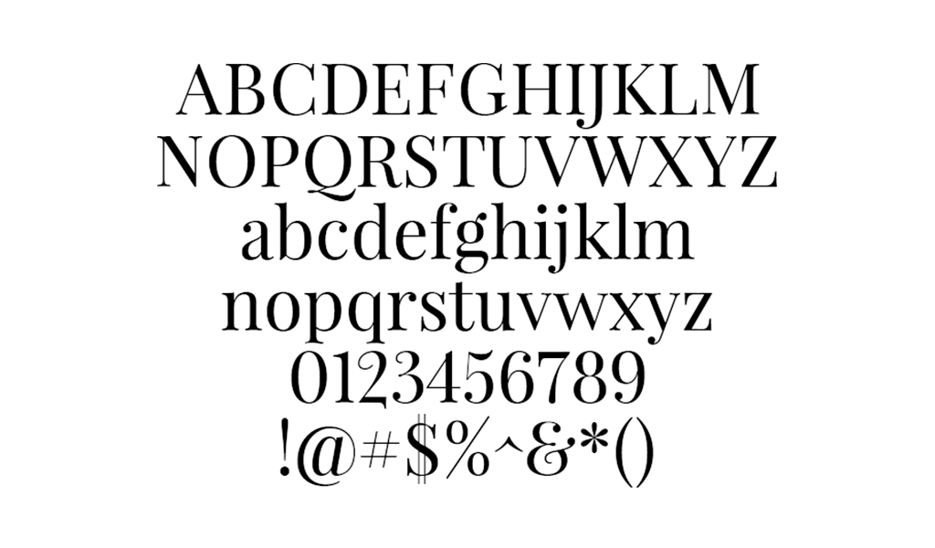
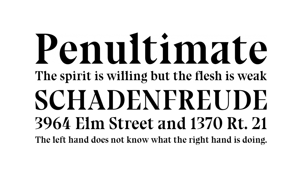
Bluu Next is a serif font. The excellent alternative to the usual Cyrillic fonts: characteristic, sharp and accurate! It has a small inter-letter spacing, a universal variant for logos, reflecting the activity of companies of different directions. It was developed in 2014 and has remained relevant for eight years.
How to choose a font for a logo?
Pay attention to the nature of the project: frankly creative solutions are ideal for companies that help organize leisure activities, children’s events, workshops and other entertainment events. The situation is similar with the goods of such categories. If the key activity is visual, it is better to choose lettering that is the benchmark of aesthetics.
Sustainable, solid fonts are suitable for the field of auditing, finance, law, etc. Experiments are welcome when it comes to design and other areas where creativity prevails.
In general, when choosing the lettering, it is recommended to pay attention to:
- Readability – the audience should not have to guess what is written on the brand name. It is important that the name and message can be read in a split second.
- Expressiveness: the task of the logo is to convey the mood in addition to information. The design should give an understanding of why and for whom the company works;
- Contrast: a lot depends on the general color scheme, but the universal advice is to find such combination of tones so the font is easy to read but doesn’t stand out from the general picture.
- Proportions: be aware of the height to width ratio, and pay attention to the solidity of the lettering. Fonts that translate fundamental and expert are not suitable for the areas of entertainment and recreation.
- Shape: rounded, angular (square), open and closed – focus on the idea of the project;
- Inter-letter spacing, as well as the volume of air (unoccupied space).
Remember: avoid overwhelming the logo with too many focal points! Maintain balance and seek an optimal layout: an unconventional arrangement of design elements might be the perfect solution. Discovering stylish and distinctive Cyrillic fonts is easier than it initially appears: select the appropriate one to craft a unique logo that enhances your brand identity and visual communication
I’m a product and graphic designer with 10-years background. Writing about branding, logo creation and business.

