If you are ready to run a restaurant or a café, you are sure to care deeply about the menu, good chef, comfortable furniture and, of course, a proper placement. However, you mustn’t forget about some quality café and restaurant logo. The branding is not as important as a good chef, but you are still obliged to apply proper ideas and designs for such companies. This article is sure to reveal all the secrets of good restaurant branding, so you’d be wise to study it carefully!
Table of Contents
The first impression of your cafe
One might say people visit such places to have something delicious and enjoy a relaxing atmosphere. And what does this logo thing has to do with it at all? And if people think they had a good meal paying a decent price they are sure to come again. The question is how would you lure your patrons into your restaurant if you don’t have an inviting sign? And the sign has to be alluring for this is its main function as it builds up the first impression of your establishment.
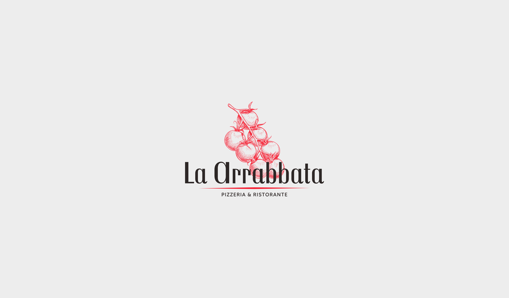
So, what kind of impression do you want to create? If you think that a sign is but a café placement indicator – you are mistaking. Actually, a design logo will tell a lot about a café. Let’s start with font selection. Using font alone you already can state the price level of your establishment. What will happen if your logo is written in exquisite font with lots of notches? Well, hardly any teenager will visit your café as he and any of his friends are surely low on cash. In most cases, they order a single drink for an entire party and spend half the day in a café. Choose a somewhat French style to avoid the situation.
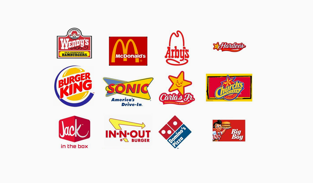
However, teenagers might be your target group. If that’s the case, your menu must include burgers, pizza, fries and there is got to be lots of cheap and comfortable furniture in the food court. Your logo must be pleasing and alluring to teenagers in the first place then. But keep in mind that you’re losing the ones with refined taste as your customers. It is impossible to fill the whole market. So, you should define your target audience in the first place, and only then start to develop a logo. You should aim to face their expectations and your café or restaurant logo is supposed to make your customer visit your establishment.
Cafe logo idea
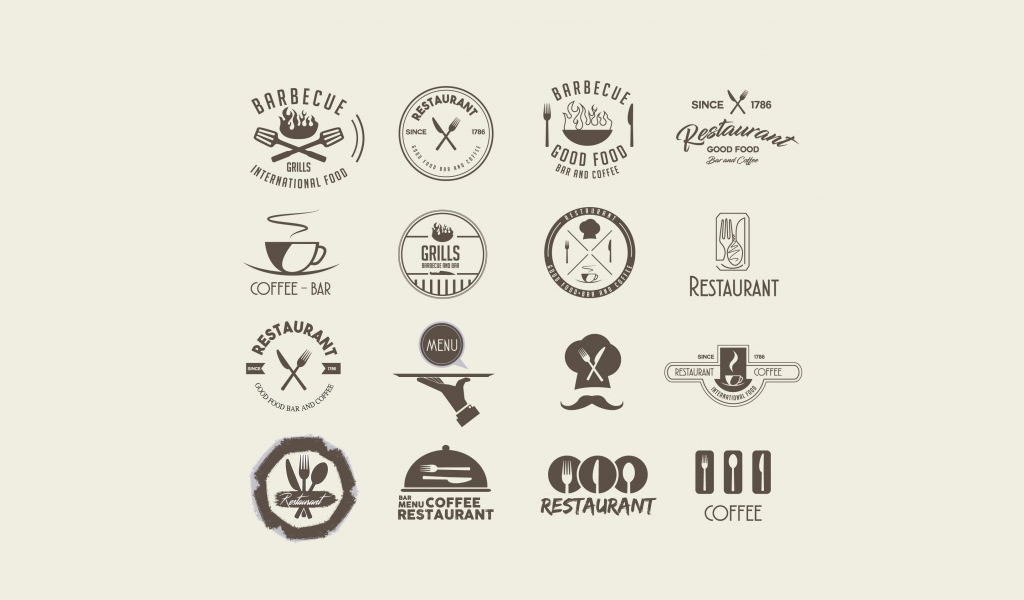
So, as you have defined your target group the time has come to come up with your logo idea. First of all, a name and logo must convey a sense of multiple-choice, a menu or something. In the end, it is a menu design that affects an overall image. For example, sushi in your menu always requires bamboo and hieroglyphs. Mexican cuisine means bright and juicy images and screaming colors as they symbolize the piquancy of dishes. French cuisine is recognized by ringlets, gilding, exquisiteness and refinement. Pastries are related to retro style, pastel and gentle, attractive coloring. A fish restaurant’s interior is often colored blue.
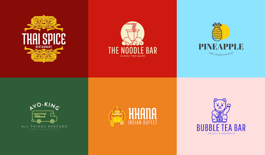
Of course, sometimes a café company logo can be completely different and hardly related to the menu or ay stereotype. In most cases, they use standard, habitual colors like beige, brown and subdued green. But sometimes it’s a good idea to break some rules. A coffee café logo isn’t always brown, right?
Logo trends and designs
Keep in mind that using trendy colors in your logo is something that your rivals do. The Lobster type story is a good example here. The font became so popular that it eventually started to bother everyone. Many vintage cafes used the font in their logos. Try to create some think original, really. But you must never forget that your logo is meant to attract customers rather than scaring them away. Don’t name your establishment “Feed” or “Hogmunch”, as people hardly will recognize the irony here.

Examples of logos for a cafe and restaurant
I’m a product and graphic designer with 10-years background. Writing about branding, logo creation and business.

