
The lion in a premier league logo is well-known as it is the best league in history of football. Most talented, professional players are gathered there. And thousands of fans come to watch premiership matches. However, England football history wasn’t always that clear. Despite tremendous achievements of English football clubs in European championships, passion for football chilled out in 80s. Many sport grounds and even stadiums were abandoned. And so began the rise of Football Hooliganism. All this led to disqualification of English football clubs from European championships. As you can see, the situation was very unpleasant.
Table of Contents
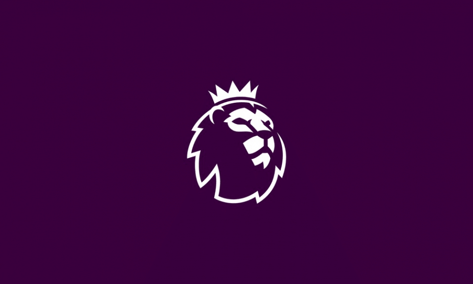
Premier league logo history
So, what did sport clubs disqualifications result in? Well, all the talented players were leaving the country. The government had to take many actions to stabilize the situation. All the stadiums were reconstructed to install seats. Large sums had to be spent, but it ultimately led to riots suppression.
Want to make your own sport logo? Explore sport logo design examples in our gallery.
As stadiums were upgraded, matches attendance increased and football became profitable business again. And that is when they decided to found a new league. The event has become the beginning of EPL history. The original Premier League logo history started in 1992. An enraged lion has been chosen as a symbol. Nowadays however, the lion seems depressed and pathetic. And overall impression of the league logo isn’t impressive at all. It has many details, which are better be removed as they make no sense. Its geometry is also a failure as the logo seems to be falling apart. Color combination is confusing for deep blue and green colors are overlapping. There also is too much black and it is devoid of harmony at all. Yet it was a plausible design back in the days of its creation as the situation was critical back then.
Premier league logo meaning
The symbol implies belonging to royal blood for lion – king of animals, whose common traits are majesty, strength and courage. Premier league, being a powerful organization indeed, could afford to bear a royal symbol as a logo.
Premier league logo evolution
Lion in the logo was actually a deliberate choice. It symbolizes English football since 1872.
League symbol was rebranded in 1996. However, professional designers say that things turned worse. Lion’s face dull expression remained and he was given a ball for some reason. Premier League logo designer’s way of thinking resembles that of a provincial girl’s. Different fonts, gold edging, rushing lines and huge, black billet looked like kid’s design.
Fortunately, they quickly removed the billet and slowly started to correct mistakes. A succession of rebrandings took place. As a result, they finally created a good background, and then the lion was improved. 2007 Premier League logo variation was far better than all the previous ones. It seems that they finally hired a professional designer, who just altered a few details rather than inventing a new conception. Sometimes it is just what’s needed.
Selecting a new Premier League logo font
Want to make your own football logo? Explore football logo design examples in our gallery.
The current logo variation can finally boast some harmony. They have chosen a royal purple color for depiction and inscription. Font used in Premier League logo is nothing but slightly altered Radical Bold. The current logo variation conveys a sense of power, nobility and contemporaneity and it is something that they wanted to convey initially. All the Premier League logos were different in terms of details, yet the gist was always the same.
Frequently Asked Questions
Why is the Premier League logo a lion?
The lion has long been a national symbol of strength and pride in England. In the logo Premier League, the lion represents leadership and authority — fitting for the country’s top football division. Its crown emphasizes excellence and prestige, while the bold design reflects the league’s modern and global image.
What is the red logo on Premier League jerseys?
The red logo seen on Premier League kits is not part of the official Premier League patch. It usually appears during special events, such as Remembrance Day, when clubs wear a red poppy to honor military service members. At other times, the red emblem may support campaigns or sponsorships, but it is always temporary and separate from the official branding.
How to draw Premier League logo?
To draw the Premier League lion, start with a stylized lion’s head in profile. Use clean geometric shapes for the mane, and add a sharp, angular crown on top. Don’t forget the bold eye and open mouth for expression. For the Premier League logo PNG style, simplify the lines and use a solid background to match the digital version.
What is the Premier League patch?
The Premier League patch is the official sleeve badge worn by all clubs in the league. It features the lion head logo, often in white or purple, depending on the kit design. The patch symbolizes participation in the top tier of English football and is updated only when the branding style changes.

SEO specialist, link builder, and blog editor at Turbologo. Writing insightful content about marketing, design, and branding. Sharing practical tips on building and promoting brands online.


