The violin is one of the most famous bowed musical instruments. Its sound is mesmerizing and inspiring. And the violin shape conveys grace, beauty, and perfection. Create a violin logo – a great solution for companies involved in the field of music.
Create your own logo with Turbologo logo maker. It takes less than 5 minutes and no design skills needed.
Go to Logo MakerTable of Contents
Famous violin logos
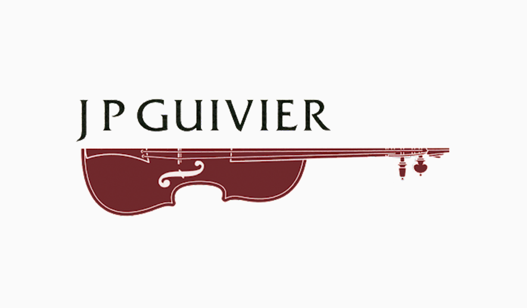
An example of a popular violin logo is the JP Guivier mark. It consists of the company name in a smooth serif font and half of this classic instrument.
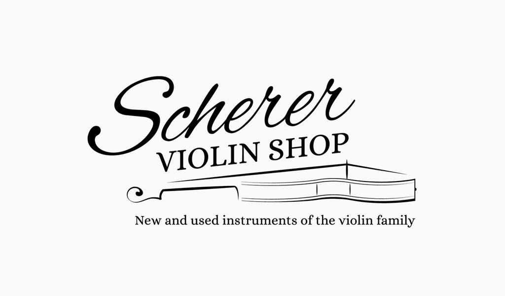
No less stylish brand mark belongs to Scherer Violin Shop brand. The logo is represented by the company name and the silhouette of a violin below. Above the instrument is a handwritten inscription “Scherer” and strict text with serifs “Violin Shop”. The logo is also complemented by the brand slogan at the bottom of the sign. All elements of the logo convey the classic style of this musical instrument.
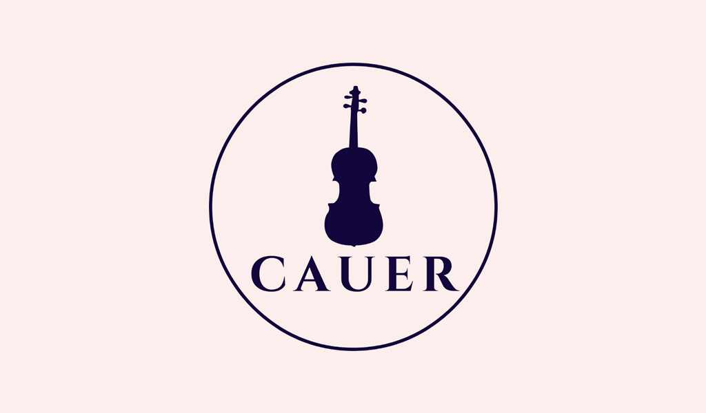
Another example of the famous logo with violin is used by Robert Cauer Violins shop. The brand logo shows a silhouette of an instrument painted in dark blue. Under it is the name of the company. The mark is painted in a pastel pink shade, except for the violin, the text and the circle around these elements.
In the following WKU Violin Fest logo design, the violin acts as the base of the sign, in which the other elements are placed. The instrument itself is presented as a silhouette in gray against a subtle shade of blue. At the same time, 3 types of font are used on the logo at once: each word of the name is made in a different style.

The classic logo with a hint of gothic style belongs to the Violin Shop in Lincoln brand. The sign consists of an incomplete silhouette of a violin and a stylized font that says the name of the store. Another inscription wraps around the top of the instrument in a classic serif font.
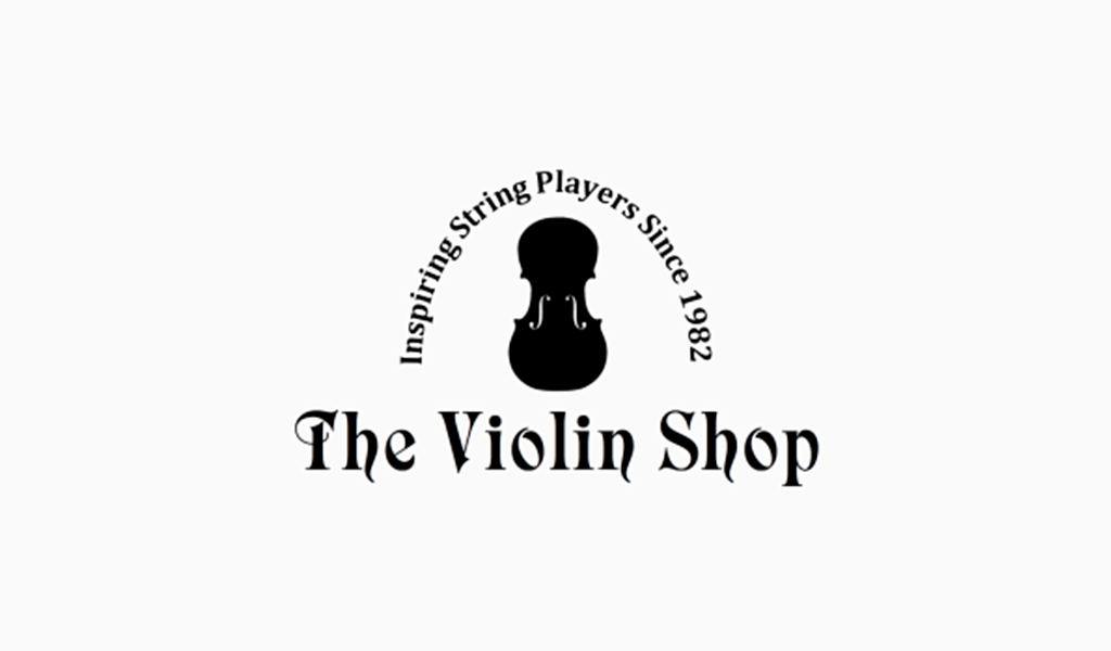
These examples of violin logos show that one element can look and read differently depending on the idea. Use the examples of famous logos when creating your own logo. Highlight interesting points and transform them into your unique idea.
Choice of logo elements
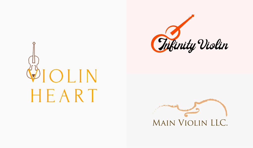
Violin as the basis of logo design will suit companies that are somehow associated with music. But on the logo you can place not only the image of the instrument itself, but also other details associated with it: fingerboard, deck, bow, etc. With additional elements, you can increase the recognizability of the mark and add originality to it.
But the violin itself can be portrayed in completely different ways: as a silhouette, a drawing, an outline, a separate part of the instrument, etc. Using additional images and details is also not a mistake. Choose any elements that represent your brand and enhance the appeal of the logo.
Choice of colors
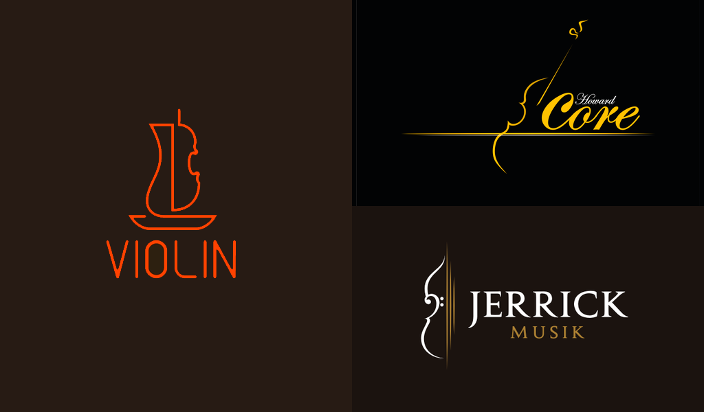
The violin is a classical instrument, so logos featuring this instrument are often presented in a restrained black and white color scheme. Another common solution is to paint the logo in brown shades, imitating the color of the violin.
You don’t have to be limited to the colors listed above. You can use any colors of the icon: from pastel to neon. For example, bright colors will ensure the recognizability of the logo, and muted colors will convey a commitment to classics and austere style.
Examples of violin logos



Conclusion
The violin on the logo not only tells the specialization of your company, but also conveys its strengths through the qualities of the instrument. You can create a logo with a violin in the online service Turbologo. It offers more than 3 million icons of various subjects, as well as hundreds of ready-made logo templates. Use the tips from the article and make your own unique trademark!
I’m a product and graphic designer with 10-years background. Writing about branding, logo creation and business.


