One of the biggest companies in the world has adopted a rebranding recently. We are talking about Ikea’s new logo, a legendary company that is well known throughout the world. They have been creating domestic goods of unparalleled comfort and design, earning thus trust of their audience. Ikea logo stands out for just the same qualities. Do you expect to see a brand new, ultrafashionable, creative design? The changes are scarce but they have renewed the logo indeed. What’s worth mentioning is that it looks more familiar than the prior one, just like there are no changes applied at all.
Create your own logo with Turbologo logo maker. It takes less than 5 minutes and no design skills needed.
Go to Logo MakerTable of Contents
IKEA logo history
So, what have the designers done? In what way is a new Ikea logo better now? Well, it has been redrawn to start with. It’s more legible now capable of proper scaling. At the same time, the designer saved tons of money by retaining the logo identity. The trick is that all the minor changes applied to require no ads to maintain a new idea logo recognition. They won’t have to alter an abundance of marketing materials as old and new symbols can be used simultaneously.
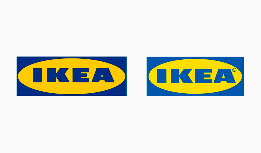
Thus, the original, well-known image hasn’t been altered significantly. However, it looks as if it has just visited a barbershop or something. It looks neat, tidy, clear, and overall better. Another useful alteration is a brand image volume. A ratio of a fitted in oval fries some additional space for lettering increasing its size. A new Ikea symbol claims more attention due to that as it occupies more space. Just like negative space in E and A letters it has also made them somewhat more legible. An overall elements allocation has been aligned thanks to an introduction of the ® sign.
Habitual blue and yellow remain pleasing an enormous audience. The colors have changed but their shapes proving to be even cleaner and pleasing the eye more now. Yet where do the colors in the Ikea logo come from and what do they mean? What are the origins of the identity? Let’s conduct a brief historical trip to learn about it.
Ikea Logo Meaning
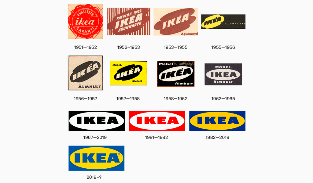
IKEA is actually an acronym standing for its creator’s name and surname (Ingvar Kamprad) and a farm in his household vicinity (Elmtaryd Agunnaryd). The logo colors are based on the Swedish flag as it is the owner’s homeland. Simple, apt, and stylish. Just like IKEA’s goods.
But why is it that simplistic? Many entrepreneurs struggle to create some fussy and complicated logos. It is all about the idea of the company. For instance, in the 40s, they decided that functionality is going to be dominant in their production. And they created a unique library case design. All their competitors designed grotesque cases with golden handles and a lot of details and decorations and stuff… And IKEA’s engineers believed that those are books that are important and developed a classic, minimalistic design that doesn’t seem to be more important than the content. And their identity follows the same patterns since then.
The legend has it, that an original design was drawn on a petty wipe during one of the business meetings. The point was to catch the idea of IKEA’s motto so that they could recall it later. The company’s members believe this to be one of the core principles. A good thought is easy to forget they say. You should put it down on paper as soon as comes to your mind. At least this is what their chief draftsman said. He also was the one who created the first IKEA logo black and white.
A Good Old IKEA Logo Font
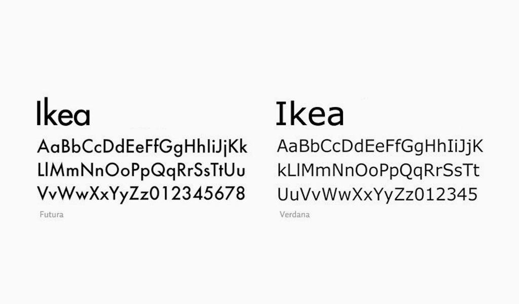
Simplicity, convenience, lasts forever; these constitute IKEA’s motto applied to every level of the company. That’s why the rebranding is seemingly unnoticeable for the audience. However, fon connoisseurs and expert designers did notice that. The move is an epoch-making one for sure. The font itself is altered in the IKEA icon! Designers have been using Verdana and Futura for decades and the latter one even had its own unique tracing called IKEA Sans.
And now the IKEA logo features a modern Noto font. This is one of the most popular fonts supported by many big companies. It can be applied to almost one thousand languages. They have also renewed its tracing. For instance, one of the “K” stems has been weirdly inclined. However, that’s just the move that makes the font slighter and it doesn’t scream obsolescence anymore. How come? Well, the devil is in the details. Tiny, old-fashioned notches have been removed from the face of the trademark.
So, what makes the font and identity of IKEA that superb? Their sign is rather pragmatic and it consists of but a few simple elements. Everything that could be simplified is already simplified. And it is still absolutely recognizable even by random customers.
The Company Symbol Creation
Many commoners believe that such simple shapes as oval don’t even worth resorting to. They also imply that plain logos shouldn’t exist. One must get it more and more complicated applying an abundance of details to a logo, they say. What they do lack is an understanding of the interrelations between colors and shapes. And IKEA logo also proves such an approach to be wrong. The logo, just like IKEA goods, features some sort of abstract space. The spacing, along with proper accentuation, stresses the design of elements and their combinations.
Ikea design stems from constructivism and vanguard. Strict, straight lines are common here. And let’s not forget about proper geometry and monolithic design. As opposed to vintage ringlets and modern detailing, IKEA’s design looks fresh even nowadays. Of course, it was absolutely revolting stuff back in the days. And the IKEA logo inherits it. Flat, white surfaces put on square mounts and/or Shelf styled bookcases of a single color with no decorations were among the first innovations. And the same stylish attitude towards fonts and spacing makes the company’s identity hard to confuse.
A yellow, clear oval is quite a recognizable image. Both the text and geometrical shape tracing are easy to get and self-sufficient. An ad makes people see some furniture and habitual blue letters on a yellow background oval in the corner. The style has been being developed for ages. It is also surprising that symbols do the trick even without lettering. You can just place the recognizable oval at the bottom of an image if you want to check it. Thus, designers can use lettering and imagery separately. The company has many designing tricks up its sleeve.
IKEA logo evolution
So, what can we learn from the IKEA logo and the company’s rebranding? It tells us that the gist of any logo is its recognizability and memorability, even for a well-known brand. All that rush towards super ideas and deep meanings is often exaggerated. Few actually care about what is written in a brand book. And it is of little importance just how good you are in identity. Customers just memorize catchy things. Simple as that.
I’m a product and graphic designer with 10-years background. Writing about branding, logo creation and business.

