
What sparkling drink is the best? The answer depends on your tastes of course, but there is a certain general rule. The market is ruled by those with the most captivating ads. There isn’t much difference between carbonated beverages. And that’s why the key to success is a proper branding and a balanced design. In today article, we’ll tell you a story of tremendously popular Fanta Orange brand and its logo.
Table of Contents
Fanta Logo History – Catering for victory
Coca-Cola used to invigorate soldiers on the frontlines back in 40s. However, a Nazi fleet cut off supply routes and numerous stoppages took place. The situation was growing critical and a bold plan was developed. They decided to build a new factory right in Europe rather than bypassing a blockade. That’s when Fanta logo history begins. The very first formula included apple leftovers and buttermilk! However, the name was more palatable. What does the name mean? It’s actually a shortening of “Fantasy”, which was helping engineers to run a production.
Thus, “Fanta” first appeared in a logo, the Fanta emblem history started in 1940. The first logo was comprised of the word alone and it was enough back then. Only the third logo variation was endowed with some basic graphic design. Those were three orange spots, symbolizing both gas bubbles and oranges. And the funniest twist here is that Fanta didn’t always have orange taste!
Old Fanta logo evolution
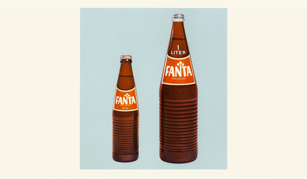
The first logo variation worth of attention was created in 90s. They finally developed a plausible color combination. A contrast of blue, orange and green made the brand recognizable. A clear and trim Fanta logo font was applied. A new millennium brought about more changes, but overall brand identics remained untouched.
Want to make your own drink logo? Explore food logo design ideas in our gallery.
The most part of design experiments were conducted in the last decade. First of all, they altered that trim font. The most similar analogs are Jabberwub and Amoeba. However, the bubble style font didn’t last long. A new wave of profound changes struck the brand design in 2017.
Fanta logo meaning
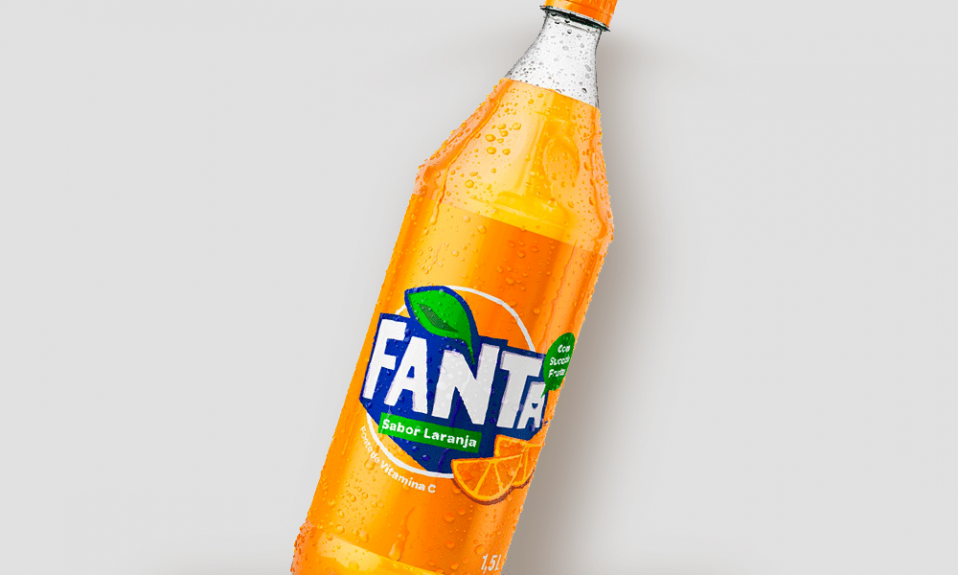
The main trademark color – orange, this color is represented in almost all logo versions and it is the basic of a “sunny” drink. Orange color is a combination of yellow and red, it means excitement and enthusiasm, it is considered an energetic color.
Fanta logo font
Many things were changed, yet the most noticeable alteration is shape of a bottle. The bottle has turned into something spiral and asymmetric. Perhaps it was supposed to resemble a squeezed, juicy orange. However, the shape gist isn’t reflected in the logo. Rounded and bubbled font was replaced by a pointy one. Nevertheless, the font is actually a special design of Fanta. The logo has become pointy too. So, the only thing that logo, font and bottle have in common is probably asymmetry.
The audience has faced new Fanta logo with a fair amount of suspicion. Critics say that the new design looks too twisted and annoying. And the bottle design is that of spoilage. However, critics’ age is far from target group. They hardly purchase the beverage, because they know well that it’s quite unhealthy. But kids and teenagers are happy to have another bottle of it. And, judging by popularity, they just enjoy the new design!

SEO specialist, link builder, and blog editor at Turbologo. Writing insightful content about marketing, design, and branding. Sharing practical tips on building and promoting brands online.


