Most colleges in the world have an emblem and a crest. And what do they need
a logo for then? The point is that you would get nowhere without proper branding these
days. It’s not some pointless pathos; a brand is needed to tell enrollees what exactly is
college’s uniqueness. Such institutions should be not only fancy places but also provide
a more informative impression. That is why proper branding is a must even for educational institutions.
Table of Contents
College Logo Design Principles and Branding Strategies

You don’t have to learn how to draw and design or hire some professionals
nowadays. An in-built logo maker AI copes with the task really well. All you need to do
once the process has been completed is to choose one of the options to your liking.
However, you can’t apply all the cool options in a college logo at once. First of all, a logo is supposed to be attractive. Spectacularity comes second, and only after it there are trends and some striking ideas or solutions.
Scrutinize your rivals to get an idea of what can be improved or changed. Think of
your enrollees. What are they like? A choice of style and color pattern depends on it
heavily. Will it be bright and extraversion or calm and sedate? Will it charge people with its energy or propagate rationality and expertise? Whatever it might be, stay away from
trends while designing college logos. In contrast to an ephemeral servicing company, a
college is a long-term project and it requires branding to stay with it for a prolonged period too.
Best Examples of College Logo Design
A majority of colleges all over the world prefer minimalism and aptness. Academy of
Performing Arts in Prague is a good example here. The academy is striving to retain its
best traditions, like talent education or an artful approach to education. The logo is of little details, nevertheless, it is spectacular; you can’t miss it.

Another proper example of minimalism and functionality is the Anhembi Morumbi University logo, one of the top universities in Brazil. Its color pattern is comprised of soothing and comforting colors, implying a stillness of the education process.

A notion of contemporary, stylish design is the University of Texas. It has been altered little since 1961, but it looks like it’s something of recent designs. It is a great example of a design that is meant to last forever. And it also makes the university’s football team uniform look cool.

Washington State University can also boast a stylish logo. An archaic depiction of a cougar is used to stress a long history and traditions adherence of the university. However, its overall design is state-of-the-art still, representing one of the educational institutions. What’s more, a font and a color pattern are a perfect match, which stresses the message even more.

Creative Concepts for Unique College Logo Design
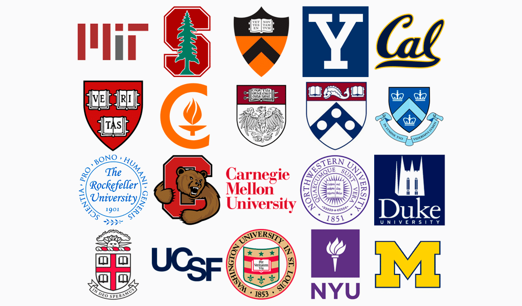
If you feel like creating your own image, but you have no idea what to begin with, we’d recommend you to look at what you currently have. If your college already has some antique emblem or crest, that’s already more than you could wish for. Redesigning it into
something modern is not a too complicated a task as there logo makers nowadays. Just make sure you won’t lose your brand identity in the end.

Another way is to choose one of the familiar college images. However, a book or a
mortarboard is just too obvious in that case. What science field does your college focus
on? Try to combine a depiction of the book with a symbol of the field. You could get a plausible result by simply depicting a silhouette of your main building. However, it would take some professional designers to accomplish. What’s more, a building depiction in a college logo is quite a flexible solution in terms of meaning implication. And it can be supplemented with some patterns or details to flag the university department for example.
Yet here is another interesting move. In most cases, there are some problems with
the crest shape. It’s really hard to change it and retain all the relevant meanings in it. Be sure to stress some modern technologies as well as it is crucial for 21-century education. Your enrollees must be sure that they will get both pertinent and modern education. And adding some contemporary branding elements is one of the best ways to imply this.
Retro Branding Strategies

You can also resort to the initial design of your institution; get back to roots, so to speak.
Retro design is another effective solution in the field of educational services. An obsolete
the graphic is sure to inspire you to recall or invent some stylistic and designing solutions.
Also, don’t forget to remove all the unnecessary detail from your college logo. It surely will be used in a variety of documents and forms, so it will have to be scaled down. All the lesser details will turn into the dirt as a result, so you just don’t need them. Keep it simplified and be sure to develop some monochromic logo variations too!
College Logo Design Examples






I’m a product and graphic designer with 10-years background. Writing about branding, logo creation and business.

