Serious people became interested in baseball in the end of XIX century. It was a golden age of baseball in America when turned it into a national sports. All kinds of entrepreneurs smelled money there. Regardless many forecasts baseball heyday didn’t end fast. Baseball remains an important and favorite game for many of us. And it is quite logical that the strongest teams were founded a long time ago. And a story of one of those is to be told here.
Table of Contents
Cubs’ logo history

Chicago Cubs were one of the strongest teams in a league starting from XIX century. And initial and the oldest team name was Chicago Orphans but it was removed hastily. It all began with lots of victories won by the team at the beginning of last century. They expected a lot from Cubs, but things went ugly after they beat the World Series in 1908.
The Chicago cubs logo history started in 1903.
Cubs’ logo meaning & font
Initially, an old Chicago Cubs logo image was looking like letter “C” written in gothic type. And “C” stood for Chicago of course. Tracing the letter was altered several times. Some options included notches, others didn’t. Color was ranging from blue to dark gray. And finally Cubs logo developed a new style in 1908. A fulvous bear cub was shaped into “C” holding a baseball bat in its paws. Perhaps, it was this logo alteration that mystically affected fate of all the Cubs.
Chicago Cubs logo evolution
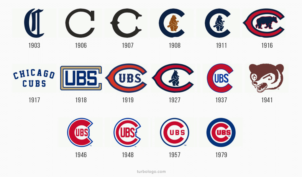
Right after the event another rebranding was issued in 1946. The “C” letter returned, but there was no cub inside of it. There was UBS abbreviation. Thus, “C” letter began to symbolize not only Chicago but also a team name as well. Red, white and blue colors were taken from the flag this time. Cubs were experimenting with logo details and outlining many times, but they haven’t changed their logo completely.
However, all the outlinings with different colors, all the rebranding attempts were in vain until 2016. 1979 logo wasn’t altered significantly. It was still outlined with thick blue line. Yet somehow the team managed to overcome its twisted fate. Billy Goat curse was lifted in fall 2016! Chicago Cubs won the World Series for the first time in 100 years! One team’s most famous fan, Bill Murray was over the moon. As all the other fans were, who were crying in the stands. Sometimes it’s not about logo or brand, it’s simply about luck!
The Curse and Its Impact on the Chicago Cubs Logo Evolution
A succession of failures is a common sight in sports. When it is hard to state direct reasons, people often tend to invent strange explanations. No other team has suffered such a long succession of failures after all. It took place in 40s when Chicago Cubs rejected another logo variation. It was completely altered instead and a wrathful, enraged bear muzzle took place of a lovely bear cub encircled by “C”. It was rather unexpected and unusual for the team and fans didn’t quite get the gist either.

And it was just perfect timing for another story to happen. The team had a certain fan who absolutely loved goats. He firmly believed that goats bring luck. And his name was William Sianis. Once upon a time he and his goat, both having tickets, went to see the match. As the goat didn’t have the most pleasant air around him, both were asked to leave the match. Sianis had grown mad because of this and cursed the team. He said that there will be no more winning for the team. And the curse came true!

SEO specialist, link builder, and blog editor at Turbologo. Writing insightful content about marketing, design, and branding. Sharing practical tips on building and promoting brands online.

