So many great ideas began with simple startups! If you sometimes feel afraid of failing to succeed on market then this very article is for you. Amazon company history once again proves that diligence, resolve and a tiny bit of luck always lead to success!
Table of Contents
Amazon company history
To answer that question, we need to delve deeper into the history of the company and its name creation. The current mega-corporation name (Amazon) is well-known by everyone, but has it always been like that? Absolutely not! A company founder, Jeffrey Bezos decided to create the biggest book shop in the world in 1994 and resorted to little-known-back-then Internet technology. It seems ordinary today, but it was truly innovative in his time. Initially, he called his project “Cadabra”, a shortening from “Abracadabra”.
Quite a special move indeed, but what’s the trick behind it? The company started its business from phone sales it its name often was misheard and understood as “cadaver”. Those were unpleasant associations with a company that only trades books. And so Jeff began to search for a new name. And so it became a real issue. Does “MakeItSo.com” fit for such business? Or perhaps “Browse.com” or “Bookmall.com” would do better?
Of course, we can easily deal with the problem by calling some professionals nowadays, but Jeff had to do it himself those years. And he resorted to logic. Provided customers are using the phone to contact the company, the name of it got to begin with “A”. In contrast, it would be a good idea to highlight a wide range of goods available by using the last letter of the alphabet – “Z”. One of the first words containing “A” and “Z” was the name of the biggest river in the world – the Amazon. A firm hint of superiority among rivals, isn’t it?
Amazon logo evolution
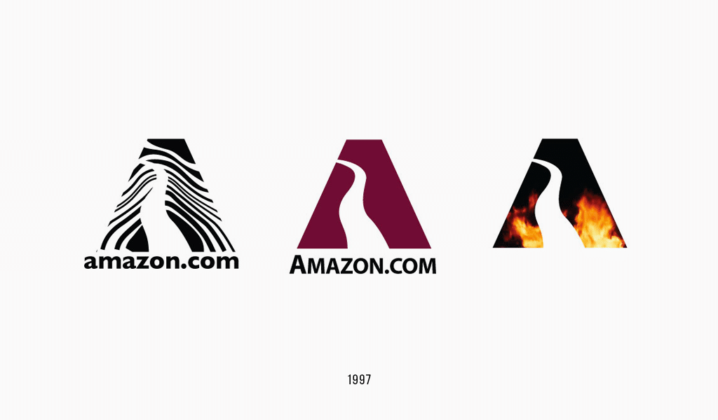
Old Amazon logo
So, the name has been chosen, but the Amazon logo faced another issue. Its design wasn’t as sophisticated as its name. And you wouldn’t want to see the result. Such designs never earn any rewards, except for maybe “Me first try ever”. Amazon logo font looks awful, given its color environs.

This, however, can still teach us a thing or two. If you have a brilliant business idea, enough resolve and proper startup funding – you are sure to succeed even with a label like the one shown before. A beautiful picture isn’t the most important thing about business. Keep that in mind when the time comes.
Obviously, after some time every one in the company realized the original Amazon logo isn’t much of a presentable one. The idea of river current forming the letter “A” was a good one, but the logo design still couldn’t be called stylish, interesting, or legible. The time has come to make a more attractive logo using vector images. Unfortunately, all the attempts to improve the logo playing with the river current shape and its background have failed miserably.
New Amazon logo
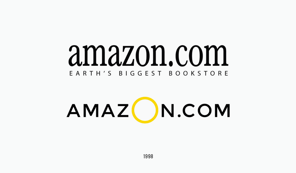
Fortunately, however, Jeff decided to hire experts in the designing field to cope with the problem. He really didn’t escape the fate of many other businessmen, who imply that making a nice little picture is easy. It happened to be far more complicated than he had thought, and the designers’ approach proved to be more than plausible. That’s why the logo hasn’t changed ever since then.
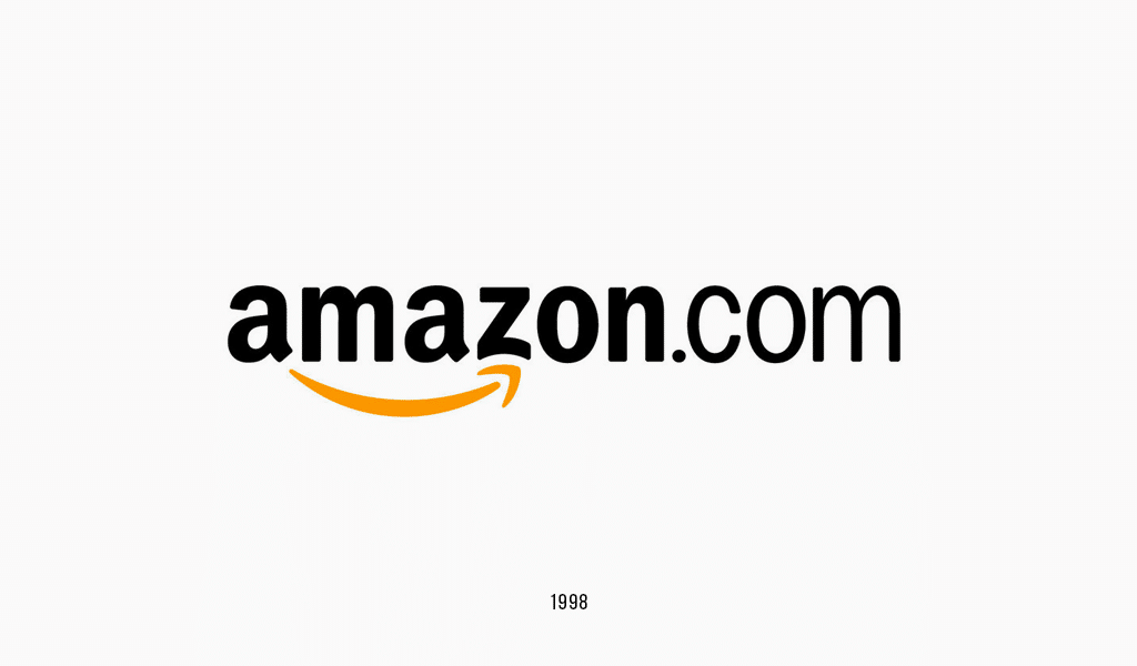
Let’s examine it closer.
Amazon font
Amazon has its own font – Amazon Ember and use it for all Amazon products and services.
Amazon logo meaning
Amazon logo meaning is that you can get almost anything on Amazon, everything starting with “A” to “Z”, a whole river of diversity. And the river is the biggest in the world! You can also see a smile in the logo, which is understood by everyone, regardless of age or nation. Amazon’s logo speaks of loyalty and amicability. Even amateurs can sense the difference between the initial and the new logos.
Nevertheless, there is something that can be seen only by professionals. First of all, the Amazon logo font has finally become legible, clear and it retained its properties even after being transformed. Secondly, this simple and easily-to-understand logo is hard to mistake for some other logo. This is something that lets down many beginner designers and artists in their attempts at creating vivid and meaningful pictures.
What good is in complicity if a customer will get it all wrong and buy from your rival? The new Amazon company logo states clearly: “If you want to be the first on the market, you got to be friendly to your customers and they will stay with you for years to come”.

SEO specialist, link builder, and blog editor at Turbologo. Writing insightful content about marketing, design, and branding. Sharing practical tips on building and promoting brands online.

