At the outset of its history, Adidas was known as a tiny company in German-made sportswear. Its footprint today is the whole world, with representative offices being just everywhere, you name it. The assortment of goods on the Adidas production line includes all kinds of hardware and accessories, such as golf clubs, badminton rackets, and football boots, to name a few. Running shoes are an item Adidas is renowned as the leading manufacturer of all over. The way Adidas has managed to subjugate the global sportswear markets is something that had never occurred before.

Table of Contents
Adidas Logo history
The Adidas logo is a single factor that has benefited the company all along its path to the top. Ask anybody you know if she is familiar with the Adidas logo, and probably 9 in 10 will say they can tell it apart every time they visit a sportswear store. The uncanny manner in which the very simplistic design has managed to take the world by the storm should be of interest to anyone who seeks to build up an Empire State Building among lower grade brands.
The original logo featured the lettering “Dassler”, the second name of the co-founders. This first version history started in 1924.
Stripes, of which there are three
This logo was simple itself, nothing special really. The approach the company employed was to put three strokes on everything that rolled off their production line. Just about the time they started out, they were already recognizable thanks to their brand mark. Adolf Dassler’s, the owner, favorite name for his enterprise was ‘The Three Stripes Company.’ As its logo moved on through its evolution, changing shape, Adidas remained faithful to its initial three stripes concept.
Adidas logo meaning – Trefoil, They Call It

Then came the turn of the trefoil to become the logo of Adidas. The three stripes motive is still far too palpable, take either the petals of the ‘flower’ or the treble stripes crossing it at the base. The company chose it to convey their desire to have something much bigger than just three stripes, but still staying true to what came down in history as the traditional Adidas logo.
This is a logo of choice when Adidas classic sportswear items are branded. However, when their top rating products are concerned, they have adopted another, final so far, logo.
Three Bars that Impress
On the logo’s evolution timeline, this one is known to be the latest and is mostly used for the best outfit Adidas offers. None of the previous logos had a greater meaning attached to them. The company’s obvious intention was to leave the three stripes in while giving the whole design of the logo the power of a champion.
What one sees in the logo is a hill, a ski slope, perhaps, thus setting an ambitious goal for Adidas product buyers. The logo is now truly ubiquitous, and anyone at once can tell it is Adidas, without the shade of a doubt.
So Why is Adidas Logo Effective?
The fact that it is cannot be gainsaid. It is very hard to find a person who would not recognize it as being the property of Adidas, and the brand’s footprint it has managed to make is any business’ wet dream, worth billions. Its outright simple design is likely what makes the Adidas logo work so effectively.
A true find was the tree stripes which make a simple, whilst highly authentic, pattern, which is compact enough to be put on almost any surface. A stroke of genius was to let the Adidas logos transform naturally around its original design, imparting the brand extra momentum every time, without running the risk of veering off the road to success. With a logo like this, Adidas will likely stay second to none for the longest time, as it invariably did in its history.
The Milestones in The Adidas Logo‘s Evolution
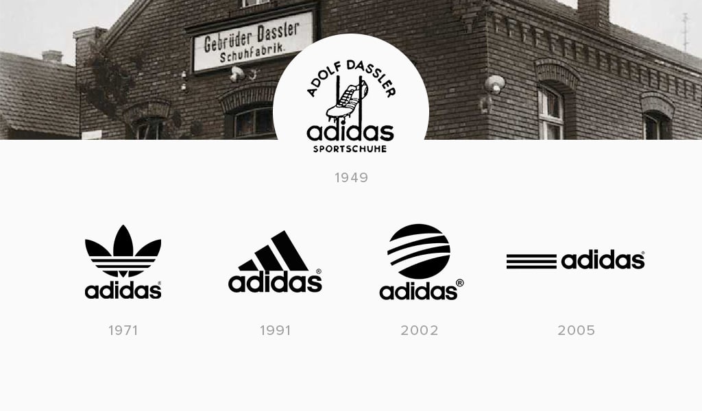
1967 – Three stripes, conceived by Adi Dassler, were first put on running shoes manufactured by Adidas.
1971 – The Adidas Trefoil Logo was born. The trefoil logo was designed as a step to diversify the Adidas brand’s footprint. Initially used in 1972, the design went on to become the Adidas corporate “coat of arms.”
1997 – Peter Moore, Adidas AG’s global creative director, redesigned the famous three stripes logo, and reintroduced it to the world.
1998 – After a merger agreement with Salomon, it was decided that an updated logo to share both businesses’ branding values was needed. The new one had the Adidas’ traditional blue color, whilst the French contributed their favorite red hue. Further, to give it the resemblance of a diamond, three geometrical shapes were used in its design. And, putting too fine a point on it, two white arcs symbolized a pair of raised arms in a victorious fashion.
2005 – This year the latest “Word Mark” Adidas logo was presented to the market. The unsophisticated, clear-cut design would put the logo among the most powerful and ambitious known to the world.
Adidas Logo font
Adidas logo is featured a ITC Avant Garde Gothic font from geometric sans serif font family.
Initially, the Adidas brand used a logo in the form of three stripes, which means structural strength, reliability. But the new logo of the company shows a shamrock above three stripes. These three sheets depicted a map of the world with three continents on which products were sold at that time. These are North and South America, Europe, Africa, Asia.
The Adidas logo is three stripes similar to a mountain. In general, this brand is intended for professional athletes. And the mountain symbolizes overcoming difficulties, achieving goals.
Why are there so many logos? The brand has several directions: Originals, Sport, Style. Adidas Sport is professional clothing and equipment for athletes, Adidas Style is designer items, including collaborations with renowned designers, Adidas Originals is casual, streetwear.
“Impossible is nothing.” This is one of the most successful slogans from Adidas. The phrase perfectly motivates the athlete before the competition.
Initially, the logo was three stripes parallel to each other, it did not have a special semantic load. The designers of the brand have changed. Logo. But now, when the logo has a different look, it is three stripes in the form of a mountain, symbolizing overcoming difficulties, achieving a goal. After all, the main purpose of clothing production is for athletes.

SEO specialist, link builder, and blog editor at Turbologo. Writing insightful content about marketing, design, and branding. Sharing practical tips on building and promoting brands online.

