The history of Starbucks logo creation is a great example of brand building for graphic designers, marketing specialists, and company owners. Where does this love for one of the most popular coffee shop chains in the world come from?
Table of Contents
Starbucks logo history
According to statistical data, the Starbucks logo and brand are recognized in 7 out of 10 cases. The company was founded in the 1970s by a group of friends, true coffee aficionados. Initially, it positioned itself as a store that sold roasted whole coffee beans. As they didn’t have too many customers, the owners could spend some time with each of them telling stories about coffee.
The idea of Starbucks is to create a special place where people could distract themselves from their daily routine and have a cup of coffee in a nice atmosphere. The coffee shop is supposed to be a buffer zone between work and home. There is a popular perception that thanks to Starbucks the Americans and the whole world have grown to like coffee to the extent they like it today.
According to Howard Schultz, former Starbucks CEO, what the organization values most is not the number of coffee shops around the world, but the fact that customers come back there day after day to get the best cup of coffee and help create the nice atmosphere they themselves seek.
For many years particular attention has been devoted to branding that has been considered to be the key element of the development strategy. An immense amount of time was spent on creating a standardized design of coffee shops and all the products they offer.
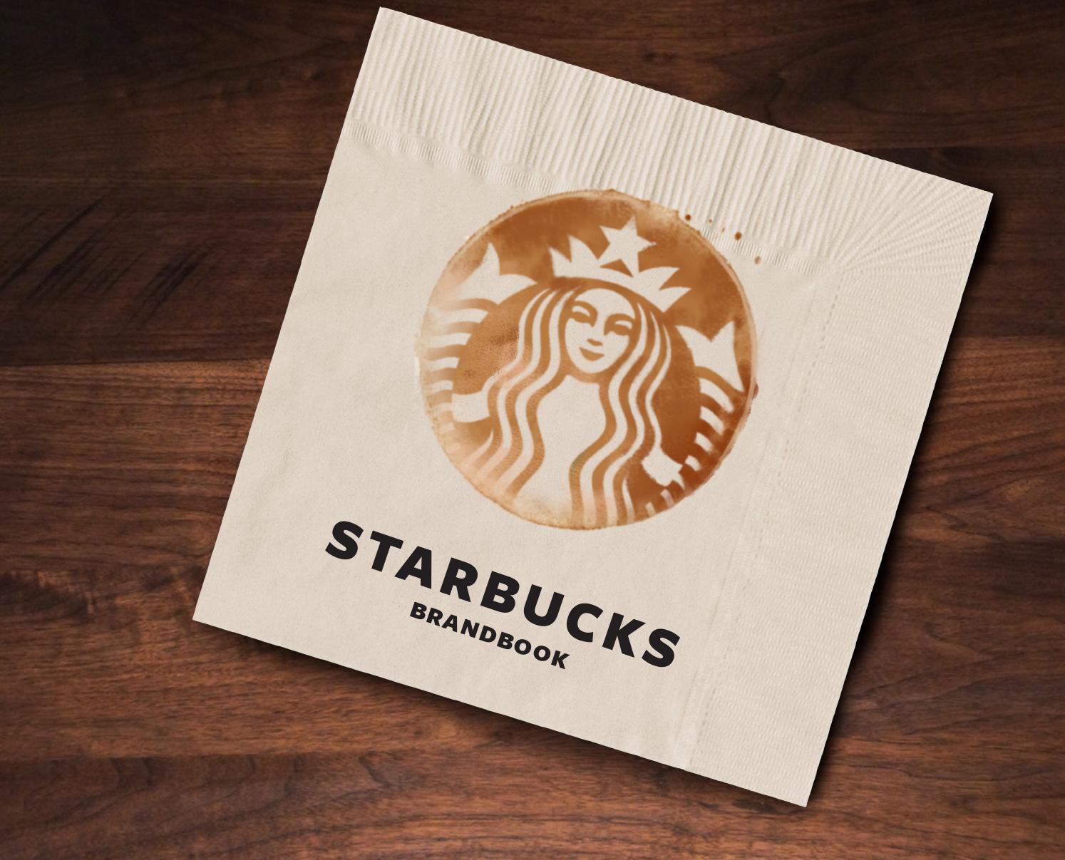
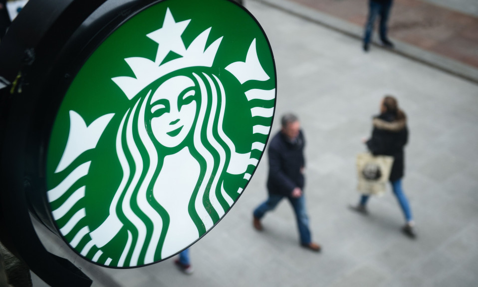
Starbucks logo is one of the most recognizable in the world. The company takes seriously expanding to new markets in other countries. It always uses the experience they already have which guarantees the stability of Starbucks.
Starbucks logo evolution
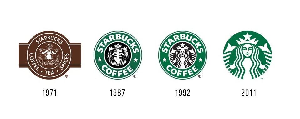
- The first logo was created in the year Starbucks opened. It was quite different from the current version. There was a text around the logo, the image contained bold details such as the siren’s naked breast and lower body ending in a fishtail. The first logo was brown.
- After the 1987 recession that is known as Black Monday a lot of people lost their money. But the company had no intention to close, instead, the founders started rebranding in order to attract new clients. Two stars were the main elements added to the logo. It was a way of connecting the logo to the company name, using a simple association that even a child could understand. The logo became brighter and more laconic.
- In 1992 the logo was altered again. The Siren’s face became the main focus. You can see this version today as it is used as a secondary logo. This logo is seen on photos with branded cups. It is possible that these changes were made for aesthetic purposes. Not everybody considers a wide belly and tail spread apart to be attractive.
- The logo designed in 2011 is used today. It is now used without the circle and text. The Siren is white on the green background, not on the black one, as it was before. Simplicity is the key component of this logo. This is how the coffee shop chain celebrated its 40th anniversary.
Starbucks logo meaning- Why Starbucks logo has a Siren
Maritime novels with engravings depicted in them became the inspiration for the logo creation. The mermaid was the symbol of Seattle and its port. The stars were used in the logo for the purposes of correlation with the name of the then store that sold coffee beans.
A two-tailed siren is one of the symbols that date back to the 8th century. Having started rebranding, the company owners didn’t change the logo completely but got rid of the lower part of the image. This was a way to give a new life to the Siren that had once inspired them, by attracting attention to her face. It was made asymmetric which provoked a strong public reaction. The founders explained that it helped make the Siren look more friendly and realistic.
Terry Heckler was the person who made a special contribution to the creation of the Starbucks logo. He was the first designer working on it.
Starbucks logo font
The unique typeface was developed by D. Darden. It stayed unchanged throughout all the rebrandings. The logo is featured a Freight Sans font.

SEO specialist, link builder, and blog editor at Turbologo. Writing insightful content about marketing, design, and branding. Sharing practical tips on building and promoting brands online.

