The wing shape, which represents the Nike company, is very illustrative and need no further commentary. It is known to everyone. It’s hard to imagine that before the Nike logo did not exist at all. Since 1963, when amateur runner Phil Knight took the first steps towards creating a future empire, it took 8 years to create a Nike logo. Probably the student, who sells Japanese sneakers from the trunk of his car, did not realize that one day his small-scale company would become one of the brightest sports brands in the world.
The Nike Swoosh is more than just a logo—it’s a symbol of speed, movement, and global influence. Designed by a college student for just $35, this iconic mark became the heartbeat of the Nike brand. In this article, we’ll explore the history of the Swoosh, its meaning, evolution, and what designers can learn from it today.
Table of Contents
The beginning of a journey
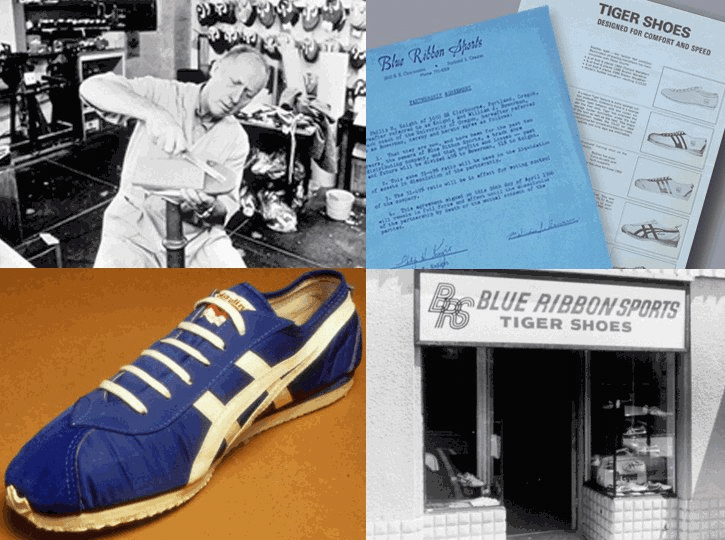
Phil’s choice was not random. The young man was very sporty. He improved his skills and was interested in new sports products. At that time, the affordable sports shoe shortage was an important problem for him and for other people. The place on the market was occupied by expensive foreign brands like Adidas, or cheap and uncomfortable shoes. Knight was seriously looking for alternatives and he turned his attention to Japan without hesitation. He was interested in the industry of this country while studying at the university. His idea was to supply cheap Japanese sneakers to the United States, and it would be available to a wide audience.
Phil Knight went to Japan in 1962 and made an agreement with a local firm, and a year later he sold the first batch in his home country. At that time, his business was called Blue Ribbon Sports. The entrepreneur did not think too much about this name. At first, Knight advertised shoes to familiar sportsmen, but soon the wave of interest in his products began to grow. The good profits and positive feedback raised the issue of their own production. The growing social trend for a healthy lifestyle served as an additional argument in favor of this opportunity. However, Phil needed a more concise name to establish a new company, as well as a memorable logo.
The birth of the Swoosh – Nike Logo History
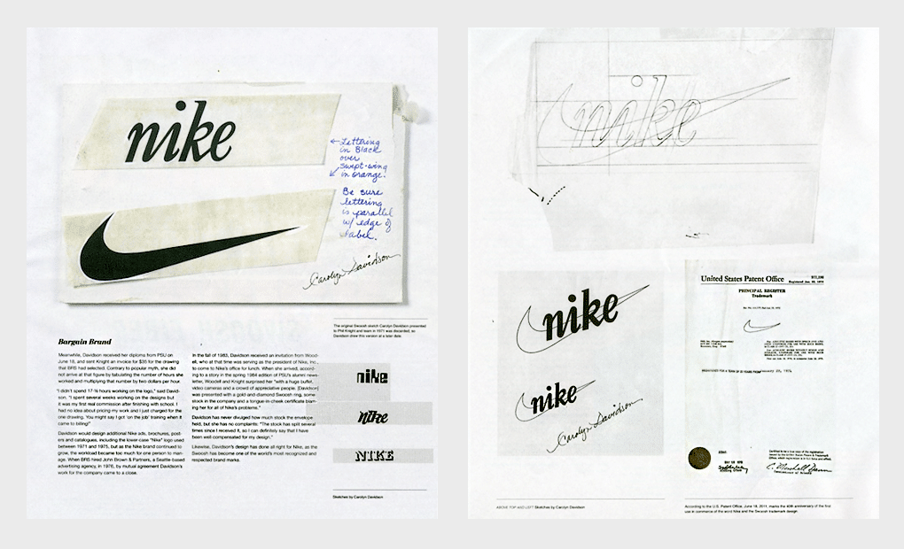
The name Nike came to Knight’s colleague Jeff Johnson, who saw Greek goddess Nike in a dream. Her image was one of the reference points for creating a logo. Knight met with designer Carolyn Davidson (the future creator of the legendary logo) when he studied at Portland University.
He looked to her for help from time to time, when he just started a business, and in 1971 he assigned a more important mission to the student. Phil wanted her to create a company logo and gave the demands for the logo: dynamism, good visual perception on shoes and difference from other well-known brands.
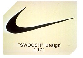
The wing shape was not the first Davidson idea. She created several sketches at once. According to legend, the designer angrily drew a line on a piece of paper, being dissatisfied with her work ideas. And as a result, the Swoosh was invented. One way or another, but the shareholders chose this particular sign as a logo. Phil Knight was dismissive of that logo; he said that isn’t what he dreams about. Carolyn Davidson was paid only 35 dollars for her work.
The founder of the Nike company could not even think about that, over the years, he will get a tattoo with a symbol that really put him on the map. The Nike logo designer received a precious ring with the Swoosh as a reward, as well as 500 company shares, it was a huge, albeit belated, award. The exact shares amount is still unknown, but today it exceeds one million dollars. Remembering this story, company fans often joke that freelancers should not be afraid of low-paying orders. No one ever really knows how things are going to turn out.
Meet the Designer: Carolyn Davidson
Behind the Nike Swoosh lies an unexpected origin story — one that started in a college classroom.
In 1971, Carolyn Davidson, a graphic design student at Portland State University, was approached by accounting professor Phil Knight, who needed a logo for his new athletic shoe company. She agreed to take on the project and was paid just $35 for her design — the now-iconic Swoosh.
Though her initial payment was modest, Davidson’s contribution became invaluable as Nike grew into a global powerhouse. In 1983, as a gesture of gratitude, Nike gifted her a diamond ring engraved with the Swoosh and an undisclosed number of company stock shares.
“I don’t love it,” Knight famously said when first seeing the Swoosh, “but I think it will grow on me.”
And it certainly did — becoming one of the most recognizable logos in history.
Symbolism Behind the Swoosh
At first glance, the Nike Swoosh may appear to be a simple curved checkmark — but it carries powerful meaning tied to both myth and movement.
The shape was inspired by the wing of Nike, the Greek goddess of victory, who personified strength, speed, and triumph. This mythological connection gave the logo a symbolic depth from the very beginning.
Visually, the Swoosh suggests motion and athleticism. Its smooth, curved line creates a feeling of forward momentum, as if it’s pushing through the air or slicing across a track. This sense of flow reflects Nike’s brand philosophy: empowering athletes to move faster, reach farther, and exceed their limits.
The Swoosh isn’t just a logo — it’s a visual expression of energy, determination, and continuous progress.
Logo font
Nike logo font is Futura.
Nike Color Palette and Meaning
- Black — #000000: Power, strength, authority. Commonly used for the logo and typography.
- White — #FFFFFF: Energy, speed, and contrast. Often used as a background for the Swoosh.
- Red — #E00000: Passion, urgency, and action. Appears in limited editions and performance campaigns.
- Gray — #7E7E7E: Technology, neutrality, and urban aesthetics. Used in apparel and digital branding.
What Do Nike’s Colors Communicate?
Each Nike color was chosen to reinforce the brand’s core message: bold action and timeless simplicity. Black gives the logo its strength and elegance, white adds speed and clarity, red injects passion into high-energy marketing, and gray supports the brand’s modern, tech-savvy edge.
Together, these colors create a powerful visual identity that resonates with athletes, creators, and trendsetters alike.
Nike vs. Other Power Brands
| Brand | Main Colors | Message |
|---|---|---|
| Nike | Black, White, Red, Gray | Power, speed, boldness |
| Adidas | Black, White | Minimalist, classic, disciplined |
| Coca-Cola | Red, White | Joy, passion, tradition |
| Tesla | Red, Black, White | Innovation, energy, confidence |
Next step forward for symbol – Logo evolution
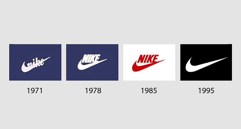
Despite the fact that shoes with this logo went on sale almost immediately after its creation, the symbol officially became a trademark only in 1995. Simple and concise Swoosh has proven to be one of the most persistent logos in history. It has remained almost unchanged for decades with some minor modifications. Initially, the wing shape had a black outline and internal transparency, and the name Nike was written over the smooth handwritten lettering. After 7 years, the logo was finalized: the Swoosh changed its bend a little, was slightly blurred and turned black. The inscription Nike was placed above the image, and its font became more restrained and symmetrical.
The logo has undergone only minor revisions. In a few more years, the font and symbol slightly stretched out. Designers used white on a black background. And the main event in the history of the Nike logo happened in 1995. The inscription Nike was lost and only the wing shape left. By that time, the emblem had become so popular and recognizable that there was no longer a need for the company name. That continues to be the Nike logo today. Anyone who sees the famous Swoosh on sportswear and footwear will recognize the associated brand.
Timeline of the Nike Logo
The Nike Swoosh has undergone an impressive journey since its creation. Here are the key milestones that shaped its evolution:
- 1971 – Graphic design student Carolyn Davidson creates the iconic Swoosh for just $35.
- 1971 – The logo first appears on Nike cleats, accompanied by the brand’s name.
- 1983 – Davidson is rewarded with a diamond ring featuring the Swoosh and shares of Nike stock for her role in building the brand’s identity.
- 1995 – Nike starts using the Swoosh without the word “Nike,” marking the logo’s standalone power.
- 2020s – The Swoosh becomes a central element in global campaigns, digital branding, merchandise, and even NFT projects.
This timeline shows how a simple mark evolved into one of the most recognizable symbols in the world.
Nike logo today
Nike still gained the title of sports brand number 1 in the world, despite the fact that the company did not manage to beat Adidas in popularity among football players. Today, the Swoosh is considered the most recognizable logo among buyers and athletes. It can be seen not only on sneakers but also on shorts, T-shirts, jackets, caps and sports equipment. From time to time, the company holds promotions, releasing products with various words and abbreviations over the Swoosh, where the inscription Nike was located before. At the same time, the traditional font remains.
The logo was liked by many sports stars. The brand cooperates with them to this day. Athletes win prizes and set new world records wearing Nike clothes and shoes. Celebrities choose Nike, and this increases loyalty and trust among customers who instantly recognize the wing shape. Swoosh history is proof that even the simplest and most uncomplicated image can gain world fame and recognition.
Comparison Table: Iconic Logos
How does the Nike Swoosh compare to other world-famous logos? Here’s a side-by-side look at four iconic brand marks, including their design features, costs, and levels of recognition:
Nike
- Symbol: Swoosh
- Typeface: Sans-serif
- Design Cost: $35
- Recognition: 🔥 Very High
Apple
- Symbol: Bitten Apple
- Typeface: Custom
- Design Cost: Internal design (in-house)
- Recognition: 🔥 Very High
Adidas
- Symbol: Three Stripes
- Typeface: Sans-serif
- Design Cost: Undisclosed
- Recognition: 🔥 High
Chanel
- Symbol: Interlocking C’s
- Typeface: Serif
- Design Cost: Undisclosed
- Recognition: 🔥 High
These brands prove that memorable logos don’t need to be complex or expensive — they just need to be consistent, distinctive, and emotionally resonant.
Design Lessons from the Nike Swoosh
The story of the Swoosh offers powerful insights for designers, entrepreneurs, and anyone building a brand. Here are the key takeaways:
- Simplicity sells – A clean, minimal design can be more impactful than something overly complex. The Swoosh proves that less really is more.
- Form is stronger than text – A shape alone can communicate a brand’s identity. The Swoosh stands confidently without needing the word “Nike.”
- Emotion drives recognition – Great logos reflect a brand’s philosophy and values. The Swoosh captures movement, victory, and determination.
- Timelessness comes from clarity – Avoid trendy visual clutter. Focus on strong, lasting forms that won’t feel outdated in five years.
Inspired by the Swoosh? Create your own minimalist and powerful logo with Turbologo’s logo generator — no design skills required.
Frequently Asked Questions
Who designed the Nike Swoosh logo?
Carolyn Davidson, a graphic design student at Portland State University, created the Nike Swoosh in 1971. She was paid $35 for the design.
What does the Nike Swoosh represent?
The Swoosh symbolizes speed, movement, and athleticism. It was inspired by the wing of Nike, the Greek goddess of victory.
How much did the Nike logo cost?
Nike originally paid $35 for the Swoosh logo design. Later, the company gifted the designer company stock and a gold ring as a thank-you.
When was the Nike Swoosh first used?
The Nike Swoosh first appeared on cleats in 1971, when the brand was launching its first line of shoes.
Why is the Swoosh used without text today?
Since 1995, Nike has used the Swoosh without the wordmark. The shape alone became globally recognized, representing the brand’s identity and values without needing text.

SEO specialist, link builder, and blog editor at Turbologo. Writing insightful content about marketing, design, and branding. Sharing practical tips on building and promoting brands online.