
Slack shared its new logo via social media. As you all know, there’s always a reaction. This is especially true when it comes to the image and reputation of a beloved brand. It is often a thoughtful and necessary decision to change the logo, at least from the perspective of the company. Many times, multiple agencies and departments are involved when creating a new brand identity. Was Slack successful in this case?
Table of Contents
A few words about Slack

Let’s start by introducing you to Slack. Slack, an IT tool and a collaboration platform that is used at work, can be described as: It is an internal chat program that allows employees and managers to exchange files and communicate with each other. The company’s name comes from the acronym “Searchable Log of All Conversations and Knowledge”, which can be translated into a searchable database of all conversations or knowledge. The company was originally launched in 2014 as a videogame solution. It has quickly gained market value, now exceeding one billion dollars. Slack is made up of several people who helped create and sell the Flickr Photo Network.
The Turbologo team uses Slack. This tool allows us to communicate with our colleagues and to share photos of dogs.
Slack logo history
Shortly before Slack was launched in 2013, the company’s initial logo was designed. The logo was shaped like an octothorp, or the “hashtag”, and was octothorp-shaped. The logo was created before Instagram existed, so it was very unique and easy to recognize. The original Slack logo was made up of 11 different colors (yes, that’s right) and the image had a perfect 18-degree angle. What could have motivated the management to choose a new image for 2019?
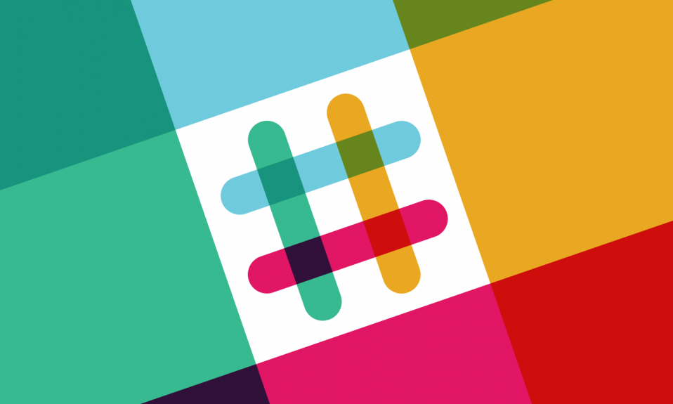
Slack logo evolution
The logo became more complicated and more burdensome for the company. It was easy to make mistakes in the angle or color of the old logo, which could have had disastrous consequences for their image. Slack also stated that the logo was not compatible with backgrounds of different colors because they could clash. Slack came up with different logos for different formats to address this issue. Their logo for the app was not the same as the original logo. This is because Slack didn’t have a plan. The “hashtag”, a popular hashtag, has become a much more common term. The new image was created by Michael Bierut and Pentagram.

The Slack logo has been simplified from the original logo.
Slack logo meaning
The logo is now a combination 11 colors and an angle. The logo was unveiled in January and consists of four colors: red, gold and green, four small bubbles, and four rectangles with rounded corners. The logo can be used with other background colors, such as black or dark purple. The new Slack logo meets more needs and is more harmonious.
Slack logo font
Slack logo is featured a font called Hellix Bold.

Comment on their new logo
Some New Yorkers saw a Slack advertisement in two New York newspapers a few days before the official launch. Is it a typographical error on the part of the publisher? Rarely does an image change on the internet before it appears elsewhere. During the launch, comments arrived quickly. Although the company did take the time to explain the reason for the change in a blog post many people had already concluded that Slack’s new look was no longer unique or interesting. Some thought the new logo looked like a duck, windmill, or four eggplants. During a logo change, no company is immune from criticism.
I’m a product and graphic designer with 10-years background. Writing about branding, logo creation and business.


