
More than half a century ago National Aeronautics and Space Administration (NASA) was convoked. It is this organization that allows us to study space, and it is something that mankind deemed impossible. Space probes, reaching our solar system frontiers, and manned shuttles, providing jolt to scientific programs, all of those is achieved thanks to NASA. The Curiosity rover, that was launched in the end of 2011, got all the forward and valuable scientific devices ever invented by mankind to Mars. Perhaps that is the reason for NASA logo to be one of the most famous logos in the world.
Table of Contents
NASA Logo History – Per aspera ad astra!
Nasa logo history originates from the first variations, created in 1959. It was looking rather interesting for those years, but it didn’t last long.
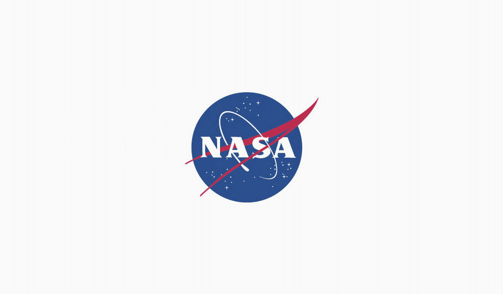
Then they decided to somewhat simplify the logo, making clearer and sharper. A lot of details were removed during designing process. Only crimson rocket trace, deep blue sky, boundless as space itself, white stars and NASA inscription remained. Later on, it was tenderly called “meatball”, while an official name was “Insignia”. That logo was very easy for a mind to grasp. Sky was just a sky and orbit was just an orbit, no hidden meanings at all.
NASA logo evolution
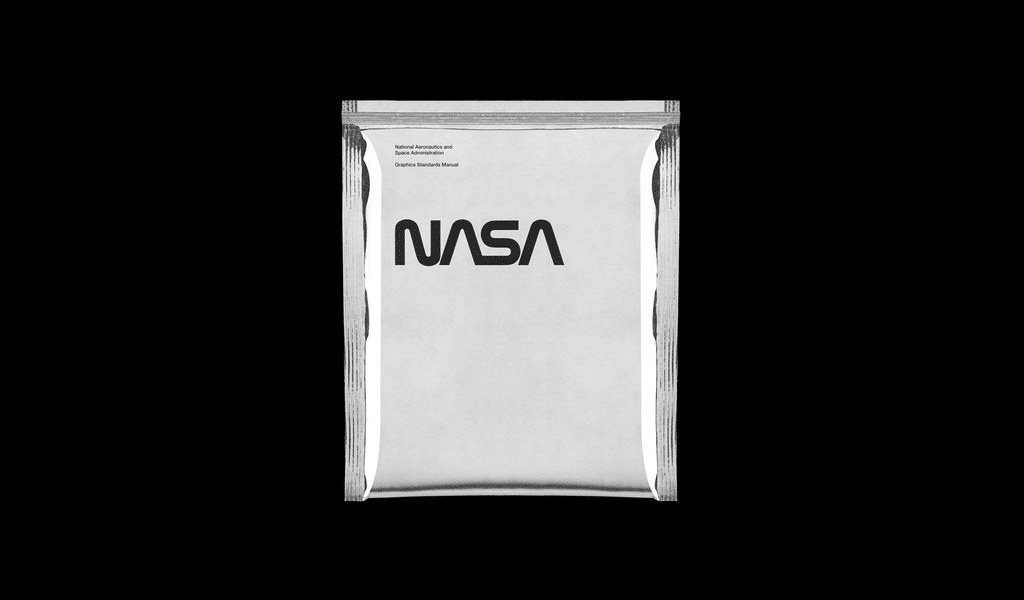
US government asked a designing agency to develop more up-to-date and relevant logo. Designers, hired for the project, decided to completely change the logo. They worked so hard that little was left of the initial logo, only a very stylish and elaborated NASA inscription.
Perhaps in our age of simplicity and minimalism such logo would be gladly accepted. Back then, however, the logo was rejected. It was called a worm logo, and it took quite a time for the logo to pass. Moreover, younger staff members liked the new logo more than the old one. In the end it was “youngsters versus old-timers” case.
The new logo was accepted and it even was granted an award for an exquisite design. Yet somehow, the “meatball” got back in 1992! The old logo was returned in order to resurrect a memory of the old merits. People started to forget about important milestones, such as Apollo program. Agency authorities decided to remind about mankind’s huge leap and prove that NASA hasn’t changed just yet.
NASA logo font
The NASA logo font – The Helvetica typeface.
Hidden Logo meaning – Meatball in other countries
Nasa logo was copied many times outside America. For example, the logo was used by Korea in 2014. They hijacked the emblem for their NADA space agency. It was done explicitly. The logos can easily be mistaken one for another, even the names are easy to confuse, and the company’s name sounds like forgery. Russian “Roscosmos” logo also reveals some similarities. The only difference is that the Russian logo is minimalistic.
To think of it though, space belongs to everyone, and the sky is always blue. Perhaps it that kind of situation when everything original was already used and it’s hard to come with anything new, for there is none. All in all, history of NASA logo reveals that a good logo doesn’t have to be obvious, and sometimes people enjoy visual propaganda.

SEO specialist, link builder, and blog editor at Turbologo. Writing insightful content about marketing, design, and branding. Sharing practical tips on building and promoting brands online.


