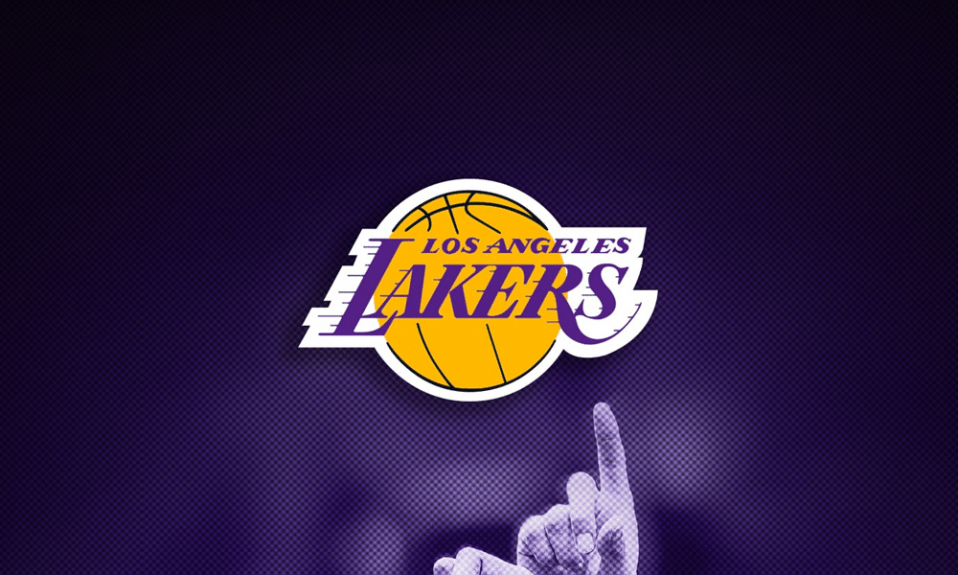
One of the strongest NBA teams appeared in 1960. It was then when the audience was introduced the first Los Angeles Lakers logo. Many predicted that the team will have a great future. And these predictions came true as Lakers are one of the most titled NBA team. The only one able to truly oppose them is probably Boston Celtics. That’s why Lakers is the most expensive team too. A total sum is hard to imagine as it is almost US$ 1 billion! The reason is good enough to tell about LA Lakers and their logo, isn’t it?
Create your own logo with Turbologo logo maker. It takes less than 5 minutes and no design skills needed.
Go to Logo MakerBasketball gets popular
Initially, the club was created in Detroit in 1946 and it was called Detroit Gems. Team logo was quite simple back then. Just a baseball ball frame with an inscribed team name inside it was. And lots of patriotic colors were there too. As we can see, there was nothing spectacular, especially in terms of professional logo design. Upon moving to Minnesota, the team changes its name to Minneapolis Lakers. Minnesota of often called a state of 10 thousand lakes, so there is nothing unusual about the name really. It is worth mentioning that the team hasn’t chosen an aggressive name like panthers, pirates, Vikings or tornado, and preferred being victorious rather than aggressive.
Want to create your own basketball logo? Explore basketball logo design ideas in our gallery.
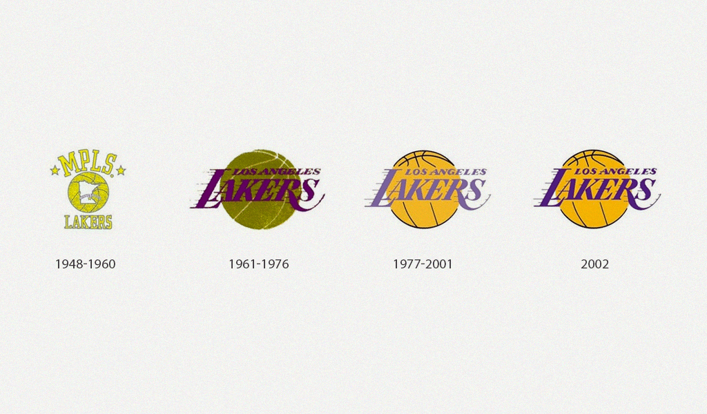
Minneapolis Lakers logo is of utmost interest as it was a prototype of the one which then became a symbol of triumph. It was a white Minnesota map on an acid-yellow basketball ball background. And Minneapolis city was marked by a bright white star there. And two yellow stars beatify an MPLS inscription in top part of the logo. This option remained until the team moved to LA in 1960. So, finally, Los Angeles Lakers logo history begins there.
Team symbols evolution
Of course as Lakers appeared in the city, so did their rivals. There were many clubs aiming at taking the place and title of the strongest LA basketball team. But Lakers did their very vest and not just beat their rivals, but also became one of the best NBA teams. While doing so, the team also developed the first Los Angeles Lakers logo.
A purple “Lakers” inscription with longitudinal lines is almost rushing near you on a golden ball background. Each league club must have a ball in its logo after all. And Lakers aren’t exception. There are a few who didn’t follow the rule some time ago, but it’s an absolute must now. The bigger is the organization the more strict rules it applies.
The logo variation turned out to be quite good. The ball was turned towards the audience in 1977. And more clean and bright shade of purple was applied too. The longitudinal lines became thicker stressing speed even more. All in all, no significant changes have been issued until today. Only shades of colors were altered to more pleasant ones. And no one can tell if the team we run rebranding or not.
LA Lakers logo font
As the depiction wasn’t changing, so was the inscription. So, what font was used to create LA Lakers logo? It is “Bodoni” and it is not team’s property. They have just bought rights to use the font. And anyone else can do the same thing and use it to one’s advantage.
Blog editor and content marketing specialist at Turbologo. Writing about Marketing and design. Victoria’s articles contain useful tips on how to build a brand and promote it online.

