Eyelash extensions – perhaps the most popular service in the beauty world. Its middle name is competition. In the struggle for clients come together and salons, and individual masters. In order to stand out in the variety of proposals, it is necessary to create a unique and attractive brand image.
Create your own logo with Turbologo logo maker. It takes less than 5 minutes and no design skills needed.
Go to Logo MakerThe logo is the first thing a client notices when leafing through the offers. If it reads well, evokes pleasant associations, and reflects the idea of the lashmaker’s brand, the chances of a response increase significantly. It’s worth taking the time to design so that the craftsmanship is well reflected in the corporate identity.
Table of Contents
What is a logo
A logo is a kind of recognizable mark. It can be represented in the following variations:
- icon (graphic symbol);
- typographic writing of the name;
- a combination of a graphic sign and text.
The logo can be used in almost all places where brand mention is required:
- on a website or official social media accounts;
- as an avatar;
- in price lists and promotional flyers;
- on employee uniforms;
- on plates and cups, if the salon offers coffee to the guest;
- on the signboard.
Therefore, the logo for the eyelash master must be versatile: look equally good in different backgrounds, not get lost and be readable.
How to make a logo for eyelash extensions

At first glance, the idea for the logo is not difficult to come up with. The imagination draws the eye and the expressive eyelashes. But do not rush to choose the first association that comes to mind. In the professional language of designers, it is called a metaphor of the first order. There’s a good chance that similar ideas are already used by hundreds, thousands of competitors.
A simple query of the form “logo for eyelash extensions” will help to make sure of this. Among the same eyes and eyelashes, non-standard images, such as those consisting only of fonts or concise lines, attract the eye.
It is useful to study examples of competitors and note among them the most successful. Highlight the main features that you liked in these images and try to combine them or modify them. Only recycled ideas can be transferred to your own brand.
After the analysis and rough idea phase of the logo design, you can move on to choosing colors, working out the shape and font.
How to choose a color
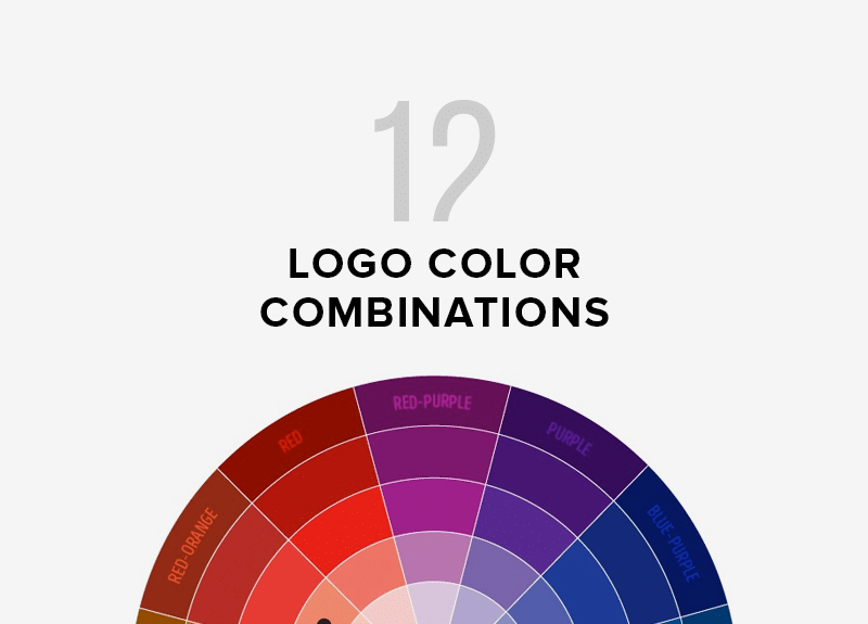
The color influences the perception of a person and affects his/her mood. There are whole theories about the color wheel and harmonious combinations. For example, opposite colors look good or, on the contrary, the colors that are close in shade.
The typical “premium” colors include beige, gray, and burgundy. Shades of pink and red are well known markers of energy and femininity. Brown gives a sense of comfort. Orange and yellow lift your spirits.
You can go the other way and use global trends. This is helped by the annual report of Pantone, the world authority in color selection. It is the reference point for many designers, including in haute couture, which has many points of contact with branding.
How to choose an icon
The question of choosing a graphic element has already been partially addressed, starting with the fact that there may not be an icon. If variants with font outlines are not suitable, examples of successful images that were selected during the preliminary analysis of competitors and trends come to the rescue. These icons are good to use as references – examples, from which you can draw your own symbol.
There are theories that assign certain properties to geometric shapes. For example, a circle is a good solution for the beauty industry. It is associated with benevolence and responsiveness. The square is considered the embodiment of stability and predictable results, which is also good for the service industry. The triangle and zigzag are less stable figures, which are characterized by dynamics, variability and high speed.
You can use free services to create icons. Another option is to add the details you like, seen in other logos. However, it is worth modifying them.
How to choose a font

It is important for lashmakers to include the name of the brand and service in their logo, as often the image alone is not enough. It is important that the potential client remembers the name of the salon or the name of the master.
There is a basic principle in the selection of the font: it should not look disjointed, as if it was chosen at random. The trick with a sneak peek at global trends also applies here. In addition, there are many free font selection services.
Tips for choosing a logo for an eyelash extension artist
- Before choosing the first association that comes to mind, you need to do a little research. As a rule, such an express analysis will reveal a few examples that resonate with the soul. You can save them as references for further processing. To search, do two simple steps: look at your competitors’ feed and a few pages of search results for “eyelash studio logo”.
- You can start your idea search by asking about brand values. Will it be a premium salon, which is important to emphasize client status? Or the main emphasis will fall on tenderness and femininity? Based on the positioning will be easier to find the right colors, shapes and associations.
- Excellent works the method of generating ideas. It is necessary to choose the characteristic features of your salon or favorite details of your competitors and transfer these features to your own unique symbol.
- There’s no need to overload the image. Laconicism and minimalism will look advantageous and will not require special drawing skills. In addition, the trend for simplification will remain relevant in the coming years.
- Global trends in design and color choices will suggest the right direction. They help you find a foundation from which you can build on in your further search for ideas.
Logos ideas for the lashmaker from Turbologo
Turbologo’s gallery of ready-made templates contains hundreds of logo options for companies in different fields. There you will find design ideas for an eyelash extensions master and you will be able to make your own logo based on them.
Conclusion
As in the work of the master of eyelash extensions, in creating a logo, it is important to conduct a preliminary analysis of the competitors and formulate your own value. Eyelash extensions are an area that needs to be regularly developed, mastering new trends and technologies. The same should be done when choosing a logo: identify fresh ideas and transfer them to your brand.
I’m a product and graphic designer with 10-years background. Writing about branding, logo creation and business.

