
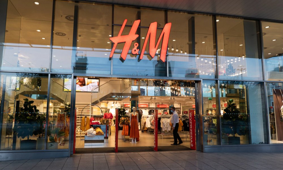
Not just any clothing brand can boast tremendous growth. There are but a few of them that managed to reach a global megacorporation level. One can notice the H&M logo in just about any mall these days. It’s one of the most popular clothing brands. Threads and accessories offered in the shops are created by the company’s designing team. Moreover, even world-renowned designers would like to collaborate with H&M and place the H&M logo on some of their creations. Today, we are going to take a closer look at the history of H&M’s success.
Table of Contents
H&M Logo History

Erling Persson, the company’s founder, originates from Sweden. He has been affected by World War II just like many of his peers. However, it also helped his business a lot. He got to the USA where he witnessed a completely different approach to clothes commerce. They paid more attention to the needs of the customers. And so Persson decided to adopt the tactics and offered usable clothes designs at reasonable prices in his homeland. That’s where the history of H&M begins.
H&M Logo evolution
So, few years after the war a new shop called “Hennes” opened in Sweden. “Hennes” is Sweden for “hers”. As you might already have guessed the shop was designed for women. The first H&M logo contained only a single handwritten inscription. Scandinavian design tends to be minimalistic and the first H&M logo wasn’t an exception.
Persson, however, kept going and developing his brand. He decided to purchase an already functioning clothes shop. He chose a huntsman clothes store. But the owner of the shop didn’t want to lose his business and offered Persson funds for further growth and became the first shareholder of the company. That’s how Hennes acquired Mauritz which was a surname of the huntsman store owner. It is these two letters that now were put together a new H&M logo.
Logo Font
Well, now that we know the meaning of the logo, the time has come to learn something about the font used in the H&M logo. The very first variation, being seemingly handwritten, was rather friendly and eye-catching. The inscription itself was slightly moved to a top angle. It was supposed to symbolize motion, confidence, reliability as well as stability.
After merging with the Mauritz store, a necessity for new H&M logo creation arose. The new option was a monogram with some explanations regarding the implied surnames. The lettering was written in Sans-Serif that was a very popular font back then. And shortly after that, in but a few years, some redecorations were applied to the logo resulting in an ultimate H&M logo version that hasn’t been changed throughout centuries. Logo is featured a HM Amperserif font.

It goes without saying that the abbreviation features some unusual font. It is actually a unique design developed especially for the H&M logo. Thanks to savvy management and capsule collections by famous and renowned designers the brand is loved and recognized across the globe. Trendy threads on sale have boomed many times causing customers to flood fitting rooms in H&M stores.
H&M Logo Symbolism
The Director Board of the company never saved for a rainy day, giving it all to proper marketing and advertising. As a result, a vocalist of ABBA that was on the top charts back then became the first model of an ad. The company’s name was conclusively reduced to two letters. After learning the history of the company there probably aren’t any questions like what does H&M logo means. But is there any hidden message? Well, sure, there is. A bright red hints that the brand is designed for teens.
An outlining has long since gone. There mustn’t be any borders for a trendy and modern H&M logo. You might consider that as advice. Don’t outline your logo if your audience is mostly teens and youngsters. In general, the logo conveys passion as well as youths’ desire for standing out from the crowd and finding where they belong. It is extremely recognizable. You can hardly confuse it with some other logo.
Dynamic lettering, traced by some wide and lashing brush, calls to immediate action. That’s why it’s hard to miss the store or simply walk by without having a look inside. H&M logo is also rather simplistic. It features no arty-crafty elements. It is not rooted in glorious history and boasts no hidden meanings. Nevertheless, the H&M logo has been designed more than fifty years ago and it still looks trendy, stylish, and inviting. That’s what a really good logo should be like.
I’m a product and graphic designer with 10-years background. Writing about branding, logo creation and business.


