All those silly and trivial designing ideas were actually major trends somewhat 15 years ago. And all those image solutions are no exception. Those ridiculous volumetric logos, created using Photoshop filters are completely obsolete these days. The flat and concise design seems to have finished the gradient logo design. However, as history goes in circles, so do the trends. Obviously, 2000s logos will never be trendy again. Nevertheless, some of their types, such as logos with gradients are tending to inspire designers nowadays.
Table of Contents
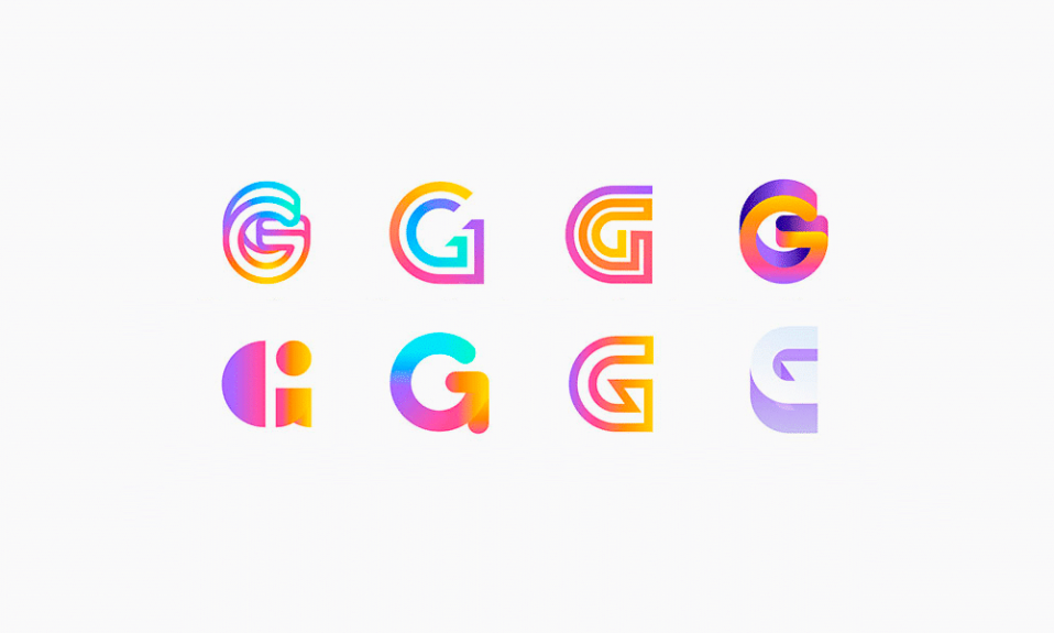
A resurgence in gradient logo design
A smooth flow of colors is trendy once again. Many famous companies have already adopted rebranding. Instagram has altered its retro depiction and now violet slowly flows into yellow and it’s beautiful! Only those companies which can afford some advanced IT services are following this trend and that makes them what they are. For instance, Google Play or Firefox icons are endowed with a colorful gradient. And this elegant, colorful solution is great for any business.
Adopting a gradient rebranding, you should keep in mind that such logo can soon be outdated. They surely are looking stylish now. They are state-of-the-art indeed. But how long do you think it will take for them to turn into an old-fashioned mockery? If still dare to add some gradient design to your logo or even completely redesign it, you should probably use an online-constructor. You will be able to design a vector logo in no time and download it.
How to create a proper logo with gradient
If you are going to design a logo by yourself, this part is for you especially. Firstly, you are to define just how wide the range of gradient colors is. Quite a plausible option is to choose a trendy color and combine it with some shades of that color. It might be rather narrow range of colors, but it is actually a way of creating a dim coating effect.
You can also use opposing colors, like in Instagram logo. However, if don’t have a professional training or at least a staff expert, it will be hard to make a smooth flow. In most cases there will be just a dull blot in the center. And only a few combinations are truly magnificent. So, grab red, green, blue and orange paint and start your experiments!
Trendy ideas and gradient logo

Have discovered any remarkable variations? If not, then here is a nice option for you! Try violet as it flows into scarlet clearly. And scarlet slowly turns into yellow. Another trendy idea is to split the logo into mosaic segments, like Google Play did. Apply close spectrum colors to small segments of your logo and you are sure to design something remarkable!
Examples of gradient logos






I’m a product and graphic designer with 10-years background. Writing about branding, logo creation and business.



Great info. Really appreciable work.