
The history of this megacorporation begins in the middle of the 19th century. William Colgate funded his tiny business in New York. The main trade was to deal with starch, soap, and candles. Many were foretelling a failure, companions were afraid of hardships, but he didn’t surrender to the conditions.
It took him but a decade to open his own factory. Yet his trade was the same. However, a few decades later the company focused on toothpaste manufacturing. And this move proved to be crucial in that respect. What was to come and had the Colgate toothpaste logo been changing is what we are going to tell you in this article.
Table of Contents
Colgate Logo history
The first Colgate logo appeared somewhat in 1897. That variation included the name of the product too. Namely, it was a state-of-the-art, perfumed dental cream. That’s what they used to call toothpaste back then. All the words except for the founder’s surname would disappear as the design would evolve. And the red and white color solution seems to last forever.
Another interesting fact is that a Colgate logo was placed on cans first and only then tubes followed as they also were invented somewhat around that time. At first, customers weren’t sure if it was worth buying. All these weird glass cans with all that dental stuff inside surely looked suspicious. But then a perfumed dental cream became as common as soap operas or Mickey Mouse.

A tooth powder actually rubbed away an enamel. And toothpaste provided a caring treatment. Moreover, exquisite cans featuring a red Colgate logo were rather handy. And when the company had switched to tubes it resulted in a huge sales boom. It was so convenient to squeeze a paste out a tube that is impossible to accidentally smash. The new product sometimes didn’t even touch mall shelves.
Logo evolution
Colgate merged with Palmolive (which still focuses on soap production) in 1928. That made Colgate a world-famous company. Thanks to effective management the company grew fast. And the merger multiplied a customer flow. After such a rocket start Colgate had but one worthy rival. It was a company that managed to sell fluoride toothpaste first. But Colgate was eager to accept the challenge and upgraded its manufacturing.
The initial lettering of a Colgate toothpaste logo was deliberately rounded as if the letters were squeezed out of a tube. And the next variation was written in shred and trim letters with capital letters. However, they rejected the move after some time. The third expression of the Colgate logo that was created in the 60s resembled the modern one. Then the company adopted rebranding in the 80s.

The majority of the audience remembers that one. Maybe it has something to do with a clear, bold font featuring minimal spacing. Or perhaps the company was at the height of its fame. Also, there weren’t many rivals and a toothpaste choice wasn’t that wide. The company owned significant advertising funds and that means that just about everyone knew the brand. The most demanded commodity was that of a “total” branch. Moreover, the market boasts an enormous choice these days, so it is a smart move not to alter the Colgate Total logo significantly.
Colgate logo Font
The font that the company uses hasn’t been changed since the beginning of the current century. They have chosen a slightly modified FreeSet font. It resembles the two previous versions of the Colgate logo. It is rather rounded and looks like a toothpaste squeezed out of a tube. A lining of letters isn’t always the same as it is getting thinner as another letter is written. There also are some right angles to mate the lettering somewhat more clear and geometrical. And after all of the above, only a few redecoration features were applied.
In 2004 is another minor change time in Colgate logo history. They have applied a little retreating shadow of some saturated, darker color. A trademark sign still remained at the top of the last letter. It was made slightly small and less bold. There also were a few attempts at diversifying the logo. For example, a lower ringlet of “g” was protracted to resemble (again) a squeezed toothpaste. Or they also tried adding a schematic smile below the logo.
A famous Colgate slogan is “It Cleans Your Breath While It Cleans Your Teeth”. Many people heard it as the company possessed tremendous advertising capabilities. However, there was no special font for the slogan. It is more of an oral tradition. Nevertheless, the company still has a guidebook of its style application that also brings usage of the Colgate logo transparent under regulation.
Colgate Logo meaning
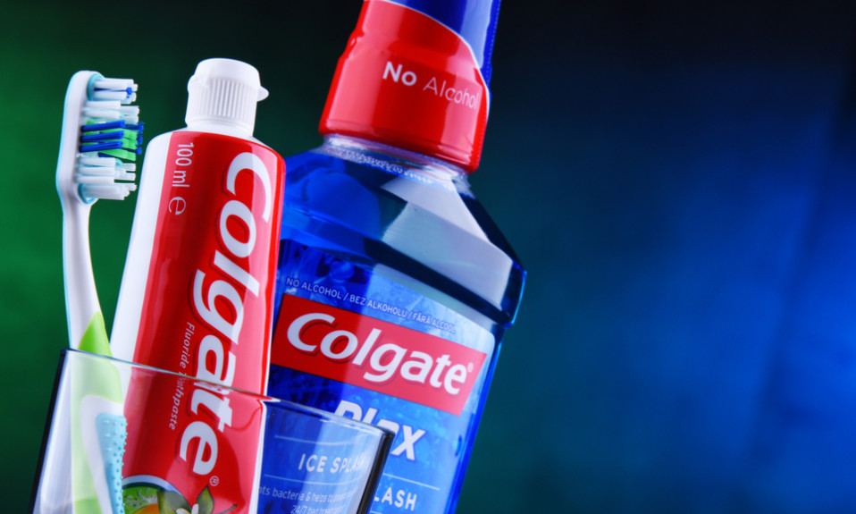
The symbolics of the Colgate logo is simple and clear. White stands in the logo for snow-white teeth and the toothpaste. And red background depicts the gingiva. Funnily, most companies of the same trade prefer using green. They seek to stress all the natural components used in their production. In the case of an aggressive red, however, the Colgate logo stands out of all the other toothpaste logos. That’s why it can be considered a worthy example.
One of the most remarkable moves is that of a planet-like logo. It was an avatar of Earth with a smile drawn with toothpaste squeezed out of a tube. The idea was to stress the naturality of the production. That point is crucial these days. Caring about the planet, the company tries to reduce the amount of plastic waste. For instance, they plan to make a package absolutely recyclable and environment-friendly. And they have already developed a biodegradable toothbrush.
Marketing moves of the company are pretty diverse and aren’t only limited by the Colgate logo. There was a time when the market was overflown with toothpaste products and that implied huge losses. Suddenly, the help came from one of the workers who suggested the most simplistic and effective solution ever. He told that it would be nice to make a bigger hole in a tube so that it was easier to squeeze the toothpaste out. And so they did. And just as the opening was increased so were the sales.
Even Colgate and Palmolive concern has its own logo. It features pleasant blue and grey shades. And they often use its monochromic version. Colgate and Palmolive logo looks like “O” resembling a circle. Well-designed “C” and “P” are united in a single depiction divided with but a thin, neatline.
I’m a product and graphic designer with 10-years background. Writing about branding, logo creation and business.


