A vital part of any successful brand strategy, in general, is having an effective logo design, and cities are no different in that respect.
Create your own logo with Turbologo logo maker. It takes less than 5 minutes and no design skills needed.
Go to Logo MakerBelow are my top eleven city logos from all over the globe.
Table of Contents
Why have cities logos?
Are you wondering why a city needs a logo? A city’s logo is a smart idea for many reasons. A strong brand presence can help to establish a unique personality, encourage tourism and business, as well as boost a positive perception of the area by residents and the rest of the world.
It’s not enough to just have any logo for a city. A great logo must reflect the unique character of the city. It takes a lot to create a good one. Every logo design is not the same as New York City’s. Below are some of the most iconic city logos.
The Best City Logos
1. New York
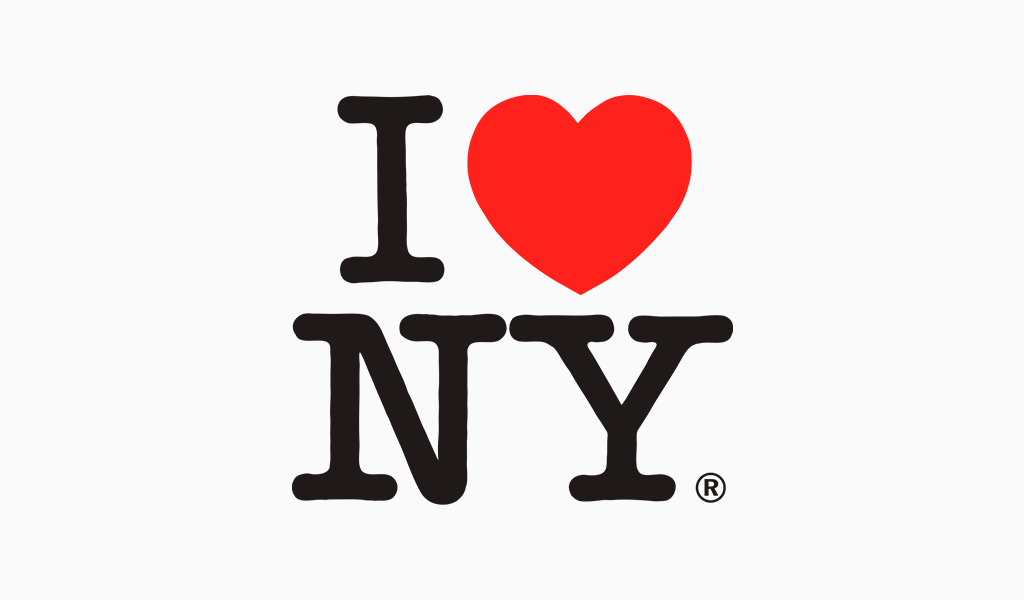
The most popular and copied image in the world is the “I Love New York Logo”. The logo was created to promote New York City’s tourism campaign.
The logo was designed by the well-known graphic designer — Milton Glaser in 1977 to promote the city and state of New York during the crisis in the late 70′
The I Love NY logo consists of an upper-case I followed by a red heart symbol and then the uppercase letters N and Y, set in American Typewriter’s rounded slab serif typeface.
The trademark logo generates more than $30 million annually through official merchandise such as mugs and t-shirts.
2. Amsterdam
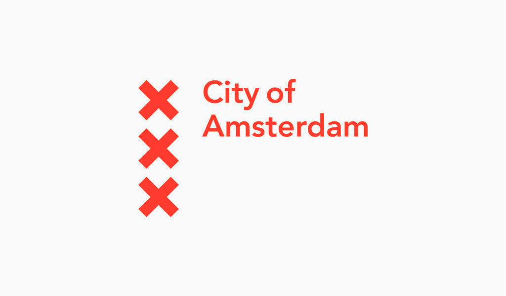
The City of Amsterdam didn’t have one single logo, but a system of logos comprising over 40 different variations, so the goal was to design one single logo for everyone.
The Amsterdam logo’s XXXs actually refers to three vertical St. Andrew’s Crosses
As you wander through Amsterdam, you can spot the city’s ‘XXX’ symbol on buildings, flags or even local food brands.
A unified system saves money because identical envelopes and letterheads can be bought in greater quantities for a lower price.
A single logo unifying the city allows them to use their vehicles anywhere they are needed.
Amsterdam’s identity system is simple and straightforward with few deviations in the application. This allows for consistent communication in a city that is already rich in creativity.
3. Melbourne
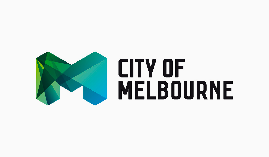
The diversity of Melbourne became the main concept celebrated the identity through color, forms, facets, and structures.
The Melbourne logo represents a progressive and dynamic city that is open to new ideas.
The overlay detail on the left side of M creates great tension. It then resolves to something simpler on the right.
Gradients add depth and breadth to a logo that is flat.
The primary logo is part of a wider set of adaptions in form and color – a great example of flexible identity.
4. Montreal
Tourisme Montreal sought to develop an image that would reflect the character of contemporary Montreal as a hotbed of creativity, a magnet for world-class talent, a breeding ground for new happenings, and an incubator for exciting, innovative ideas.
Montreal’s logo cleverly emphasizes the accent in its name.
5. Oslo
Oslo, the capital of Norway is the largest city. It has a population of over 650,000.
The reason for the new identity is a clear need to bring consistency – the old one gives a fragmented and unclear image (over 200 different logos in use).
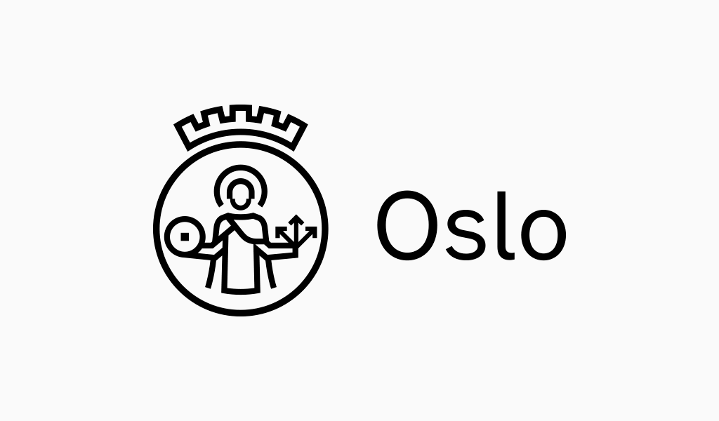
Oslo’s coat-of-arms: crown, millstone and arrowhead inspired the logo.
All businesses in Oslo would have to be under the same identity.
St. Hallvard’s logo uses a one-weight stroke.
The font’s wordmark is a customized font that was inspired by city signage. It has a unique, cool aesthetic.
6. Porto
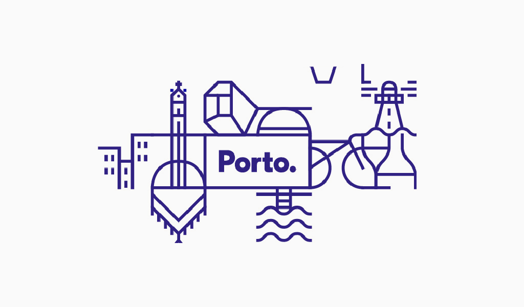
Porto, Portugal’s second-largest city, has a population of approximately 1.4 million. Porto’s large inventory of blue tiles inspired the branding of the city.
Porto is a collection of specific graphic references that can be combined in endless combinations in terms of both icon combination and pattern structure.
The logo of Porto is located in the middle of the flexible identity that depicts the city’s landscape. The wordmark is a sans serif geometric font that matches today’s bold, sanserif design trends.
These patterns create beautiful textures and are very attractive in signage around the city. Although it isn’t the most innovative or adventurous approach, it works well. It has been ambitiously designed and deployed all over the city.
7. Sao Paulo
Sao Paulo is the largest city in Brazil and one of the most populated cities in the world with 10 million people living in, and additional 10 million visitors a year.
The logo depicts a colorful explosion from a firework and represents the city’s party atmosphere. The bright colors are a sign of the variety and diversity of cultures found in and around the city.
The perfect symbol of a party atmosphere is the Sao Paulo logo.
8. Madrid
The creation of the new Madrid logo responds, to the needs identified in the Strategic Tourism Plan of the city of Madrid 2015-2019, which recommends strengthening the tourism brand.
Madrid is a city where everyone is welcome. Madrid’s people are a part of Madrid. They have a unified nature that makes everyone feel at home, regardless of where they came from.
Each city has its own intangible attributes and values. Paris is the city of love, New York the city that never sleeps, Rome the eternal city and Madrid the city of welcome.
Although the design is not as clear as it could be to convey this idea of embracing, it is at least sympathetic and original. It also maintains its consistency, despite changes in its shape and color.
9. City of London
London’s incredible history is reflected in its crest-like coat of arms logo design.
The St. George’s Cross is central to the mark, which is the flag of England that has been used since the crusades. It is surrounded by two dragons, and above them, a Knight. This symbol is a nod to the history of the emblem.
Like many coats, it also includes the Latin motto, which is translated as “O Lord, Direct us”.
10. Stockholms Stad (City of Stockholm)
The City of Stockholm rebranded 2013 with a new identity that included a custom-made typeface for St. Erik, the patron of Stockholm.
The brand as a whole is incredibly refreshing in its contemporary design, but the portrait logomark works so well in the range of colors within the vibrant palette.
11. Venice, City

Despite a poll suggesting that almost half of all Venetians disliked the new logo, I feel it is an elegant combination of style and history, in a form that feels typically Italian, despite being designed by a Frenchman!
Conclusions
A well-designed identity system for a city can boost tourism, change people’s perceptions, and bring consistency to all different city institutions. These famous logos of cities are sure to inspire you. A city branding campaign can be a visual trigger for a set or emotions that show a city in a positive light.
A professional logo can capture people’s imagination, instill pride and a sense of belonging, and spark the city’s economic growth through tourism and business investment.
The city’s logo, if done correctly, can support growth and change in population. It can also connect you dynamically to future opportunities.
I’m a product and graphic designer with 10-years background. Writing about branding, logo creation and business.

