Ever wondered how BTS’s logo transformed over the years? Spoiler: it’s not just a design thing — it’s a whole story of growth, identity, and the bond with fans. Let’s take a look at how these visuals evolved, and why they matter more than you might think.
Table of Contents
A Symbol of Evolution: BTS’s Brand and Fan Connection

The BTS logo didn’t just change — it grew up. The earliest version shouted resilience. The current one? It leans into connection, simplicity, and global relevance. And somewhere in between, the band — and their message — matured.
In 2017, BTS switched things up. Instead of clunky symbolism, they introduced something cleaner, more abstract. Two sets of trapezoids. Half-open doors. Not exactly self-explanatory at first glance — but the symbolism ran deep.
Fans saw openness. Growth. A meeting point between BTS and their ARMY. It wasn’t just rebranding — it was a shift in voice.
Where It All Began: The Iconic Bulletproof Identity
Back in 2013, when BTS officially debuted, they came in loud and proud — not just with music, but with a logo that screamed defiance. That bulletproof vest? Not just a cool graphic. It was a visual shout: we’re here to protect.
The name “Bangtan Sonyeondan” literally means “Bulletproof Boy Scouts.” So yeah, the logo made sense — grenade, spikes, lightning bolts, the whole package. It felt like armor. Not elegant, but unapologetically bold.
It wasn’t just edgy for the sake of it. The design tapped into youth frustrations, societal pressure, and a collective desire for strength. In that sense, the logo was the band.
The “Wings” Era: Subtle Growth in BTS’s Visual Identity
2016 brought a subtle but important shift. With the Wings album came a cleaner, more symbolic mark — four textured circles. Each one representing something unique. Each one tied to songs, personal themes, growth.
Compared to the original vest? This logo was almost whisper-soft. Minimalist. Reflective. A sign that BTS was stepping into more vulnerable, artistic territory.
They didn’t shout about it. But the change was there — and fans felt it.
2017: A Transformative Evolution
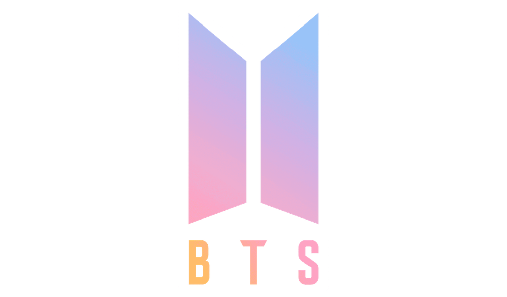
Then came the moment that really turned heads. In 2017, BTS introduced a logo that broke from the past completely. Gone were weapons and armor. In came a sleek, minimal design: trapezoids forming doors — or portals — half open.
It was clever without being obvious. Open-ended, symbolic. Like BTS was inviting fans in — or walking through into something new.
The meaning behind this logo was layered. It reflected not just aesthetics, but an evolution of purpose: to connect, to grow, to meet fans where they are.
The black-on-white version became instantly iconic. Sophisticated, but not cold. And perhaps most importantly — timeless.
The Symbolic Evolution Within the Design
Those trapezoids? Not just geometry. They stood for BTS and ARMY coming together. Two entities. Two sides of a story. Meeting in the middle.
This version also introduced a fresh meaning for BTS: Beyond the Scene. A promise of pushing boundaries, staying creative, and making space for something bigger than fame.
No glossed-over symbolism here — just a clean design with an open invitation. And fans got it.
Not Just a Logo — A Language
The BTS logo didn’t stay on paper. It showed up everywhere. Concert banners. Hoodies. Bags. Light sticks. Fans weren’t just wearing it — they were living it.
The logo became a quiet language. “Borahae” — I purple you — took on new depth when paired with that simple black emblem. And the famous ARMY Bomb light sticks? Each one stamped with the BTS mark, glowing like signals in the crowd.
It wasn’t corporate. It felt personal.
Cultural Symbol and Industry Blueprint
It didn’t take long for the rest of the K-pop world to catch on. BTS’s branding was working — really working. Their logo wasn’t just a nice design; it was a storytelling tool.
Other groups followed suit. Clean visuals. Narrative depth. Emotional resonance.
Meanwhile, the BTS logo became more than a music mark — it turned into a symbol of the Korean Wave. A subtle nod to language, identity, even social messages about self-worth and belonging.
Future of BTS Logo Evolution
What’s next? Hard to say for sure — and that’s part of the excitement. BTS isn’t done evolving. And chances are, neither is their visual identity.
But one thing’s certain: the logo will remain a touchpoint. A reminder of where they started, how far they’ve come, and the global family they’ve built along the way.
Maybe it’ll get a facelift. Maybe not. Either way, it’ll still say BTS — even without words.
TL;DR (But With Some Heart)
From bulletproof vests to abstract doors, the BTS logo has walked the same path as the band itself: bold, evolving, and always emotionally charged.
It’s more than a rebrand — it’s a chronicle. A connection. And if you ask the fans? It’s family.
FAQ
What was BTS’s first logo about?
Think bulletproof vest — tough, bold, and literal. It mirrored their name and their early mission to speak out against societal pressure.
How did it change?
Gradually. From chaotic and fierce to clean and conceptual. Each version reflects a different chapter in BTS’s story.
What’s the current logo trying to say?
That growth is ongoing. That BTS and ARMY are in this together. The open doors mean they’re still moving, still inviting fans in.
Why does it matter on merch?
Because it’s not just about fashion — it’s about belonging. When fans wear that logo, they’re carrying shared history.
Has it influenced others?
Absolutely. BTS’s visual strategy inspired a wave of K-pop acts to rethink logos — not as labels, but as languages.

SEO specialist, link builder, and blog editor at Turbologo. Writing insightful content about marketing, design, and branding. Sharing practical tips on building and promoting brands online.