Whether you’re making a brand name from scratch or planning to rebrand, knowing logo design trends can help you create a modern logo. Here are a few 2022 logo design trends that can form the basis of your mark.
Create your own logo with Turbologo logo maker. It takes less than 5 minutes and no design skills needed.
Go to Logo MakerTable of Contents
3D gradient

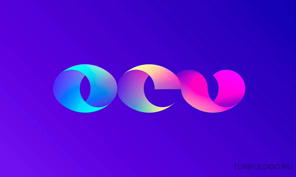
The popularity of three-dimensional gradients in logos is increasing. This trend will make any coloring dynamic and unique. The three-dimensional effect will emphasize the contrast between shades. Designers note that tapered gradients will only become more popular. This is because they transform a simple logo into a complex, elaborate mark.
Three-dimensional gradient logos look interesting and easy to remember. In addition, when creating such logos, you can let your imagination run wild: play with shades and their combinations. 3D gradient will turn an ordinary design into a bright concept.
Minimalism
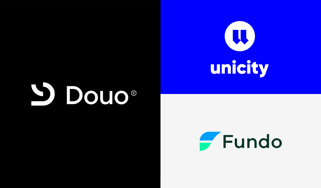
A minimalist logo can tell more by showing less. The trend for simplified logos will be relevant for 2022 as well. Additional elements are kept to a minimum in the sign, leaving key points in the spotlight. With the right logo design, you can demonstrate your originality and excite your audience.
Brushstroke
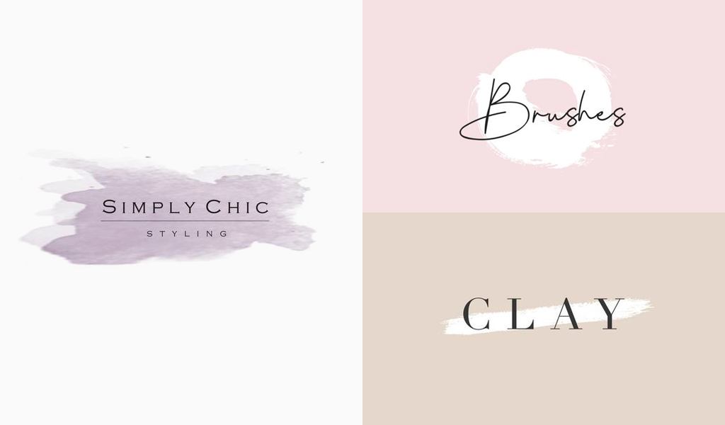
The “brushstroke” technique in logos is a recognizable style in modern design. And in 2022, it will be among the top trends. Audiences like brushstroke logos because they resemble handwritten text and drawing. Logos of this design are often used by women’s brands. Paint strokes give the sign a casual mood, a relaxed atmosphere. It is safe to say that this trend will be popular for more than one year.
Lettering fusion
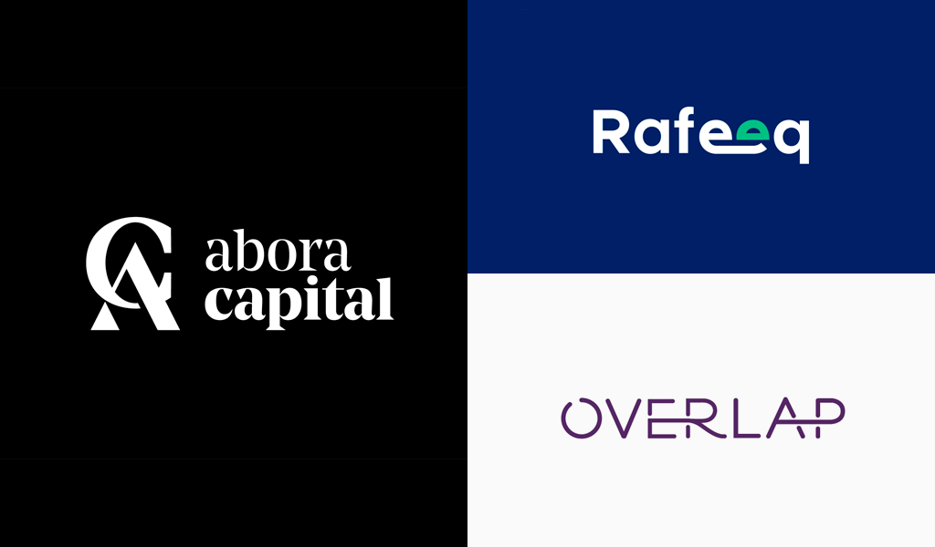
To make the logo memorable and interesting can be a fusion of letters. This trend gives freedom of creativity and allows you to reflect the originality of the brand. Letter fusion works by balancing colors and fonts to create an effective logo design.
It takes effort to find the perfect blend of simplicity and modernity with the lettering style. The fusion of letters conveys a powerful message about the brand image and makes a vivid impression on the audience. This way, the company has a better chance of attracting customers and retaining them in the long run.
Simple shapes
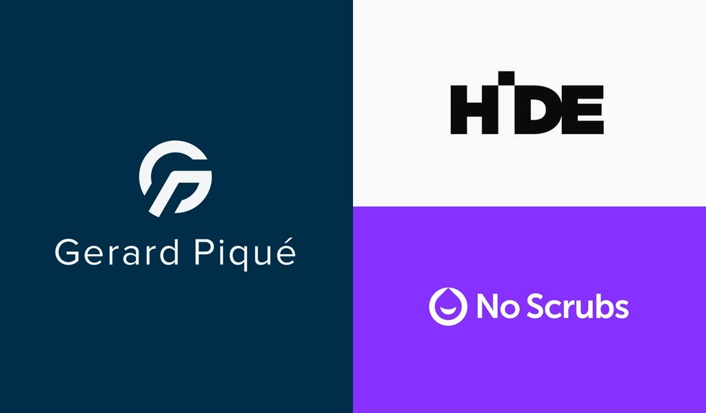
One of the major trends of 2022 is simple shapes in logos. This is a design trend that has remained relevant for years. Simple logos are easily recognized and remembered by the audience, thus promoting the brand. Following this trend, you can make an attractive and simple logo design that will attract the attention of customers and tell about the company.
Blurred logos
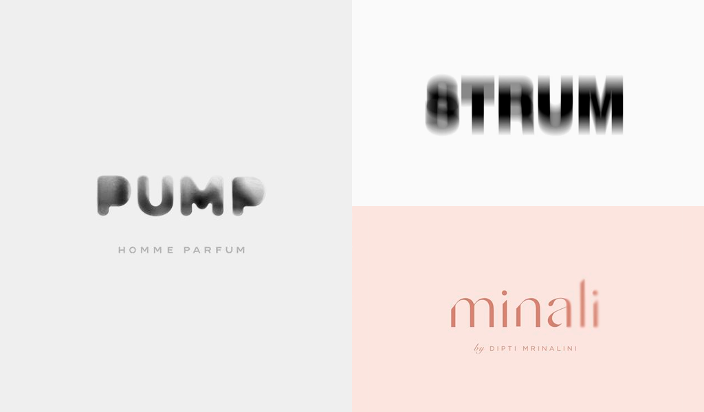
In 2022, readability of lettering will be a much lower priority as designers experiment with blur effects to emphasize fluidity and movement instead of focusing solely on readability.
A logo design option is to blur only the edges of the letters, leaving the bulk of the text legible and clear. Another interesting solution is to accompany the blurred logo with a clearly printed version of the brand name, so the customer understands exactly what the company is called.
Playing with letters
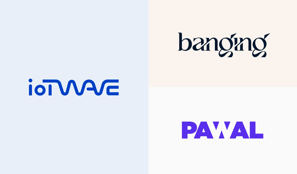
Destruction of parts of letters, their overlapping, indistinctness, voids in the lines – unusual solutions that will definitely attract attention. However, it is important to use this trend correctly so that the inscription remains readable. If the brand name is originally written but legible – clients are much more likely to remember it than in the case of a normally written text.
Stretched lettering
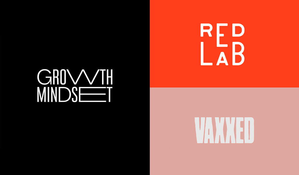
Stretched logos aren’t the only kind of distortion we’ll see in 2022 logos. Signs with stretched and continuous lettering to create a borderless design is another trend that will be widespread. You can stretch one or two letters while leaving the rest of the elements at their regular size.
With stretching, the pronunciation of the brand name changes: a speech accent is created on such letters. In addition, the distortion can reflect the direction of the company’s work.
Multi-layered elements
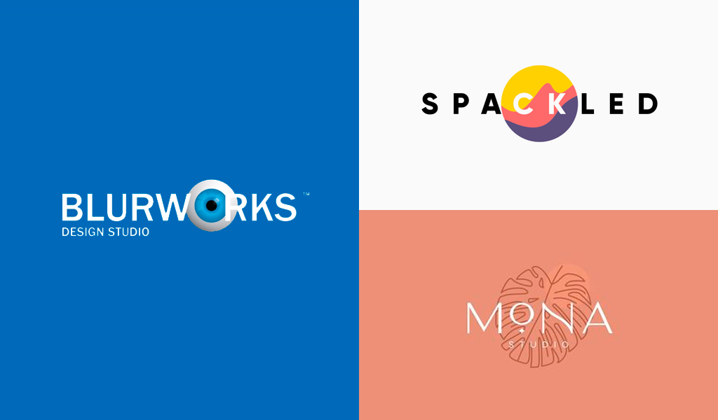
Another key design trend in 2022 is logos with layered elements. These logos have abrupt changes in color and pattern that break up and separate the elements of the logo. The components of layered signs are as if placed in different spaces, but still form a single harmonious picture.
Conclusion
Trends in logo design are important to consider in order to make an interesting and modern corporate sign. However, you should not rely only on fashion trends. The logo should reflect the concept and features of your brand and remain relevant for years and decades to come. Get creative and imaginative, take inspiration from trends, and create a unique product.
I’m a product and graphic designer with 10-years background. Writing about branding, logo creation and business.

