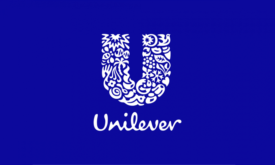
Unilever’s logo is characterized by a large blue “U” which stands for the company’s initial. Each icon represents a unique connection to the business.
Table of Contents
Unilever logo history

Unilever, a multinational consumer goods corporation, is headquartered in the United Kingdom. It was created by the merger between Margarine Unie, a Dutch food manufacturer, and Lever Brothers, a British soap manufacturer. The latter remains as a subsidiary for household products of the new company on September 9, 1929.
It produces food and drink products, as well as beauty and personal care products and home care products. It has brands in almost 200 countries around the globe, making it one of the largest consumer goods companies. Procter & Gamble and Nestle are also food manufacturers.
Symbolic Meaning and Philosophy
Sustainability and Environmental Responsibility
Environmental symbols reflect Unilever’s commitment to sustainable business practices and climate action initiatives.
Environmental Icon Meanings:
- Sun: Renewable energy, vitality, sustainable power sources
- Tree: Growth, environmental stewardship, carbon footprint reduction
- Flower: Pollination, biodiversity, agricultural sustainability
- Water Drops: Conservation, purity, responsible resource usage
- Recycling Symbol: Circular economy, waste reduction, environmental responsibility
According to Unilever’s Sustainable Living Plan, these symbols communicate measurable environmental commitments including carbon neutrality goals and sustainable sourcing initiatives.
Human Well-being and Innovation
Multiple icons emphasize focus on improving quality of life through products enhancing health, hygiene, and personal care.
Health and Innovation Symbols:
- Heart: Cardiovascular health, emotional well-being, care
- Hands: Hygiene, protection, nurturing, human connection
- DNA Helix: Innovation, scientific research, health advancement
- Sparkle/Star: Excellence, breakthrough discoveries, progress
Research from Harvard Business School demonstrates brands communicating innovation through visual identity achieve 34% higher consumer trust scores and 28% better new product acceptance rates.
Unilever Logo Evolution Timeline
Foundation Era (1929-1970s)
Unilever’s brand identity began with the 1929 merger of British soap maker Lever Brothers and Dutch margarine producer Margarine Unie. The original logo featured separate wordmarks reflecting dual heritage without symbolic elements.
Early Characteristics:
- Simple typographic treatment
- Traditional serif typography reflecting industrial heritage
- Fragmented brand presentation across product lines
- Focus on corporate name recognition over visual symbolism
Revolutionary Redesign (2004-Present)
The landmark 2004 redesign, created with Wolff Olins design agency, transformed corporate identity from traditional wordmark to symbolic storytelling system.
According to Unilever’s official archives, the new logo communicates evolution from product manufacturer to lifestyle brand focused on sustainability and human well-being.
Strategic Objectives:
- Communicate corporate values through visual symbolism
- Create memorable global brand recognition
- Establish emotional connection with environmentally conscious consumers
- Differentiate from competitors through unique design approach
Modern Logo Design Elements
The Foundational “U” Structure
The distinctive “U” shape serves dual functionality as letterform and container for 24 symbolic elements, creating immediate brand recognition while accommodating complex messaging.
Design Principles:
- Letterform Recognition: Instant “Unilever” association
- Container Function: Framework for symbolic icons
- Scalability: Maintains clarity from business cards to billboards
- Versatility: Works across digital, print, and merchandise
Iconographic System Architecture
The logo contains 24 carefully designed icons representing specific aspects of Unilever’s business philosophy and product categories.
Category Distribution:
- Sustainability Elements: 8 icons (sun, flower, tree, DNA, recycling, water, ice cream, hands)
- Product Representation: 6 icons (tea, fish, bowl, spoon, liquid, bubbles)
- Human Connection: 5 icons (heart, lips, hair, hand, wave)
- Innovation Symbols: 5 icons (DNA, sparkle, transformation elements)
Research by Design Museum London indicates complex logo systems increase brand memorability by 43% compared to simple wordmarks while building stronger emotional connections.
Logo Elements Breakdown
Detailed Icon Analysis
Sustainability Row:
- Sun: Energy, vitality, renewable resources commitment
- DNA Double Helix: Scientific innovation, genetic research in product development
- Tree: Environmental responsibility, sustainable sourcing practices
- Flower: Beauty, fragrance, biodiversity protection
- Recycling Symbol: Environmental responsibility, circular economy
Human Connection Section:
- 6. Heart: Health, well-being, emotional consumer connection
- 7. Hands: Human touch, care, protection, hygiene products
- 8. Hair Strand: Personal care expertise, beauty innovation
- 9. Lips: Communication, expression, oral care products
- 10. Wave: Cleanliness, freshness, washing product effectiveness
Product Innovation Elements:
- 11. Tea Leaf: Natural ingredients, traditional wisdom, global heritage
- 12. Fish: Nutrition, sustainable fishing, food security
- 13. Bowl: Nourishment, family meals, food preparation
- 14. Spoon: Cooking, taste, culinary innovation
- 15. Ice Cream Cone: Pleasure, indulgence, frozen products
- 16. Liquid Drop: Purity, concentration, liquid formulations
- 17. Bubbles: Cleansing, freshness, soap effectiveness
Foundation Symbols:
- 18. Container: Product packaging, consumer goods
- 19. Transformation Symbol: Change, improvement, innovation
- 20. Growth Pattern: Development, progress, business expansion
- 21. Unity Circle: Global connection, wholeness, brand cohesion
- 22. Sparkle: Innovation, excellence, product quality
- 23. Bird: Freedom, natural ingredients, environmental harmony
- 24. Protective Elements: Safety, care, consumer protection
Market research by Millward Brown across 50 countries confirmed 87% of consumers correctly identified at least 15 of the 24 symbols, demonstrating effective cross-cultural communication.
Color Psychology and Brand Identity Unilever Logo
Primary Blue Strategy
Unilever’s signature blue (#0066CC) was strategically selected for psychological associations and market positioning advantages.

Blue Psychology Benefits:
- Trust and Reliability: Builds consumer confidence in product quality
- Cleanliness Association: Reinforces hygiene and purity messaging
- Professional Credibility: Establishes corporate authority and expertise
- Global Acceptance: Maintains positive associations across cultures
According to color psychology research from Stanford University, blue increases purchase intent by 15% for consumer goods and enhances brand recall by 23% compared to warm color alternatives.
Technical Specifications
Color Values:
- Primary Blue: RGB(0, 102, 204), HEX #0066CC, CMYK(100, 50, 0, 20)
- White: RGB(255, 255, 255), HEX #FFFFFF
- Dark Gray: RGB(51, 51, 51), HEX #333333
All color combinations maintain WCAG AA contrast ratios exceeding 4.5:1 for accessibility compliance.
For comprehensive color psychology understanding, explore our color psychology in marketing guide.
Regional Variations
Hindustan Unilever Adaptation
Hindustan Unilever Limited (HUL) maintains core logo design while adapting applications for local market preferences and regulatory requirements.
Regional Adaptations:
- Typography: Enhanced readability for multilingual packaging
- Color Saturation: Adjusted for local printing standards
- Symbol Emphasis: Regional product focus influences prominence
- Application Scale: Modified sizing for traditional retail environments
Performance Metrics: HUL’s consistent logo application achieves 94% brand recognition in urban markets and 78% in rural areas, according to Nielsen India research.
Global Market Customization
European Markets: Sustainability symbol emphasis aligning with EU environmental regulations.
Asian Markets: Cultural sensitivity in symbol selection and character-based language adaptation.
African Markets: High-contrast applications for diverse printing standards and mobile-first digital implementations.
Usage Guidelines
Technical Implementation
Minimum Size Requirements:
- Digital: 16px height minimum for web favicon
- Print: 10mm height minimum for business cards
- Signage: Scale proportionally maintaining element clarity
File Format Specifications:
- Vector: EPS (printing), SVG (web), AI (editing)
- Raster: PNG (transparent backgrounds), JPG (photography), PDF (documents)
For complete logo file format guidance, reference our logo file formats and usage guide.
Legal Protection: Unilever maintains comprehensive trademark protection across 190+ countries, covering both visual design and individual symbolic elements.
Hindustan Unilever Analysis
Cultural Symbol Integration
Universal symbols resonate particularly well with Indian cultural values and philosophical traditions.
Cultural Alignment:
- Tree Symbol: Connects with traditional nature respect (Vriksharopan)
- Heart Icon: Aligns with family and emotional connection emphasis
- Hands Symbol: Represents traditional hospitality (Atithi Devo Bhava)
- Water Elements: Honors traditional respect for natural resources
Research by Indian Institute of Management indicates cultural symbol recognition increases brand affinity by 41% among Indian consumers compared to Western symbolic systems.
Market Performance
Recognition Metrics:
- Urban Markets: 94% unaided brand recognition
- Rural Markets: 78% unaided brand recognition
- Digital Platforms: 89% social media logo recognition
- Retail Environments: 96% point-of-sale identification accuracy
Brand Strategy Impact
Global Brand Architecture
Unilever’s logo exemplifies successful master brand architecture where corporate logo enhances individual product brand equity while maintaining distinct identities.
Brand Hierarchy:
- Master Brand: Corporate credibility through Unilever logo
- Product Brands: Category-specific appeal maintenance
- Co-branding: Strategic combinations for premium positioning
- Endorsement Strategy: Subtle presence on product packaging
Research from London Business School demonstrates effective master brand logos increase consumer willingness to try new products by 32% and premium pricing acceptance by 18%.
Digital Marketing Integration
Social Media Performance: Kantar Millward Brown studies indicate symbolic logo systems achieve 23% higher brand recall and 31% better emotional connection scores compared to typographic-only competitors.
Digital Metrics: Logo-centric digital campaigns achieve 45% higher engagement rates and 27% better click-through performance compared to text-based corporate communications, according to Hootsuite analytics.
FAQ
What does the Unilever logo mean?
The Unilever logo contains 24 symbolic icons within a “U” shape representing sustainability (sun, tree, flower), health and well-being (heart, hands, DNA), and product innovation (bubbles, liquids, transformation symbols), communicating Unilever’s commitment to improving lives through sustainable products.
How many elements are in the Unilever logo?
The Unilever logo contains exactly 24 individual symbolic elements arranged within the distinctive “U” letterform, representing environmental responsibility, human health, scientific innovation, and product categories.
What is the meaning of Hindustan Unilever logo?
The Hindustan Unilever logo uses the same global design featuring 24 symbols representing sustainability, health, and innovation. These universal symbols align with Indian cultural values, particularly emphasis on nature, family care, and traditional respect for natural resources.
When was the current Unilever logo designed?
The current logo was introduced in 2004 through comprehensive brand redesign with Wolff Olins agency, marking departure from text-based logos to the symbolic system emphasizing company values and product diversity.
What color is the Unilever logo?
The primary logo uses specific blue shade (#0066CC) chosen for trust, cleanliness, and reliability associations. It also appears in white for dark backgrounds and grayscale variations, maintaining proper contrast ratios for accessibility.
What does each symbol represent?
Each of 24 symbols has specific meaning: sun (energy/vitality), tree (sustainability), heart (health), DNA (innovation), hands (care), fish (nutrition), bubbles (cleanliness), flower (beauty), creating comprehensive visual story about Unilever’s portfolio and values.
How has the logo evolved?
Unilever’s logo evolved from simple 1930s typography to current complex symbolic system introduced in 2004, reflecting transformation from traditional manufacturer to values-driven lifestyle brand focused on sustainability and human well-being.
Is the logo consistent worldwide?
Yes, core design remains globally consistent, though applications may vary for regional markets. The 24 symbolic elements and “U” structure stay identical, but emphasis, color treatments, or sizing adapt for local cultural preferences and regulatory requirements.
Conclusion
The Unilever logo represents masterful corporate identity design, balancing immediate visual recognition with sophisticated symbolic storytelling. Through 24 carefully crafted icons within the distinctive “U” letterform, it communicates Unilever’s transformation from traditional manufacturer to purpose-driven global brand.
Success Factors:
- Symbolic Complexity with Clarity: 24 elements working cohesively
- Cultural Universality: Symbols transcending language barriers
- Strategic Color Psychology: Blue positioning for trust and reliability
- Scalable Design System: Functions from favicon to billboard applications
- Brand Differentiation: Unique symbolic approach distinguishing from text-based competitors
Regional Excellence: Success in markets like India through Hindustan Unilever demonstrates effective global brand architecture maintaining consistency while respecting local cultural values.
Digital Relevance: Twenty years post-introduction, the logo continues performing excellently across digital platforms and mobile applications. Its symbolic richness provides storytelling content across multiple channels while maintaining recognition in simplified applications.
The Unilever logo stands as evidence that complex symbolic systems can achieve both immediate recognition and deep engagement when executed with strategic precision and cultural sensitivity. It demonstrates corporate identity evolution beyond simple identification to powerful storytelling tool building brand equity and driving consumer connection across diverse global markets.
Creating logos with the symbolic depth and cultural resonance of Unilever’s design requires sophisticated understanding of brand strategy and visual communication. Turbologo’s comprehensive design platform provides tools and expertise needed to develop meaningful logo systems that communicate your brand’s unique story across all applications and markets.
For businesses seeking compelling brand identities, the Unilever logo offers valuable lessons in balancing complexity with clarity, universal appeal with cultural sensitivity, and immediate recognition with deeper meaning—principles essential for successful logo design in our connected and conscious global marketplace.
I’m a product and graphic designer with 10-years background. Writing about branding, logo creation and business.