
There is an understanding of people’s need behind any successful startup. Each time when a new bright idea enlightens the world’s horizons in becomes slightly better. And people aren’t ready to pay for vague possibilities in distant future. But they are eager to pay for a real opportunity to make their life easier right now.
That is why we haven’t colonized Mars yet. And that is why we can just call a taxi today rather than drenching in the rain. This may seem a tiny deed, but making this idea come true once took a huge effort. That is why Uber company took its place on a market. Who knows, maybe some other novelties await us in the nearest future.
Table of Contents
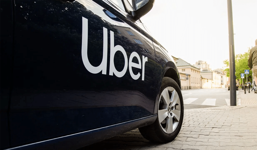
Uber logo meaning
The whole business has begun as a startup of two active persons. And they have offered something revolutionary. Initially, Uber has been named as UberCab, so that everyone would understand that taxi is meant. And the first logo has been simple too. The company founder has just used Photoshop to draw a big, red and super thick letter “U”. And then he has typed “Uber” above it. And it has become a shortened version of the logo. And he has done the same for UberCab logo. Only two thick letters “U” and ”C” has been there. Only this and nothing more. But when the company was clearly about to become something serious, the founders realized that the logo has to become something more as well.
The new Uber logo inspired by the “bit” and the “atom”, which are the small parts of technology and the world itself.
Uber logo history
It took only ten years for tiny company to become the most influential and large-scale taxi service. Despite the fact that there are protest marches against the company, and some are trying to shut the company down, Uber is doing just fine. Taxi drivers, annoyed by service cost reduction can simply do nothing about it. And just a few years ago they were the ones who stated the price. And it was their decision alone whether to take an offer or leave it. So, how come that their monopoly has come to an end?
The first Uber logo was introduced in 2010, when the company name was UberCab. The logotype was featured with a red “UC” lettering at the top of the emblem. Then the name was altered and the logo dropped the “C” and the word “Cab” were dropped.
Uber logo evolution
The first version of the logo made by a professional has looked like another “U” of medium thickness. A font could list some notches and colors haven’t been many (black and white actually). However, it was this combination of colors that has become rather recognizable regardless of being gloomy enough. On the other hand, we might say that the result has been looking no less than exquisite. And that might just be the goal. Taxi service must look stylish in XXI century.
The variation has suited many. And a unique, monochromic inscription has been created in 2016. Uber direction has perceived the logo as elegant yet not pretentious. It has made the company noticeable as Uber has also asserted themselves and their values. Finally, the company has become popular and recognizable.
New Uber logo rebranding
Nevertheless, the company has announced rebranding in even less than 10 years. Many critics view it as an unnecessary decision. And an altered Uber logo triggered even more negative reaction. The rebranding has been followed by an emotional tornado as the meaning of the new logo is hard to get even being a professional. Color combination has included now more vivid colors. However, there hasn’t been developed a unified color combination. It differs from one country to another as it tries to adapt to cultural features.
So, what is the meaning of Uber logo? The company direction is sure that those are bits or atoms. It implies that people often don’t even think about such tiny and insignificant things. Yet whatever small atoms are, they are part of our everyday life. Maybe Uber direction will delve deeper into the critics someday and come up with clearer logo!
Uber logo font
The lettering in the new Uber emblem is featured a custom “Uber Move” typeface. This font resembles to the font that is common to use for transportation signage around the world.

SEO specialist, link builder, and blog editor at Turbologo. Writing insightful content about marketing, design, and branding. Sharing practical tips on building and promoting brands online.


