Google has rebranded the Google Chrome browser icon. This news was shared on Twitter by the company’s designer Alvin Hu.
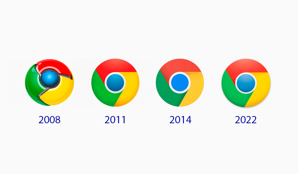
The new logo is not much different from the previous version. It was decided to simplify the sign to meet modern requirements. However, many users didn’t notice the difference. So what has changed in the Google Chrome logo?

In the new version of the Chrome logo, the shadows have disappeared and the sign has become flat. The proportions have also been simplified somewhat. The colors remained the same, only brighter, without a pronounced gradient. In general, the logo stayed almost unchanged, but it looks livelier and more modern.

Designer Alvin Hu also noted that the new Chrome logo is adapted to different operating systems. For example, for Windows 10 and Windows 11, the icon has a smooth design, while for Chrome OS, the logo is in brighter colors (no gradient). This will keep the icon consistent with the appearance of the other system icons.
The updated version of the logo will soon appear on all devices and operating systems.

SEO specialist, link builder, and blog editor at Turbologo. Writing insightful content about marketing, design, and branding. Sharing practical tips on building and promoting brands online.


