Formed in 1994 in Berlin, the band has paid great attention to the visual component of its image from the very beginning. Simple and neat, the Rammstein logo nevertheless carries a deep meaning and has an interesting history of its creation.
Early period: 1995-2004

Guitarist Paul Landers reportedly designed Rammstein’s band logo in the early years. The design was minimalistic. It reflected the band’s industrial and provocative style. At that time, the logo was primarily text-based. It featured massive letters in a strict, gothic-like brutal font. The letter “T” was replaced with a bold, stylized cross.
The visual part of the logo emphasized the aggression and heaviness of their musical sound, but did not yet have any symbol. This was a formative period, and the main focus was on creating a recognizable name, rather than a complex visual identity.
Rammstein symbol appearance: 2004 to present

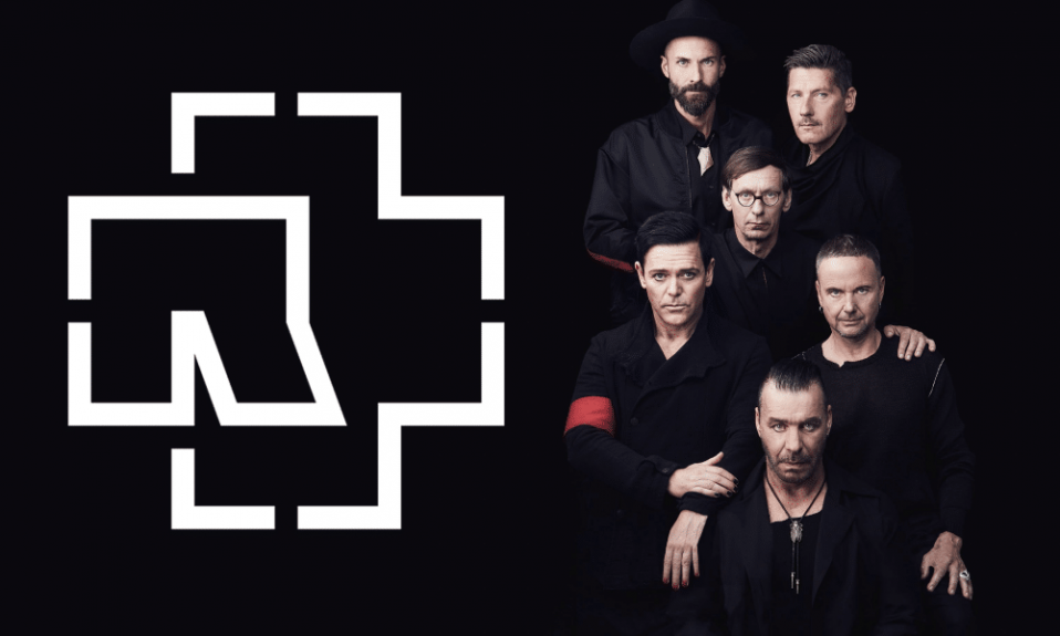
In 2004, the Rammstein logo changed significantly. The band introduced an iconic symbol that became their hallmark for decades. The central element of the logo was a cross. It looked like a schematic intersection of lines forming the letter “R.”
This cross, combined with the heavy font of the band’s name, became an integral part of their corporate identity. The cross symbolizes strength and unification, and is a prime example of how minimalist design can become a powerful visual symbol.
The text element of the logo remained massive and angular, which emphasizes the solidity and permanence of the brand. The simplicity of the logo design makes it easy to scale the Rammstein logo even in PNG format for use in both small icons and large banners.
The Logo Rammstein: A Timeline Consistency

Since 2004, the Rammstein logo has remained virtually unchanged. It has become a stable and recognizable symbol of the band, and is present on all concert materials, albums, and merchandise. This approach emphasizes their stability and strength, while maintaining a connection with their musical philosophy. Thus, the Rammstein logo has gone from a simple text solution to a powerful graphic symbol that resonates with a multi-million army of fans around the world.
I’m a product and graphic designer with 10-years background. Writing about branding, logo creation and business.