If we scrutinize famous brands’ logos, we are sure to notice a certain tendency. It was fancy to endow brand depiction with various ringlets, notches and other beautifications. Look at the very first Apple logo. And now compare it to the current one. A certain funny theory says that a mermaid in the Starbucks logo will be able to retain only her face in ten years. And in twenty more it would be great to still have that green circle. It may be but a joke, yet it still holds some important gist. Minimalism is trendy and it’s going to remain so for quite a time. In our today’s article, we’ll tell you how to create a minimalist logo with minimal effort.
Table of Contents
Simple symbols in modern branding
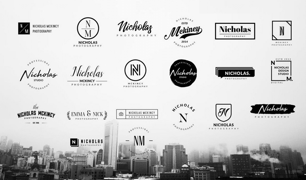
So, what companies can boast the least fine label? Those which are edging out by following the latest trends can. Social networks, such as YouTube, Instagram, Twitter and others are revealing most ordinary labels. High-tech companies are keeping their eyes on the trend too. Apple and Xiaomi labels are just simple. Canon and Sony have only a company name for a logo. And Hewlett-Packard 2016 is only comprised of four lines!
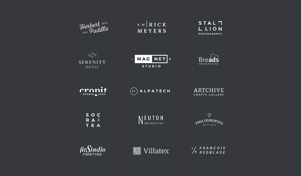
All in all, if we look at overall rebranding results, we’ll see that every famous company follows trends. Even fast-food companies, caring about recognition a lot, are using minimalistic designs. Subway removed outlining, KFC simplified the depiction and McDonalds already can’t become even simpler!
Ideas and types for minimalist logo design
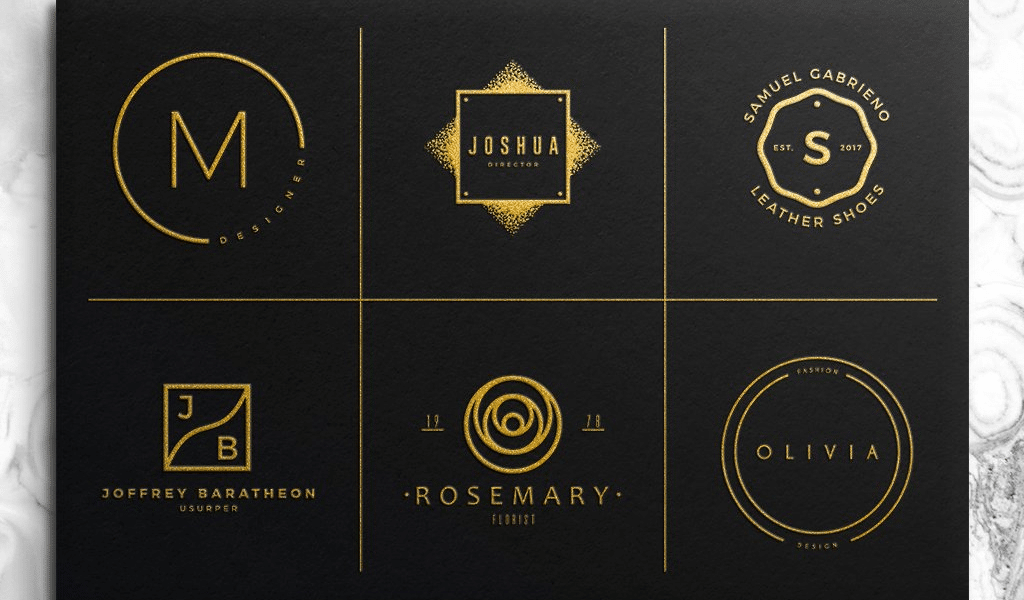
If you have no idea what to begin with while creating a new design, try addressing professionals. The process of creating both meaningful and concise picture is an arduous task to complete. It’s best to go to online logo constructors. There you can find many graphic templates and types readily available for you. That will enable you to collate the best option possible and download a vector image of it.
However, if you have decided to create a trendy minimalist logo on your own, you’d be wise to start with an inscription. And most famous brands have only an inscription in their logos actually. You’ll need a good font for this though. Of course, it is supposed to be devoid of any ringlets, notches and those “stylish solutions”. Basically, you’d better avoid “Times New Roman” or “Lobster” and prefer something like “Arial”, “Bebas” or “Intro”. If you have read our previous articles, you are sure to remember that the best minimalistic font is “Helvetica” as there numerous minimalistic inscriptions designed using that font.
Non-standard techniques for crafting minimalist brand logos
The trickiest move is to combine an inscription and a depiction. Choose ordinary, rounded type and shape a depiction into one of the letters. This will enable you to save lots of space and avoid using useless details. Proper example here “Pandora” brand. The letter “O” is designed as a diamond ring. Negative spacing is another “secret move” as most people still tend to forget about it. And it’s their loss, really. You can provide twice the amount of information by using the move. The thing is to design it slowly and carefully though. That well-known “FedEx” arrow is a good example of negative spacing.
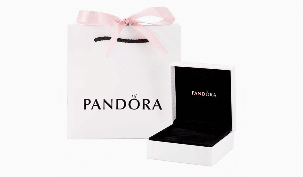
It is worth mentioning though, that you don’t have to create a brand new minimalist logo design. Most companies just simplified their logo. So, the advice here is to use your imagination and make up a perfect depiction caring only about results. And then simplify it! Keep removing details and you’ll know when to stop. You’ll be surprised just how simple it is!
Examples of minimalistic logos


I’m a product and graphic designer with 10-years background. Writing about branding, logo creation and business.


