What makes a financial website look trustworthy and a toy brand feel playful? In many cases, it’s the font. Understanding different font types helps beginner designers and entrepreneurs go beyond picking something “nice” — it’s about choosing the right visual tone to match your message and build a memorable brand identity.
This guide breaks down the most common font types, explains their key features, shows where they’re typically used, and helps you choose the right one for your logo, website, or product. You’ll also see real examples and learn how to test fonts that reflect your brand personality.
Table of Contents
Main font types
- Serif: Traditional and trustworthy (e.g., Times New Roman, Garamond)
- Sans Serif: Clean and modern (e.g., Arial, Helvetica, Open Sans)
- Script: Elegant and handwritten (e.g., Pacifico, Great Vibes)
- Display: Decorative and bold (e.g., Lobster, Bebas Neue)
- Monospace: Technical and structured (e.g., Courier New, Consolas)
| Font Type | Style | Examples | Best For |
|---|---|---|---|
| Serif | Classic, formal | Times New Roman, Georgia | Books, newspapers, law firms |
| Sans Serif | Minimal, modern | Helvetica, Lato | Logos, websites, tech startups |
| Script | Handwritten, elegant | Pacifico, Allura | Invitations, boutique brands |
| Display | Artistic, bold | Lobster, Bebas Neue | Headlines, packaging, ads |
| Monospace | Fixed-width, technical | Courier New, Consolas | Code snippets, developer tools |
1. Serif
This group contains the font styles serif, with perpendicular strokes at the ends of the lines. Those are classic fonts characterized by respect and reliability, arousing a warm feeling of comfort and illustrating preserved traditions. Some examples are the most used Times New Roman, Georgia, along with Trojan and Baskerville. Plus a lot of others.

2. Sans Serif
This one has no serifs, so letters are more “rounded”, which is why it looks more modern, innovative and neat. Its mission is to convey determination and professionalism. Such fonts are well-known sans serif font examples like Calibri, Helvetica, Arial, etc.

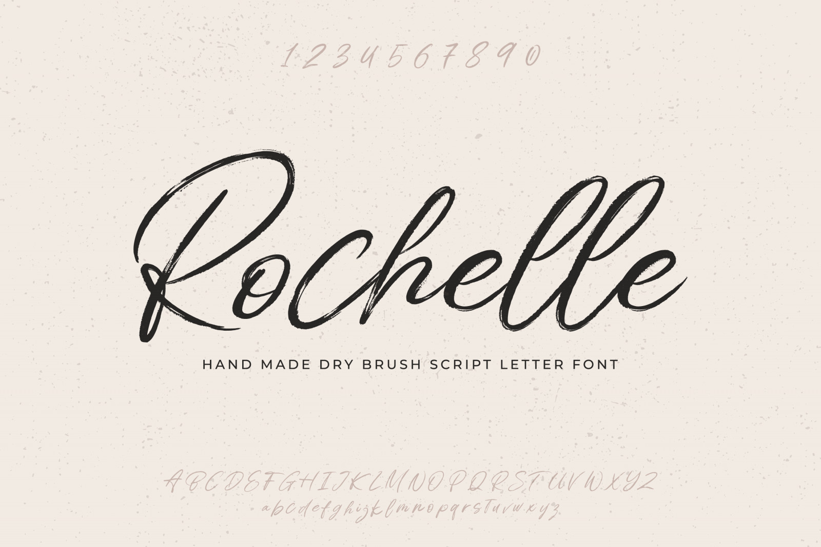
3. Script
The fonts of this group are called “handwritten” because each letter looks totally hand-made. Fonts like that are considered elegant, exquisite, conveying tenderness and care, as well as helping to implement creative ideas.
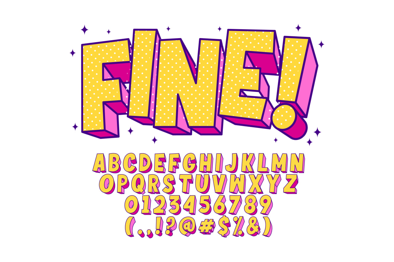
4. Display
In other words, friendly fonts, bringing joy, conveying expressiveness and uniqueness. Welcome Broadway, Copperplate Gothic Bold, Forte, etc.

What font to choose for a logo
1. The simpler, the better
What a logo orderer needs to keep in mind is: they will further need to use the services of different typographers to have promo materials printed. So, different formats and sizes will be needed, which means the font should be maximally readable – that is, simple. Otherwise, an overly complex font will look like a total mess in case of a small size.
2. Study the logos of competitors
First of all, you need to do this because you want to be different from them and not copy the same kind of symbols and fonts in your creation. And if you see the font you’d like to use, you already know what it looks like when integrated into a logo.
3. The font should illustrate the atmosphere around the brand
Thanks to the font, your brand logo will be remembered and recognized. So, the font should convey the main idea of the business. Thus, taking into account everything that’s mentioned above, it is best to choose a Display-type font for a creative business, whereas Modern-type fonts will serve serious businesses best since a high-level professional approach is required in such cases.
4. The less, the better
Sometimes several fonts are used in one logo. However, it is best to not do that. A combination of different fonts does not always look aesthetic and elegant, so, try to use one font at most.
5. Classic beats trends
The most trendy fonts of today may easily get obsolete and fall out of fashion, so you’ll have to rebrand, which incurs additional expenses. It is best to stick to classical fonts that will remain up-to-date for years.
How to Choose the Right Font Type for a Logo
Picking the right font for your logo is not just about aesthetics — it’s about sending the right message. Here’s a simple checklist to help guide your decision:
- Target audience: Who are you trying to reach? A children’s brand and a law firm need very different font personalities.
- Brand personality: Is your brand formal, playful, elegant, modern, or edgy? Your font should reflect that tone.
- Industry: Some industries favor tradition (e.g., finance, law), while others thrive on creativity (e.g., food, fashion, tech startups).
Once you have a clear sense of your brand voice and audience, you can narrow down the font types that align best with your goals.
Want to know the best font for a logo? Try them in our AI logo maker — it’s free and instant.
Font Type FAQ: Common Questions Answered
What’s the difference between serif and sans serif fonts?
Serif fonts have small decorative strokes (called “serifs”) at the ends of each letter. Sans serif fonts do not — they look cleaner and more modern, which makes them popular for digital design.
Which font types are best for logos?
SWhen choosing the best font logo, sans serif fonts are commonly used for modern, minimalist designs. Serif fonts work well for traditional or luxury brands. Script and display fonts can be great for personal or artistic brands, but readability should always be a priority.
What is the font for cursive?
Many readers ask “what is the font for cursive”. Cursive fonts are designed to mimic handwritten, flowing letters. Popular examples include Brush Script, Lucida Handwriting, and Pacifico, often used for creative or decorative branding.
Can I mix different font types in a logo?
Yes, combining different font type styles can create contrast and hierarchy — for example, pairing a bold display font with a clean sans serif. However, avoid mixing too many styles to keep your logo clear and cohesive.
Are free fonts good for branding?
Absolutely — many free fonts are high-quality and widely used by professionals. Google Fonts offers a great collection, but always check licensing terms if you’re using them commercially, especially when looking for the best font to logo design.
What font is the Barbie logo?
The Barbie logo is written in a custom cursive typeface that closely resembles fonts like Dollie Script or Barbie Medium. The exact font is proprietary to the brand, but these alternatives recreate the playful, handwritten style that defines Barbie’s identity.

SEO specialist, link builder, and blog editor at Turbologo. Writing insightful content about marketing, design, and branding. Sharing practical tips on building and promoting brands online.