The contemporary world is a world of visuals, full of bright and creative images. And a company brand neat outward appearance is a must if you are running your business successfully. Their many ways of logo creating and designing a business logo on your own are but one of them. Entrepreneurs, choosing this path to possess a huge advantage, as a hired designer, as qualified as it might be, cannot read your mind, can it? So, if you have decided to create a business logo you’ve come to the right place. And we’ll tell you how to manage this path, making no mistakes at all!
Create your own logo with Turbologo logo maker. It takes less than 5 minutes and no design skills needed.
Go to Logo MakerTable of Contents
An absolute basis
When you get down to branding the first issue to overcome is the simple question of how to create a business logo? First of all, look at your rivals and their logos. Do they pay attention to them? And what do you think of those logos?
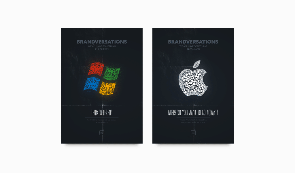
Also, it won’t hurt not only looking through your direct rivals but also through other companies. Many logos can be considered being state-of-art things. Remember well that an excellent design is eternal. Look through brand history, not modern trends. You might find answers you seek in the examples of past logos. Everything new is actually well-forgotten old.
Creating a business logo — a first step
First of all, you need to define the name of your brand. However, naming is a question of general branding, so let us think that you already have it. You have come up with a meaningful name and it corresponds to the mission of your company. And now look at your name with the designer’s eyes. Is it of palatable length? Are there any poorly compatible letters? For example, if there are two short words in your name, it is best (in most cases) to place them one above the other.
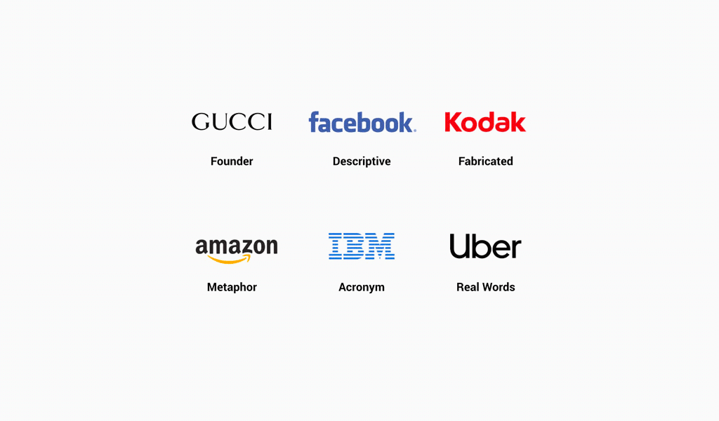
If you are having a good name you are halfway done. You don’t really need to be proficient with designing to create some DIY design. You can always resort to using a free business logo maker. It always is simple, convenient and clear. Nevertheless, before you will get down to compiling your logo, there is one more thing to know.
Basic logo design shapes for your business
If you deem labels to be randomly compiled shapes and letters, you are mistaking. It is the whole picture that translates the information; it is not about the name or slogan alone. Now we’ll analyze the most basic constituents affecting customer’s perception.
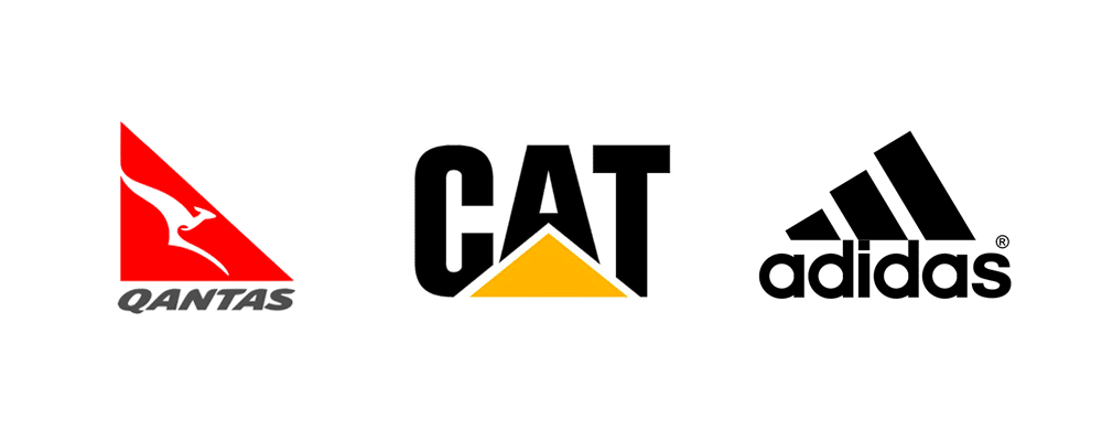
The first step when creating a business logo design is its shape. Obviously, a variety of geometric shapes is far from huge. However, all of the shapes possess their own meaning. The circle represents harmony and it is most pleasant to the eye. The triangle symbolizes an ability to stand strong and repel enemies if necessary. It is best to place the only angle on top, as it looks more reliable and stable. Low, steady triangles and pyramids do well in business and financial companies. This shape is associated with accumulation. If the triangle has two of its angles on top it becomes aggressive and pushing. Choose this shape if it corresponds to your business idea.
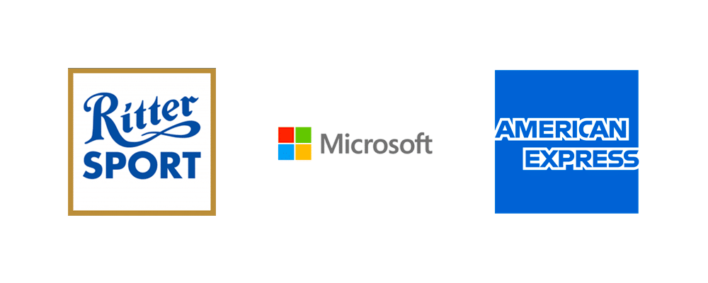
Square is associated with energy and resource production. So, if your company is somewhat related to these spheres it would be a good idea to choose a square logo. Rhomb is viewed as a symbol of wealth and patronage. Also, you can often see a spiral, as it is a symbol of eternity and life force. Stars and polygons are always good for any business, so you are to be careful when choosing them, as you might get lost among other similar designs.
How to choose a color for a business logo
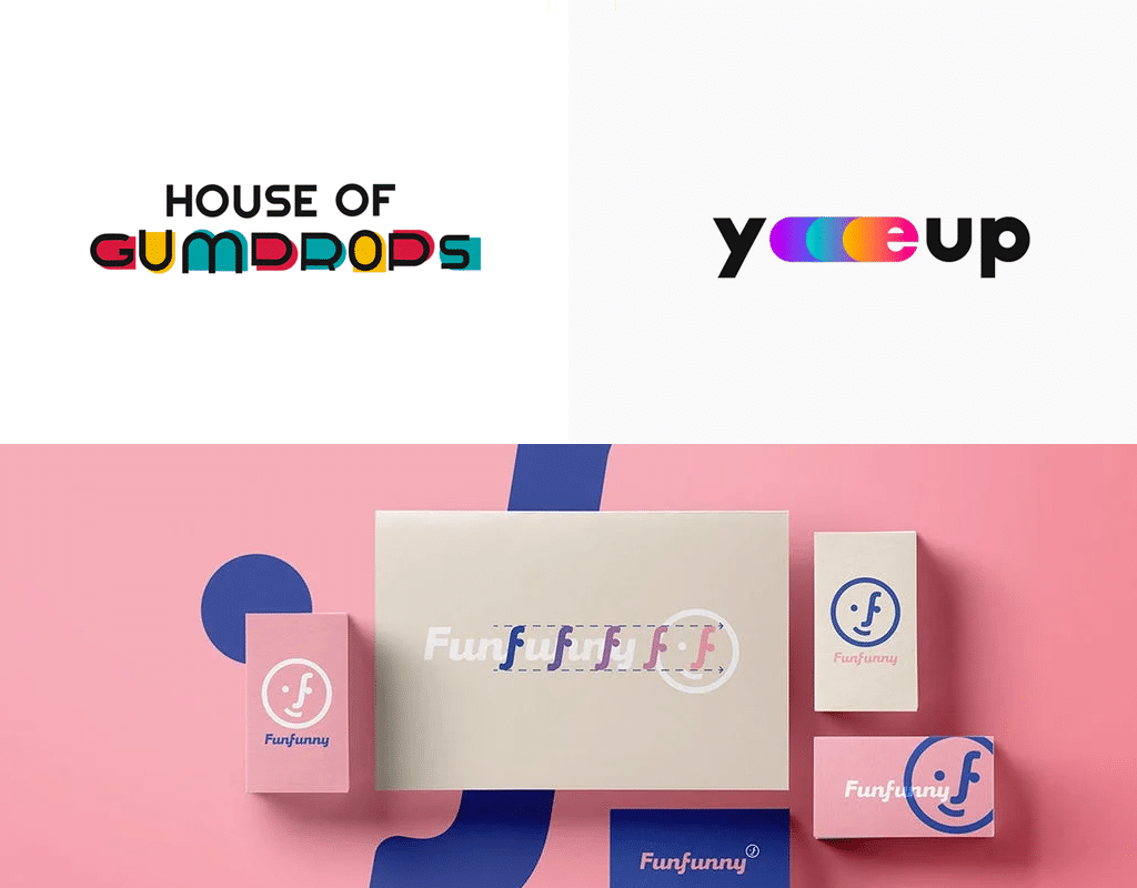
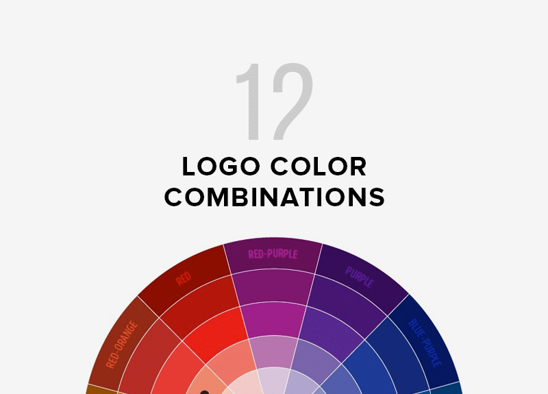
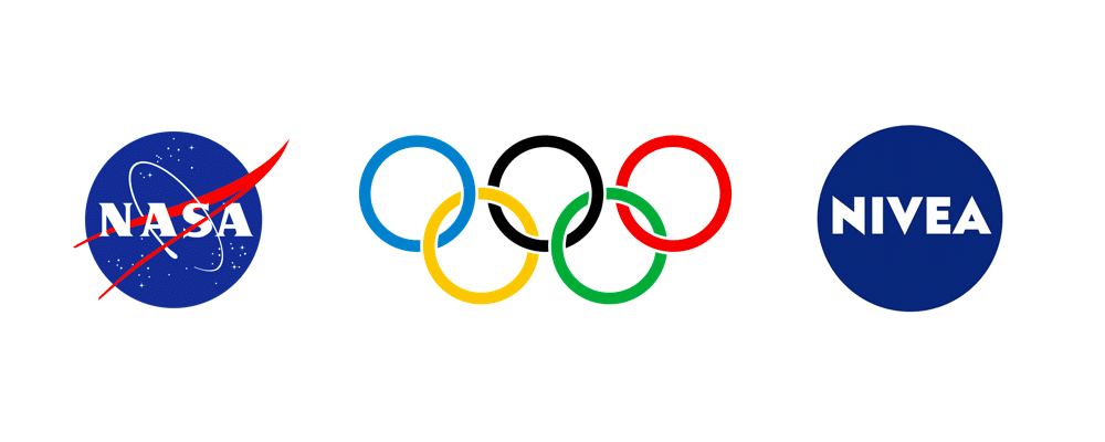
The next step is coloring. You must be extremely careful here, for many color combinations are strongly associated with certain brands. What’s more, there are settled combinations like red and green, which mean Christmas. Each color alone has its own, separate meaning. Red is associated with love and aggression. Yellow means prosperity and entertaining, and if you want to stress your company ecology preservation – choose green. Green color also symbolizes hope, and shades of blue convey a sense of stability, loyalty and succession. White color is for those, who chooses purity, calmness, peace. And you have come across black it unifies notions of complicity and emergency situations.=
How to reflect meaning when making free business logo

The most important thing here is not to focus on goods visuals too much. Don’t place in your label the first that came to your mind. If you are making pizza, don’t use a pizza in your logo, it‘s too obvious. Look at Domino’s Pizza, their label is more than just a circle of dough. Starbucks uses mermaid as a logo, and you will find no sneakers on the Nike logo. Certainly, you mustn’t go too far with creativity, but the modern world is already full of banality. Be sophisticated. Keep in mind that in the end your customers buy holes in the walls, not drills or augers. Concentrate on the inner sense rather than the outer one. Keep it that way and luck is sure to be on your side!
I’m a product and graphic designer with 10-years background. Writing about branding, logo creation and business.


