Not everyone knows what that acronym actually is. And the word itself sounds spooky. And semantics seems difficult to grasp too. Acronym is shortening based on the principle of relevant sounds. Unlike abbreviation, it shortens sounds instead of letters. You can perceive it as an abbreviation which can be pronounced like a word. It sounds even more complicated now, isn’t it? Well, the examples of here are PLZ, ASAP, LOL or 10Q. And those “words” can make a nice logo! Is it still complicated now? Anyway, there is still plenty to tell, so let’s get down to business!
Table of Contents
Why opt for an acronym logo?
That logotype is particularly good for monogram logos. It allows to make your logo not only apt and clear but also easy to memorize. The thing is that people just got used to shortening. It is actually one linguistic phenomenon. As a result of that, we can boast Mickey D’s instead of McDonald’s, SBUX for Starbucks and Dunkin’ Donuts sound like Dunkin’. And we all are able to understand what people are talking about.
By the way, it is possible that our grandchildren will purchase SBUX coffee in 50 years. Many of those brands we got used to are actually acronyms. What is Fabbrica Italiana Automobili Torino? FIAT it is! Try and guess the following by yourselves. What is International Business Machines, Bavarian Motor Works or Integrated Electronics?
How to design an acronym for your logo
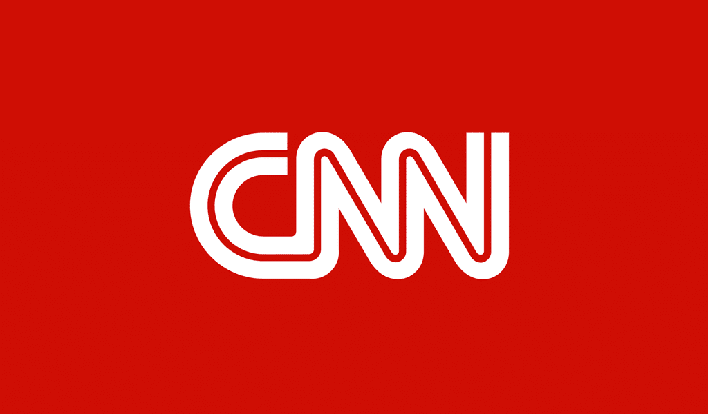
And so you are aimed at creation of both apt and meaningful brand name. Of course you can just shorten your current name if there is any. Something like Cable News Channel turns into CNN and High Tech Computer becomes HTC. However, if an abbreviation is ridiculous or hard to pronounce there are still plenty of things to do with it. For example, you might come up with some meaningful word and then encipher you logo into it. It is called backronym though, but it doesn’t change the gist at all!
It is a good bargain to get some trenchant word which hasn’t been widely used you’re your acronym must ridicule your company under no conditions. Hemisphere Order Negligences Kite and Ocean Island Notary Kempt are a good example here. Think of what associations could possibly be caused by your acronym. Some mothers’ goods would certainly require warmth, coziness and tenderness. However, it’s going to be some bloody computer game, a name is supposed to be scary and striking.
Acronym isn’t necessarily a word, but it can become one. And it surely conjures associations. “R” sounds powerful and “W” is rather soft and smooth. Suggest your acronym to your friends or relatives and listen to what they’ll tell you. They will actually provide you with extremely valuable outside perspectives.
Acronym design tips
If you made up something plausible, we strongly recommend resorting to the acronym logo generator. It will endow with sense every letter in your inscription. It is also capable of new acronym construction. Keep an eye on ridiculous variations, however, as there is still no AI clever enough to understand humor. Slang or vulgar names are intolerable of course.
It is a good idea to resort to your origins when making an acronym logo. IKEA branding is created according to that idea. “I” and “K” stand for Ingvar Kamprad, a founder of the company. “E” and “A” represent Elmtaryd farm and Agunnaryd village accordingly. Ingvar reflected his love for his origins in the logo. DKNY is another clear example here. “D” and “K” stand for Donna Karan, a founder. And “NY” is just obvious. The idea is that you can create such an acronym all by yourself and it’ll be as effective as professionally designed one.
Use nonstandard color combinations in acronym logos. The logo isn’t necessarily includes initials alone. Intel isn’t an abbreviation at all. It means just Integrated Electronics, but it looks like something more… intelligent, right? Acronyms can be comprised of two short words. Words like car, wash, bank, art, nap, bill make a nice material for that.
Acronym logo finalization strategies
If you were lucky to make up some pun, be sure to reflect it in your logo pic! Use negative spacing and simplify the inscriptions as much as possible. It would be perfect if letters will become part of depiction. Simple and clear lines stress aptness like nothing else. And you won’t have to design a simplified logo version if the logo is already simplified enough, will you?
The font is to be chosen according to required associations. It can be rounded and smooth or ragged and shred. As for the color, they often make it monochrome. It shows that shape comes after the message. And don’t forget to combine all the elements into something sophisticated or at least meaningful. A proper composition leads to harmony, and it is rather eye-catching!
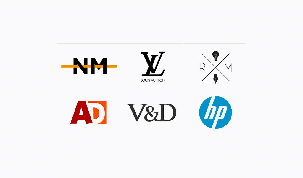
Acronym logo design illustrations
I’m a product and graphic designer with 10-years background. Writing about branding, logo creation and business.