Pastel shades are often undeservedly ignored. However, those colors can diversify your branding color pattern. Moreover, pastel colors convey a sense of refinement and subtlety. In general, pastel shades are associated with lightness, water and spring. And you can still apply them for various purposes.
The best pastel logo examples can be seen in many companies’ logos as it is a major trend nowadays. Sweets and desserts-producing companies usually resort to such images. Also, various spa centers, tourism companies and many establishments related to traveling and vacation would benefit from pastel color patterns. A majority of companies producing goods for children choose this mild color palette too. And today, we are going to tell you how to create a good pastel logo design.
Graphic brand design goals
You are sure to follow some set of rules when designing something as vintage and transparent as a cute pastel logo. Graphic design is a powerful tool used to fulfill certain objectives. They never create a design for the sake of design alone. It is created to achieve some goals in the first place. In most cases, they manufacture some goods first and then they seek to apply various graphic styles.
So, what makes a pastel logo inspiration? All the pastel colors are light, and all the group is of low saturation too. Their peculiarity is a high concentration of white, which creates this powder effect. If you have decided to add some light shades, you should know why exactly you do this.
What effects can be achieved by pastel logo design
There are but two tricks here. You either use contrasting, stressing some striking image, or you make the whole logo gentle, vanilla and airy. If you decide to follow the first path, just make sure to supplement the main color with its pastel sibling. Applying volumes, textures and material colors is a major trend these days. And it is perfect for pastel logo design as pastel color texture is pleasant to the eye. It feels gentle, yet it’s hardly detectable.
Pastel colors can be warm or cold. It depends on what color has been selected for being mixed with lots of white. For example, red is a very warm color. And its pastel variation will be much colder than the initial color. So, you can easily make your logo with the help of that technique.
You can also use backgrounds of such shades as they are very soft and still. Logo makers often use pastel shades in additional ornament color pattern. What’s more, pastel colors have a very useful feature of dissolving in space. They escape our attention if placed next to very bright colors. And that makes them perfect for contrasting. Yet they don’t result in pressure when you use too many contrasting colors. So, pastel colors are the best choice when you stress a single main color due to many unique features!
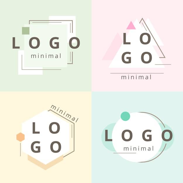
Examples of pastel logos
I’m a product and graphic designer with 10-years background. Writing about branding, logo creation and business.