When it comes to iconic brands, few can compare to the Oreo cookie. The black-and-white sandwich has been a constant companion to a cup of milk around the world for over a century. Behind the apparent simplicity of the Oreo logo design lies a rich history of evolution, innovation, and marketing genius. Let’s take a journey through the evolution of one of the most recognizable symbols of the candy industry.
Table of Contents
Origins and History of Oreo Cookies

It all started back in 1912 in a Nabisco bakery in New York. At that time, the National Biscuit Company (later Nabisco) was looking for a way to compete with the popular Hydrox cookies, released four years earlier. Few could have imagined that this “newcomer” would not only outlive its predecessor, but also achieve global success in diverse markets.
Initially, dunking Oreo were sold in metal tins with a picture of a glass dome on the packaging, and the cost of the cookies was only 30 cents per pound. The name, according to one version, could have come from the French word “or” (gold), since the first packages were golden in color. According to another theory, it is simply a short, memorable word, easy to pronounce in any language — a real marketing chameleon that can take root in any culture.
The first design of the cookies was significantly different from the modern one — it was more ornate, with a wreath along the edge and the company name in the center. However, the signature concept of two chocolate wafers with a white cream filling in the middle has remained unchanged since the beginning, proving the truth: sometimes the classics are the best way to the hearts of consumers.
Evolution of the Oreo Brand Name

The name “Oreo” has undergone a thorny path of transformations before it became entrenched in the modern consciousness of consumers. Initially, the full name of the product sounded like “Oreo Biscuit”, which reflected its English roots in the classification of sweet pastries.
In 1921, the first rebirth took place — the brand turned into “Oreo Sandwich”, emphasizing the unique structure of the cookie. A few years later, in 1937, the name evolved into “Oreo Creme Sandwich”, a reference to creamy filling, the highlight of the product.
Key stages in the evolution of the name:
- 1912 — “Oreo Biscuit” — the birth of a brand identity;
- 1921 — “Oreo Sandwich” — emphasis on shape;
- 1937 — “Oreo Creme Sandwich” — highlighting the sweet cream filling;
- 1974 — “Oreo Chocolate Sandwich Cookie” — modern formulation.
By 1974, the final name “Oreo Chocolate Sandwich Cookie” had crystallized, and it is still used in official documents today, showcasing brand consistency. However, the amazing magic of marketing allowed the brand to become known simply as “Oreo” — a short, sonorous name that crossed language barriers and became a household word. “Perfection itself sometimes needs no long introduction” — this is the principle that Oreo’s marketing strategy has followed for almost half a century.
Oreo Logo Design: From Simplicity to Recognizability
Over its century-long history, the Oreo symbol has evolved from a simple, ornate lettering to a global iconic logo recognized by billions of consumers around the world—an odyssey of metamorphosis that reflects both the trends of 20th- and 21st-century graphic design and the brand’s ambitions.
1910s: The Birth of the Classics
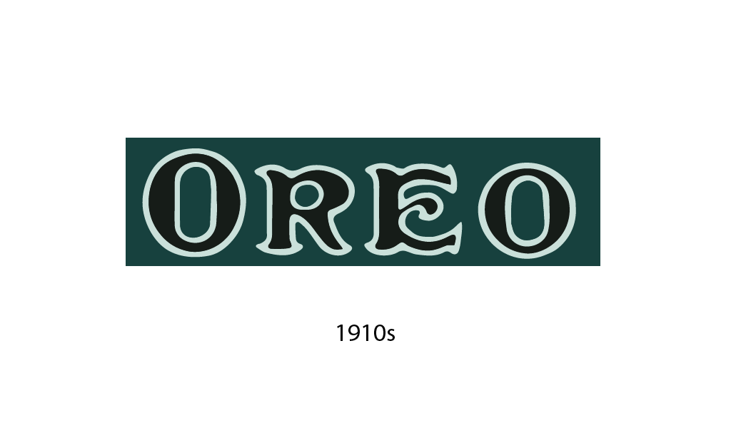
The first logo (1912-1923) featured ornate calligraphy on a dark background. The ornate letters and decorative elements reflected the aesthetics of the Art Nouveau era, a time when design strove for ornamentation. This initial look for what would become an iconic cookie resembled a luxury label rather than a mass-market delicious treat.
1920s: The Shift to Visuals
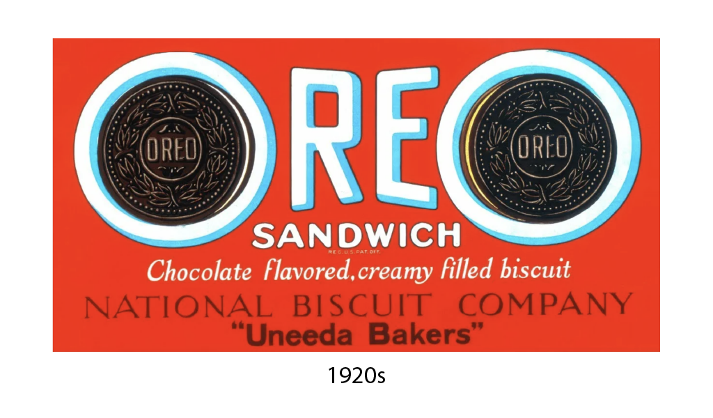
Between 1923 and 1931, the logo underwent a revolutionary change. The red background with the word “OREO” clearly highlighted and the signature “SANDWICH” created a striking contrast. Notably, the appearance of images of the American biscuits themselves on the sides of the inscription was a marketing move that literally showed the product face to the consumer. This visual honesty, combined with the rich color, enhanced the brand’s visibility on shelves.
1930s: The Age of Experimentation
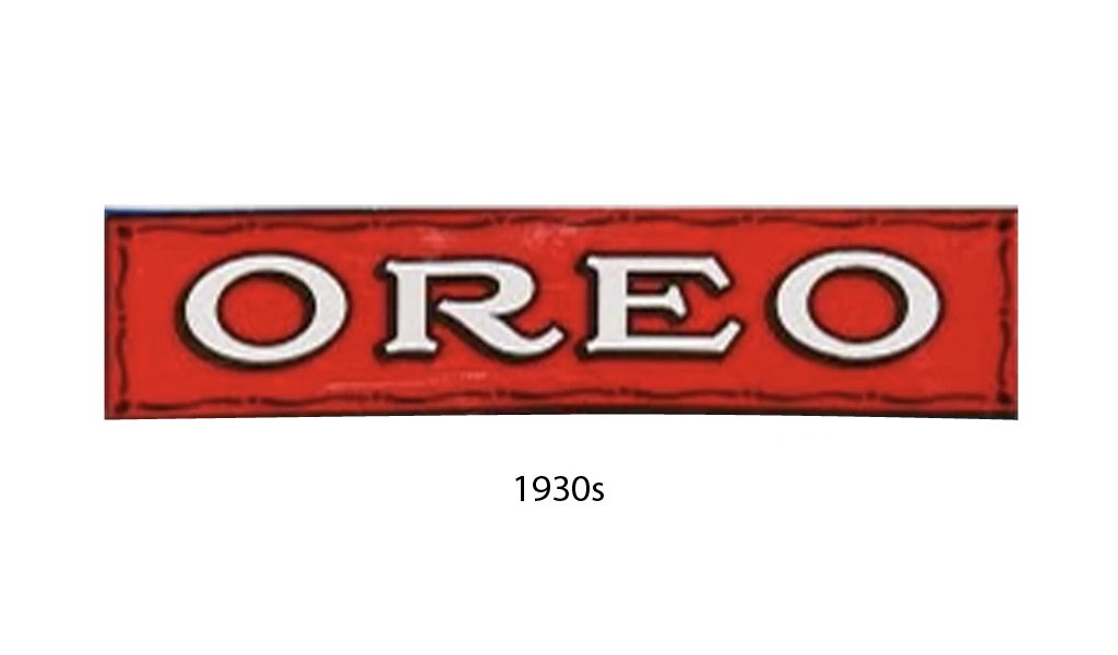
The humble beginning of the 30s (1931-1936) was marked by a return to simplicity — a red oval with white letters “OREO”. Designers abandoned the image of cookies, relying on the purity of form. The end of the decade (1936-1940) brought an unexpected solution — a bright yellow background with black letters, as if the brand was looking for a way to stand out during the Great Depression, bringing brightness to gray everyday life.
1940s: Dynamics and Movement
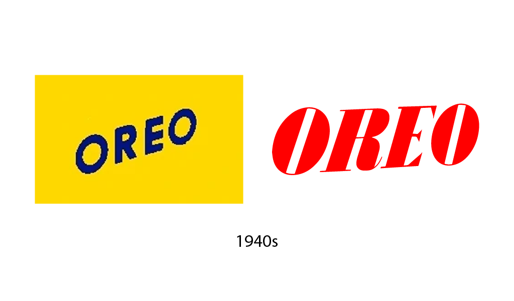
The war decade (1940-1949) gave the logo a dynamic feel — the red slanted letters created a sense of forward movement, symbolizing the optimism of post-war America. In 1949, a hexagonal design with white letters on a red background appeared — geometric clarity displacing the calligraphic softness of the earlier versions.
1950s: The Blue Period
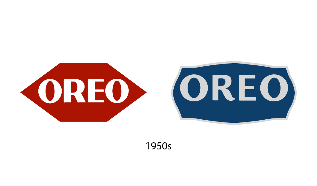
In 1952-1960, the logo acquired a blue color, which later became the brand’s calling card. The oval shape and contrasting white letters laid the foundation for recognition for decades to come. Blue, the color of reliability and constancy, perfectly matched the post-war era of stability.
1960-70s: Formation of Modern Aesthetics
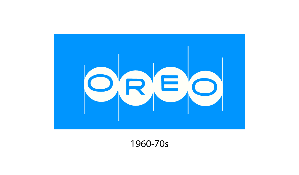
The period 1960-1972 brought new typography with rounded letters and characteristic connections between them. The design became more friendly, as if to say: “eating Oreos is part of the family tradition.” By the beginning of the 70s, the outline of the letters became more pronounced, and the proportions more harmonious. It was then that the famous Oreo flavors with double stuf of vanilla cream were released.
1970-90s: Stability and Recognizability
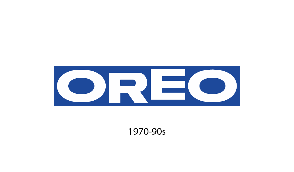
The 1972-1991 logo built on the similar success of the previous iteration, retaining the core elements but amplifying the expressiveness of the lines. For nearly two decades, the image has become deeply ingrained in the minds of consumers worldwide — a rare case of design longevity in the fast-changing world of branding.
1990s: Polishing the Classics
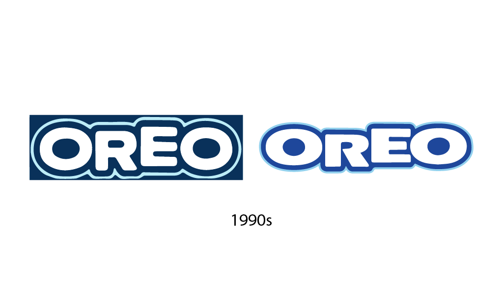
The 1991-1995 years brought subtle changes to the proportions of the letters, and the 1995-2001 designs took on a more modern shape with a subtle slant—an evolution, not a revolution. As the saying goes, don’t look for good from good, and Oreo designers chose to polish a winning formula rather than change it radically and break emotional connections.
2000s: Volume and Depth
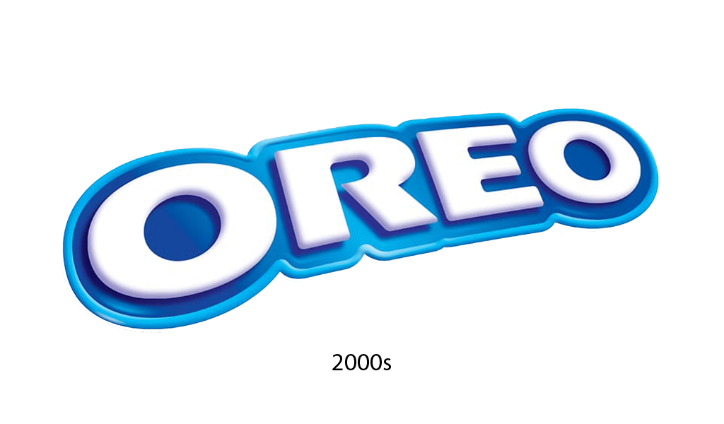
The 2001 logo was a truly revolutionary step and a visual anchor for the brand in the new millennium. The designers added depth and volume, bringing the flat image to life with 3D rendering technology. The characteristic gradient from dark blue to azure, the chrome shine of the contours and unobtrusive highlights created the effect of “juiciness” and premium.
The slope of the letters was preserved, but acquired a dynamic expressiveness — the logo seems to be moving forward, like the Oreo’s journey itself. It is noteworthy that the proportions of the letters were carefully verified: the rounded “O” balances the upward-facing “R” and “E”, creating an impeccable balance.
Over the course of the decade, Nabisco introduced a variety of limited-edition cookies, such as Dulce de leche Oreos and Golden Oreos, to strengthen its position in different markets and appeal to audiences worldwide.
By the 2010s, the Oreo logo had reached the height of recognition. The designers masterfully balanced between brand loyalty to tradition and modern trends. In 2012, for the brand’s centennial, a campaign was launched that underscored the historical value of Oreo’s design. The pattern on the cookie itself also evolved, becoming more detailed, with the addition of the signature symbol — the heraldic lily, which harmoniously combined with the overall design.
The Modern Oreo Logo: Adapting to the Social Media Presence
In 2024, the company reimagined its visual identity, transforming its classic logo into a digital art object. The bold azure-blue outline creates a neon glow, as if the cookie had been dipped in cosmic energy. The contrast between the deep blue background and crisp white letters is reminiscent of milk’s favorite cookie structure — dark on the outside, light on the inside.
The logo’s three-dimensionality is not just a nod to fashion, but a practical move: in a world where users’ attention spans are measured in milliseconds, the three-dimensional Oreo symbol instantly stands out from the information flow, erasing the line between the virtual sign and the real product.
This chameleon logo looks equally at home on a tiny social media avatar or a giant VR banner, turning each digital appearance of the brand into a mini-feast for the eyes. Notably, Oreo maintained the playfulness of the round shapes — a visual tribute to cookie enthusiasts that has now crossed over from the physical world into the digital realm of memes and challenges.
The Role of the Logo in Oreo’s Marketing Campaigns

The Oreo logo has always played the role of the lead singer in the brand’s marketing strategies. Beginning in the 1950s, when television advertising was gaining momentum, the recognizable symbol of the black and white cookie became an integral part of advertising messages. The slogan “Twist, Lick, Dunk” was always accompanied by a close-up of the cookie with the logo, turning the simple act of eating into a ritual familiar to millions of consumers.
In the 1980s, the brand began experimenting with packaging in new flavors, but always kept the logo in the center. The blue background of the packaging served as the perfect canvas for the contrasting image of the cookie and the white font of the logo — psychologists noted that this combination evokes a feeling of reliability and quality. “Once a shot, Oreo hits the bull’s eye forever” — the company had a deep understanding of the value of visual continuity.
The logo made a breakthrough in the modern era in 2013 with the “Oreo Daily Twist” campaign, which featured 100 days of cookies modified to celebrate current events and holidays. The famous tweet during the 2013 Super Bowl blackout, “You can still dunk in the dark,” featuring the logo on a black background, became a textbook example of disruptive social media engagement.
Summing up
Throughout its history, the Oreo logo has demonstrated an amazing ability to change while remaining the same at its core. Like a chameleon, it has adapted to design trends of different eras, but has always retained its recognizable personality. Inspired by the Oreo way, with its three-dimensional depth and bright blue outline? Turbologo offers AI tools to create elaborate designs, maintaining a balance between recognition and modernity. With an intuitive interface and layouts with customizable elements, you can fine-tune a logo that, like Oreo, will be equally effective in both the digital and physical environments.
I’m a product and graphic designer with 10-years background. Writing about branding, logo creation and business.