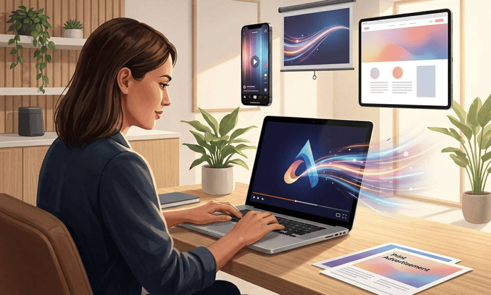
There are various means of rebranding. A new slogan or a merge of two logos (in the case of companies merging), gradients, stylish outlining, shadowing and texturing are but some of the available techniques. Yet there is one attribute, which is changed far more seldom than the others. A logo color it is. And it’s not surprising, as color is the most noticeable part of a logo. It’s made for the internals of our vision and psychic as color is closely interrelated with lighting. And perceiving of warm and bright or cold and dark spot is far easier process than rendering its shape concrete. In the case of text, however, it’s even more complicated. That’s why most companies never change colors in their logos, even if the colors aren’t trendy anymore.
Both color choice and color alteration are extremely important steps. For it is brand recognition that is at stake. Nothing repels customers more than a sudden color alteration, especially in a well-known one. They subconsciously imply that your goods have become worse and your brand isn’t trustworthy anymore. However, in some cases, a hype, deliberate and flashy rebranding can repel old customers and attract many more new ones. If you are ready to take the risk, study our advice below carefully and ponder those.
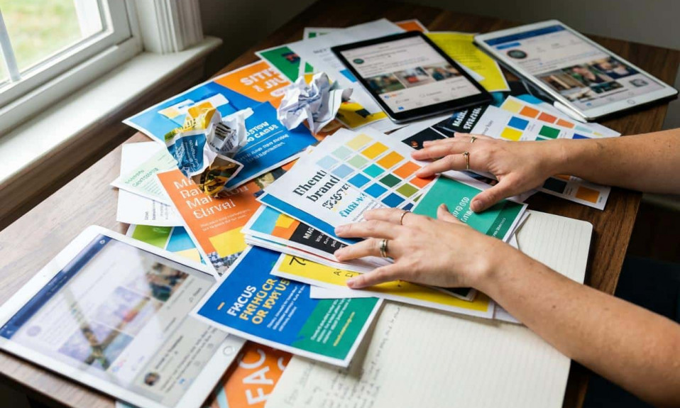
Best colors for logos
One of the most effective ways to stay trendy is to keep an eye on the color of the year. Thus you can combine the most trendy colors in a logo for free. Pantone announces trendy colors every year. 2020 is a year of classic blue. Professionals say that the shade helps to keep your cool, follow your own lifestyle and avoid stress.
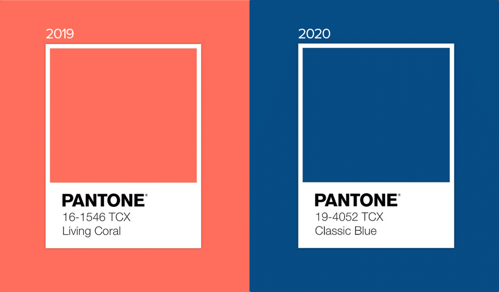
However, in order to choose the best colors for business logo, it is crucial to follow your own path rather than following fashion blindly. It is necessary to feel it, understand how it works and finds your place in it. So, the best advice here is to use colors well-compatible with blue. Pastel colors like skin or mild sand colors dim the lone blue, making it warmer, more friendly and extravert.
Trendy colors of past years and modern blue also make a fine combination. For example, the blue, coral pink and soft pink colors convey a sense of something marine. If you are running a traveling agency of some sort, this could be your best choice.
Plausible logo color combinations and their psychological impact
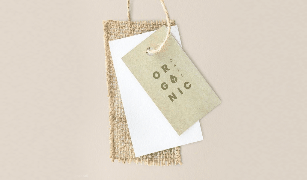
It is combination of colors that has a meaning as a single color can be interpreted in different ways. However, you should decide what you want to tell in the first place. Here is an example. Let’s assume you are running some healthy way of life business. You’ll need a combination of natural colors for such a logo. A good idea can be to combine a classic blue and some brownish colors like those of hay, dried grass or fallen leaves. These colors almost send you to back to your childhood memories of a warm autumn day.
There are many ways to introduce a business. Let’s imply you manufacture some goods for teenagers and you use sportsmen, parkour, tricks and stunts in you ads. In that case it could be a good idea to choose some contrasting, bright and juicy colors. Skillfully combined, a flashy red, blue and green will help you to make a brilliant dynamic logo.
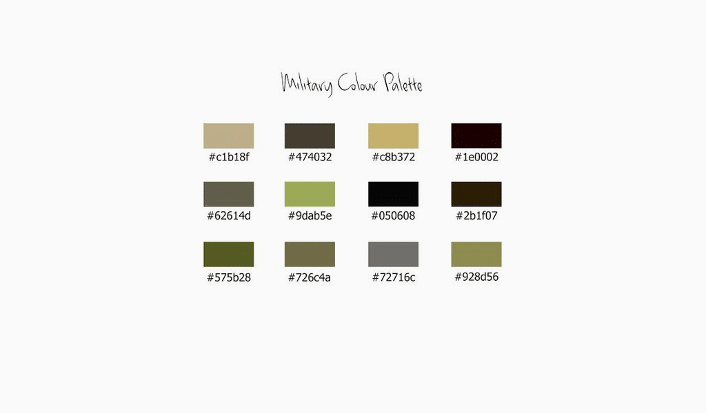
Meanings of colors and their combinations are transacted into logo. Khaki color is widely associated with army. However, a combination of khaki, soft pink and bright green conveys a meaning of upcoming spring, resembling turgid bulbs. Use that meaning to create a logo related to ladies goods. It’s a bold an unusual move. And stop avoiding mustard color. It’s not the most pleasant one, but it’s great for combining.
Best logo colors contemporary tendencies
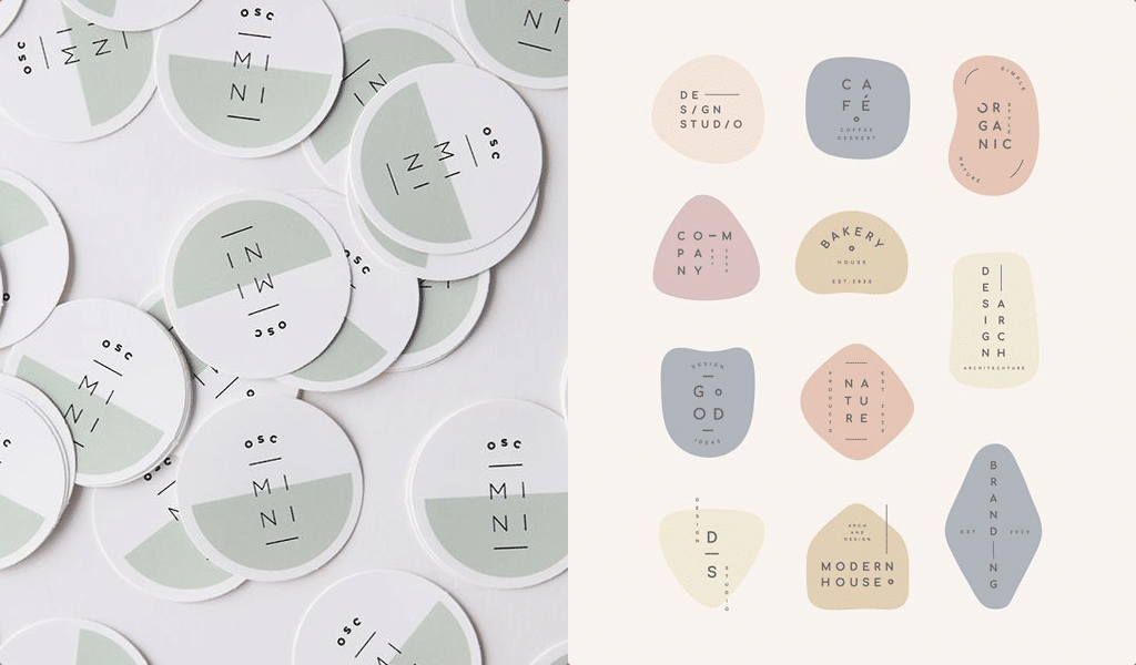
Another latest trend in designing is to make colors not only vivid, but also volumetric. It is essential to take textures into consideration too. There two major trends these days. The first one is to use flat and bright dots. And the second is soft, mild volumetric and grainy surfaces. You’ve always wanted to touch one of those, haven’t you? It goes without saying that both designs are very difficult to elaborate. However, it seems that simplicity finally doesn’t sit as tightly as it used to. Learn to use texture a measure of volume. It this simple feature that will enable your logo to stand the test of time.
I’m a product and graphic designer with 10-years background. Writing about branding, logo creation and business.