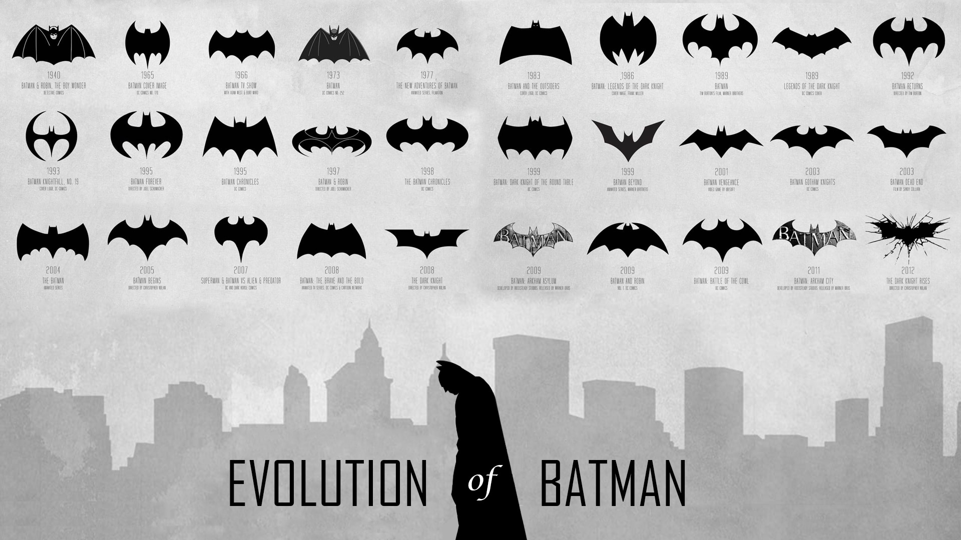
Who is one of the best-known superheroes, almost always wearing black and preferring not to change his costume color? Whose logo is projected on grim clouds of the gothic city when criminals start to move? Obviously, it’s the Dark Knight with a bat sign on his chest. You can adore Batman or consider comics to be worthless garbage fit for kids only, but it still changes little.
You can’t deny that with the appearance of computer graphics most blockbusters follow superhero topics. What’s more, an amount of money invested by marketologists in image development is so tremendously vast that you can’t ignore batman to be quite an influential person. In this article we’ll tell you how has his image been changing from war days to present ones.
Table of Contents
All the history of batman logo begins with creation of character in 1939. Nowadays, super-powers, mysterious appearance and hand-to-hand fighting seems funny and parodic, but it was cool back then. Following Zorro’s steps, Batman has become another elusive avenger wearing a mask. He has claimed hearts of many and by doing so took his place in a separate line of comics.
In general, the hero’s image (Hero’s costume, his incredible car, devices and gadgets, and of course the batman logo.) was created back then. However, the scenario was dull, antagonists were stupid, the costume looked poor on a screen and Batman logo was simple as all the logos of that time. In contrast to many others the logo has undergone numerous changes before it took its modern form. And we are not sure if you know the modern look of batman logo or not, but we’ll find that out soon enough.
The first batman logo hasn’t been changing for many years. And in 50s super hero fashion has downturned and many comics disappeared as a result, but not Batman. Comics’ authors decided to further develop the character in mid 60s. Narration style changes and a huge searchlight of attention highlights burning issues now. Criminal master minds, threatening the city are replaced by more real and common problems, such as corruption, smuggle, etc. The batman logo image itself undergoes alterations. It elongates and becomes far more stylish and attractive. And that triggers a chain reaction of course.
A logo variation from 70s emanates confidence. Such logo is fit for deliberate and experienced hero, who keeps his word and deems responsibility for city’s fate a highest privilege. In 1983 an idea of minimalism overwhelms common sense and Batman silhouette loses its wings and resembles a huge cupboard with tiny head. Comics sales also went down, as DC Comics spotted a rival. All the nest decade turns out to be difficult for both the Hero and the company.
90s become a new, unparalleled popularity limestone for Batman character, as sales reach unprecedented levels and designers burst out a variety of new ideas for the logo. Variations differ in many ways. Wings vary from thin and pointed to boundlessly unfurled, covering a vast area. New batman logo turns to vertical one, and then back to horizontal, and then the cycle continues over and over again. It was easy to decide that all those logos belonged to different companies rather than symbolizing one and the same Batman character.
A new millennium shows Batman all the mercy it can, though he still changes logos as he pleases. It looks like the character authors gone wild because of tremendous success and aim at claiming their rights for every bat image in the world. They even sued Valencia CF regardless of the fact that the club uses their bat logo from 1919. And usage of the bat itself as a symbol of Valencia region dates back to 13 century. However, Batman seems to be the only relation to a bat in authors’ minds. So, if you decide to use the animal in your logo – you just keep DC Comics in mind. There is a possibility that they will charge you with plagiarism, so design your logo carefully!
SEO specialist, link builder, and blog editor at Turbologo. Writing insightful content about marketing, design, and branding. Sharing practical tips on building and promoting brands online.
In ten years of working on logos and brand identities I have probably looked at…
Over the years I have worked with brands, I have seen the same situation play…
Every tool in this article can put a post on Instagram at 9am on Thursday.…
We launched PostPost.ai, an AI social media management tool that reads your website, learns your…
Over more than ten years of working with design, I have seen several moments when…
Over ten years of working with logos, I have seen the same situation many times.…