
A logo is a symbol that illustrates the company’s image and is one of the main ways to differentiate from competitors. What should you think about before creating a logo? The first thing to start with is choosing the type of your logo.
Although they all use the same combination of images and typography, each logo gives your brand an individual feel. Your logo will be the first thing that new customers see. Make sure it is perfect. How to choose the right logo type for your company? These are the 9 types of logos you should know about:
Create your own logo with Turbologo logo maker. It takes less than 5 minutes and no design skills needed.
Go to Logo MakerTable of Contents
1. Wordmarks or logotypes logos
A wordmark is similar to a lettermark. It’s a font-based logo which focuses only on the business name. These are also called logotypes. This type of logo design suits businesses with memorable and unique names. Because the company name is distinctive, it can be easily recognized by consumers if combined with good typography. Wordmark logos must accurately reflect the service or product offered by the company.
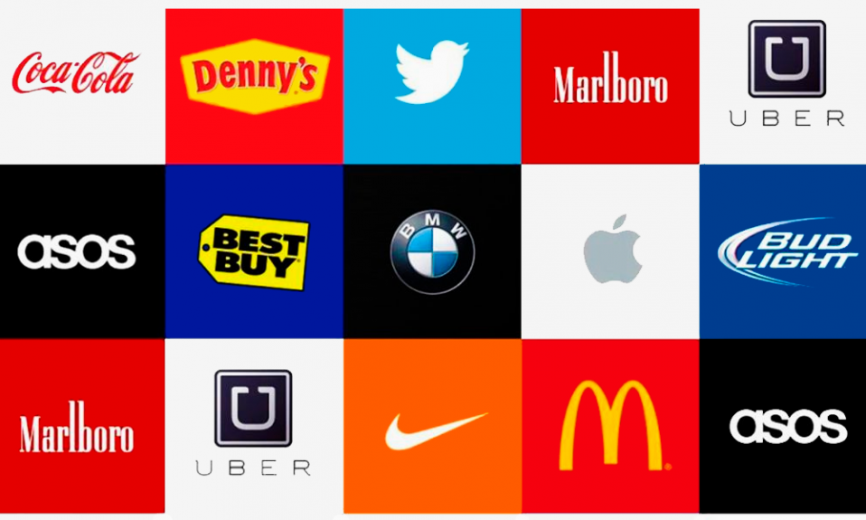
Wordmark logos include Think Visa, Coca-Cola and Think Visa. You’ve probably seen their logos known all over the world. Like the first type, this one will make you think carefully of the font and the colors. Note: the font should illustrate the company’s main idea and be easily readable. Fashion brands, for example, tend to use elegant fonts that feel high end. However, legal and government agencies tend to stick to more traditional text that feels safe.
Tips on how to create a wordmark logo
If you are a new company or have few followers, be cautious. Although a brand mark can be a hallmark for companies that are considered iconic, it is important to establish enough recognition to make your mark. Your logo might not convey enough information about your company to your target audience and cause them to lose interest in your brand.
2. Monogram or lettermarks logos
Monogram logos can also be called lettermark logos. These logos are typically made up of letters that represent the brand’s initials. Monogram logos are great for companies who want to use their initials to identify themselves to customers. Monogram logos are great for companies with long names. These logos can be very simple but effective. The logo is only composed of initials. Therefore, the company must ensure that they use a clear font that is legible and easy to read.
Simple is the key to a lettermark. If a company has a long name, a lettermark logo can be used to simplify the brand. It is much easier to remember the National Aeronautics and Space Administration than it is to say “NASA”.
The focus of the logo is on the initials. We should note TV channels like CNN, ABC or HBO. These names look good in the corner of a TV screen. When designing such a logo, you’ll need to pay attention to what font you choose. It needs to be easily readable and match the company’s image.
If you don’t have an established business, you might want to include your full name under the logo to let people know who you are.
Tips on how to create a monogram logo
Get to know your fonts. You should use the simplicity of your logo to your advantage. However, don’t be stuck with boring or forgettable logo designs.
You might also consider embossing the full name of your business under your logo on branding materials, such as business cards or landing pages. This will allow people to associate your monogram logo with your company name.
3. Letterform logos
These logos are minimalistic versions monogram logos. These logos are also called letter logos. These brandmarks must be both beautiful and bold in order to grab attention. It can be difficult to see just one letter as representative of your brand.
The letterform logo must be easily legible. Once people see your letter logo, they will instantly remember the brand name.
Tips on how to create a letterform logo
These logos only have one letter. The design is essential. If the logo isn’t memorable it is pointless. It could have a bold font, dramatic background or interesting color scheme – anything that makes the letter stand out on the page and resonates.
Make sure that the font used is easily readable. Even if your logo only contains one letter, people should be able to read it.
Using a wordmark, lettermark or letterform logos:
- Choose a Lettermark type If your business has a long name. Your logo will be simpler if you can condense your business name into just the initials. Customers will also have an easier time remembering and logo of your company.
- Lettermark And Wordmark Logos can be easily replicated across marketing materials and branding, making them highly adaptable options to a developing business.
- If you have a unique business name that customers will remember, a Watermaker logo is a great idea. Your brand will be more memorable if your name is in a well-designed font.
- If you are a new company and need to get your name out, Watermark logo is a great decision. However, make sure the name is concise enough to maximize the design. Too long names can make your business look cluttered.
- Letterform logos need to be striking, attractive and communicate a clear message about the brand. This type of logo can be easily accommodated on business cards, banners and brochures.
4. Pictorial marks or logo symbols
Pictorial marks are a logo that is based on an icon or graphic. Sometimes known as a logo symbol or brand mark. This is the most common image you associate with the word “logo”, including the Apple logo, the Twitter bird, and the Target bullseye. These logos are so iconic and so well-known that they can be easily identified by anyone who sees them. True brand marks are only images. It is a simple logo type that can be difficult to use for new companies or people with weak brand recognition.
When choosing an image for your pictorial mark, the most important thing to think about is which one to use. The larger implications of the image that you choose should be considered. Do you want to use your name, like John Deere did with their deer logo? Are you trying to create deeper meaning? Companies should choose carefully when choosing brand marks as they will be used at every level and in all instances. A symbol could have a deeper meaning, or trigger an emotion about the product.
Tips on how to create a symbol-based logo
If you are a new company or have few followers, be cautious. Although a brand mark can be a hallmark for companies that are considered iconic, it is important to establish enough recognition to make your brand stand out. Your logo might not convey enough information about your company to your target audience and cause them to lose interest in your brand.
Keep in mind, however, that your logo could misrepresent your product line if you plan on expanding it to include a variety of products.
5. Abstract logos
Abstract logos often contain abstract geometric images and shapes. These logos are unique, and leave a lasting impression on the customer. The logo does not have to be a specific shape. There are many creative options. An abstract logo is unique and will convey the entire business idea. Nike is a great example. It denotes freedom, movement and mobility. Pepsi and Adidas are two other examples of abstract logos.
An abstract mark has the advantage of being able to communicate what your company does symbolically without having to rely on specific images. You can assign meaning to your brand through color and form.
Tips on how to create an abstract logo
It is important to refine your logo design until it conveys the desired message to the world. When designing abstract logo marks, attention to detail is essential. You don’t want your message misunderstood by a logo design that is too unclear or difficult to understand. You can easily recall the Nike logo.
A logo that is too detailed may not look right when printed at different resolutions.
6. Mascots
Mascot logos feature an illustrated character. The mascot logo can be colorful, cartoonish or fun.
Tips on how to create a mascots logo
The character is often cartoonish and humorous. Mascots are the spokes-characters of the brand. This logo is popular with children and their families. To draw attention to their product in public places, companies often dress up as the mascot logo. Examples of mascot logos include the colonel from KFC and Kool-Aid man. Companies should adjust the logos to fit all marketing materials.
Mascots are simply characters that represent your company. You can think of them as your ambassador. Some of the most famous mascots are the Kool-Aid Man and KFC’s Colonel, as well as Planter’s Mr. Peanut. Mascots can be a great way to promote a positive atmosphere and appeal to children and families. Imagine all the mascots that attend sporting events, and how they bring out the best in the crowd by engaging with them!
Using a symbol, picture and abstract logos
- Global commerce can also be done using abstract and pictorial marks, even if a business name is not easily translated.
- It can be difficult to use a pictorial mark by itself. Although it is more effective if your brand is already established, this is not a strict rule. If your business name is too long, you can use brandmarks to communicate what your business does graphically. They can also be used to convey an idea or emotion.
- If you expect future changes to your business model, a pictorial mark may not be the best choice. Although you may initially sell pizzas, your logo could include a picture of a pizza. But what happens if you want to start selling burgers or sandwiches?
- If you want to appeal to children and families, consider creating a mascot. A mascot can be a good tool for both social media marketing and real-world marketing events. Who wouldn’t love to take a picture with the Pillsbury Doughboy!
- A mascot is just one component of a logo or brand that is successful. You may not be able use it in all of your marketing materials. A business card may not be able to print a detailed illustration, for example. Consider the combination mark, which is the next type below.
7. The combination mark
Combination mark logos, as the name suggests, consist of a combination logo with both an image-based and typeface logo. Companies usually place the text and image next to each other or stack them together. Combination marks can be used to identify a brand. The combination of text and images is very distinct. Combination mark logos are easy to trademark.
It’s best to start with the most famous examples: Burger King and McDonald’s. In such a case, a wordmark and a symbol or a graphic image work together, maximizing and adding to the effect of one another. Companies do sometimes omit the wordmark, like when making business cards, which is absolutely an advantage, because it’s quite challenging to design a logo looking good on everything: business cards, websites and huge banners.
Tips on how to create a combination logo
People will associate your name with the combination mark as soon as they see it. You may be able, in the future, to rely only on a symbol for your logo and not always have to include your name. These logos are easier to trademark because they combine text and a symbol, creating a unique image.
Being versatile doesn’t have to be boring. Identify the way you want your symbol and name to interact, and then design your logo with care.
8. Emblems
These logos are the most common. These logos are still in high demand. An emblem logo is a symbol or icon that includes seals, crests and badges. Emblem logos are the best choice for college, schools, government agencies, and the auto industry.
They are less flexible than other types of logos due to their tendency towards greater detail and the fact that the symbol and name are tightly entwined. It will be difficult to reproduce an intricate emblem design across branding. A busy emblem might shrink too small to be read on business cards. If you intend to embroider this type of logo on hats and shirts, you will need to make sure it is simple.
Tips on how to create an emblem
Remember to consider scalability when designing your emblem. These logos are more complex and may not be as attractive when resized.
Emblems also don’t offer the same flexibility that standard combination marks, so make sure you are 100% certain about your design before you send it out to the world.
Using an emblem logo or combination mark:
- A combination mark can be a great choice for any business. This is a versatile and highly distinctive logo that is very popular among well-known companies.
- While an emblem’s classic look may be preferred by many public schools and agencies, it can also be used to serve any private business very well, particularly those in the food or beverage industry. Be careful with the details.
9. Dynamic Marks
The dynamic mark logo can be adapted to various contexts. They don’t have a uniform font-color-text combination. They can change depending on the branding materials we use to represent them. These logos can be as creative or simple as you like, and the possibilities are endless. We can choose different styles depending on the marketing platform we use such as blogs, social media, and websites.
Tips on how to create a dynamic logo
Your logo’s association power is important. Your logo can be associated with colors and shapes by some of your followers. However, if your logo is static, it may not have the same impact as one that has changed. Keep your logo consistent and be aware of any changes.
Final words
So, we have briefly reviewed the nine types of logos. After you make a decision on which you like the most, it’ll be time to start designing and, further, using it.
Your imagination is your only limit when it comes to choosing a logo for you brand. You can create many different logos using Turbologo logo maker. There are thousands of logos available for different industries. You can choose the logos you like the best: wordmarks, letterforms and logotypes. Take a note of every logo that you like. The message your logo should convey to your audience is what you need to consider before making a decision.
I’m a product and graphic designer with 10-years background. Writing about branding, logo creation and business.
Please share our article if you like it!