Create your own logo with Turbologo logo maker. It takes less than 5 minutes and no design skills needed.
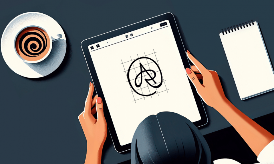
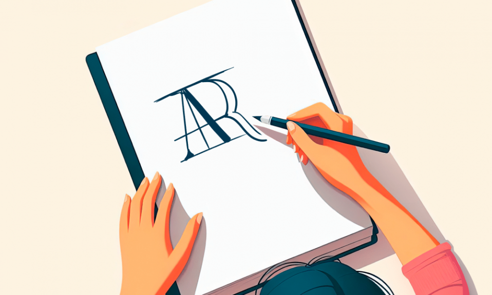
Go to Logo MakerIt is common knowledge that a good logo makes any startup far more noticeable. It is all about recognition and impression. Colors, symbols, types are actually tools using which you can improve your reputation greatly. People subconsciously feel that they have seen it somewhere or maybe someone recommended the brand before. Ads suddenly become more effective, and customers visit your stores more often as a result. However, there is a mistakes-to-avoid top when creating your logo. Don’t burn your fingers twice. Let your rivals do that for you. Read our pieces of advice meanwhile.
Table of Contents
1. Old fashioned graphics makes your logo dull and boring

And the latest tendencies are hard to measure and define until they become a major trend. And sometimes we don’t even fully realize what an obsolete effect can do. An outdated designing move is capable of ruining the whole branding. Artisans used to apply a variety of Photoshop techniques and effects. It was trendy and fresh. Not today, however. Shades, blooming, outlining, acid gradients, and many other would-be-trendy moves should be refused nowadays.
2. An infelicitous color gamut choice is another common mistake
Not all the colors are compatible, you know. Dos and don’ts of logo design take a profound consideration indeed. Each has its own unique features and its own place in a pattern.
3. Using dirty colors is something which you’d better avoid too
This point is based on the previous as you have already guessed. It is crucial to get a plausible color combination, but it is a matter of life or death to apply a gradient technique that won’t allow your combination to look dirty and untidy. It is a major mistake when they don’t take shading into account. You can always recognize a failed gradient by dull grayish shades at the interface of mixed colors.
4. The lax composition has ruined many logos too

It is hard to recognize if you don’t know where to search for flaws. Most people don’t understand what is wrong. They just feel that a logo is a failure. A major issue in such cases is a simple asymmetry. A majority of logos are symmetric. Only a few professional designers can use asymmetric techniques and improve your logo. In many other cases, they just would ruin it. A good example here is the Windows logo.
5. One of the logo design mistakes to avoid is an imbalance
It appears when logo elements don’t correspond in terms of color, style, size, etc. A big circle and a tiny dot, for example, would surely implement an imbalance into a logo. Also, you should avoid a mess of styles. It’s always better to stick with one style, rather than mixing them all and getting some scratchy depiction in the end.
6. One more common mistake is a too complicated logo

You can get it by putting too many details in an image. It leads to illegibility. Your customers will never be able to get what you wanted to say. And brand recognition would decrease too. Good examples here are Starbucks and Netflix. Their logos are quite complicated, but they still retain legibility.
7. Oversimplification can often be even worse than an abundance of details
Quite surprising, but the trend is included in our logo design mistakes to avoid top. A flat design trend ultimately results in the creation of too abstract logos. Try to avoid abstractness. Black square by Malevich is a masterpiece, it’s true. And all those green drops, purple lashes, and white squares aren’t.
8. A lack of variability makes your logo annoying

Keep in mind that people enjoy abundance. Also, logos look different from being printed on paper, plastic, or some other material. Logo placement changes the way it looks too. You should be aware of that and have various logo modifications for different occasions. It is also a good idea to study the culture of foreign countries if you run an international business. In some cases, your logo could insult people of a different culture.
9. Doubtful meaning makes your success doubtful

Remove everything that may seem obscure or vague. Don’t overdo yourself in terms of creativity as it is likely to confuse your customers. Focus on a brand message and express it as clear as possible.
10. And finally, a false impression comes into play

Under any conditions, you must avoid tricking your clients. Any logo is aimed at a certain target group and if you disappoint the group by implying something which is not true, you’d better consider a total rebranding. People can easily distinguish between fast food and luxury restaurant. This means you shouldn’t place a luxury logo above a fast food restaurant entrance.
I’m a product and graphic designer with 10-years background. Writing about branding, logo creation and business.